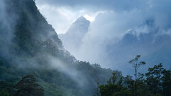
Color grading can turn a flat sunrise into a scene with shape, depth, and energy. If you shoot high-contrast landscapes, nailing tones in the sky and keeping detail in the foreground is where Lightroom’s tools earn their keep.
Coming to you from Christian Möhrle - The Phlog Photography, this practical video walks through a start-to-finish edit that leans on HDR merging and targeted masks before any color work. You see the reason to merge five bracketed frames first, with auto align on, so highlights recover cleanly while shadows stay workable. Basic panel moves stay restrained: exposure up just enough, shadows lifted, highlights pulled down, blacks nudged up, and whites eased in for snap. White balance warms the base image, and a touch of vibrance plus texture adds bite, while lowered clarity and dehaze create that soft, glowy atmosphere you want at sunrise.
Masking is where the file opens up. Lightroom’s Landscape mask can isolate architecture, which makes it easy to raise exposure and texture on a small chapel without bleeding into the hills. Object Select with a rectangle isolates the crest of the hill so you can brighten only the rim and add subtle clarity. A linear gradient darkens the near foreground to plant the scene and guide the eye upward. Separate sky masks handle different zones: one darkens and adds contrast to the upper clouds, another warms and brightens the lower glow with careful temperature and tint, and a third uses a gradient to keep the bottom of the sky clean. You build depth in layers rather than with a single global adjustment.
The split toning in the Color Grading panel is the headline. Highlights get a strong warm hue with higher saturation to push the sunlit areas into that intense, sunrise look. Midtones shift cooler so the top of the sky stays blue and the image keeps color contrast instead of turning into a monotone orange wash. Shadows take a subtle blue, not heavy-handed, and luminance sliders on each range tweak brightness to stack contrast without crushing detail. Balance favors warmth so highlight color speaks louder, while Blending moves just enough to keep transitions smooth. The global wheel adds a gentle warm bias once the range wheels are balanced, which ties the palette together without steamrolling the local work.
If you like to fine-tune color response, the Calibration panel offers a quick extra push. Lowering Blue Primary hue and adding a bit of Blue Primary saturation can clean up skies and lock in that complementary warm-cool play. It is not a fix-all, but in this style of edit it often tightens the palette in a way HSL alone does not. Sharpening stays controlled: radius down, detail up, then hold Option while raising Masking so sharpening hugs edges and leaves smooth tones untouched.
You should notice how the edit separates tasks by intent. Merge to capture data. Basic panel to set exposure and base color. Masks to shape light and attention. Color Grading to design the palette. Calibration and sharpening as finish work. If you skip the local masks and push only global color, you might get bold tones but lose the sense of distance and air in the scene. Check out the video above for the full rundown from Möhrle.


Join the Fstoppers community for free
-
Post comments and join in the discussions
-
Browse the site ad-free
-
Share your work and get featured in the community
-
Compete in the photo contests for fun and prizes
No comments yet