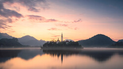
Editing autumn photos requires a mix of thoughtful adjustments and creative techniques. Sometimes, achieving those rich, warm tones can be tricky, but there’s a way to make it easier with a lesser-known profile setting that can instantly improve your images.
Coming to you from Christian Möhrle of The Phlog Photography, this helpful video explores how to enhance the colors of your autumn photos using a "hidden" profile within Lightroom. Möhrle walks you through how to access this profile, which isn’t found under the usual Adobe Raw or Camera Matching options but is instead hidden in the Artistic menu. By selecting the "Artistic 3" profile, you can immediately see a shift, with greens turning into those desirable orange and yellow tones. However, the effect is strong, so it’s essential to dial back the intensity using the amount slider. This adjustment gives you control over the color transformation, ensuring you maintain variety in your tones without overwhelming the image.
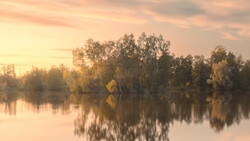
Another critical step Möhrle covers is adjusting the basic exposure settings. Boosting overall exposure can help bring out details in the darker parts of your shot, but this often leads to issues like blown-out highlights. To counter this, he recommends pulling down the highlights slider to restore lost details, especially in bright areas like water or sky. These adjustments might seem small, but they play a crucial role in balancing the image and making the autumn colors stand out without losing important details.
The video also highlights the importance of masking to direct attention where you want it. Möhrle uses a mix of linear and radial gradients to darken distracting bright spots and add subtle glow effects, drawing the viewer’s eye toward key areas like waterfalls or vibrant foliage. By increasing clarity and contrast in specific spots, you can add depth and guide how the image is perceived. This method helps to emphasize the elements you want to stand out, making your composition stronger overall.
For those looking to get even more out of their colors, Möhrle suggests diving into the color mixer and calibration tabs. Here, you can tweak the hue, saturation, and luminance of each color to add variety. Instead of an overwhelming sea of orange and yellow, adjust the green tones slightly to bring back some natural hues, or deepen the reds to make the image richer. Playing with calibration can further fine-tune these tones, giving your images a polished look. Check out the video above for the full rundown from Möhrle.


Join the Fstoppers community for free
-
Post comments and join in the discussions
-
Browse the site ad-free
-
Share your work and get featured in the community
-
Compete in the photo contests for fun and prizes
1 Comment
Hidden Profile!!!! Is this more for Adobe than the camera profiles?