
Use your next five minutes effectively and learn how to create faded, filmic photo edits with nothing more than a few tweaks in Lightroom.
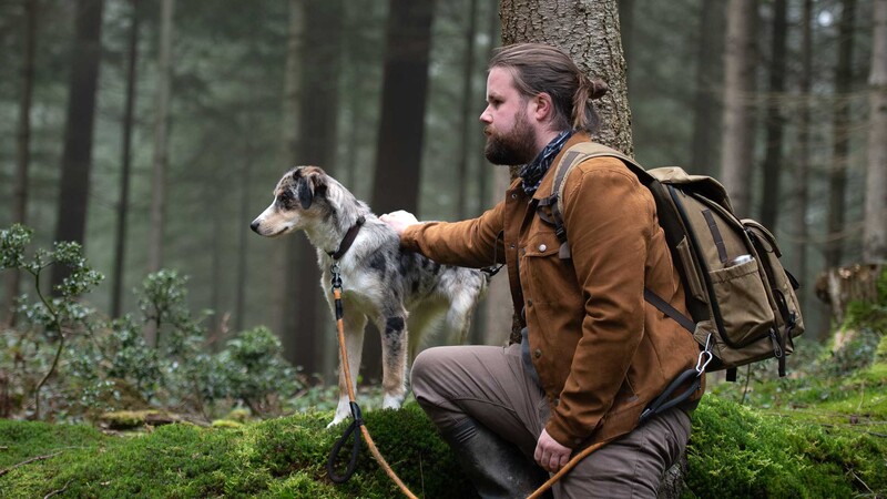
It doesn't take long to completely ruin your photos with a bad edit. But you can also transform dull shots into something more cinematic in a matter of minutes, if only you know the right knobs to tweak. In this tutorial, I'll be showing you how to take a standard portrait image and apply a few exposure changes and utilize the tone curve tool to make your shots look more like the kind of stills image you'd see on the silver screen. We'll be aiming for a matte-style filmic look where our dark areas are crushed into a deep gray and the color tone is tweaked ever-so-slightly to produce something much warmer and inviting.
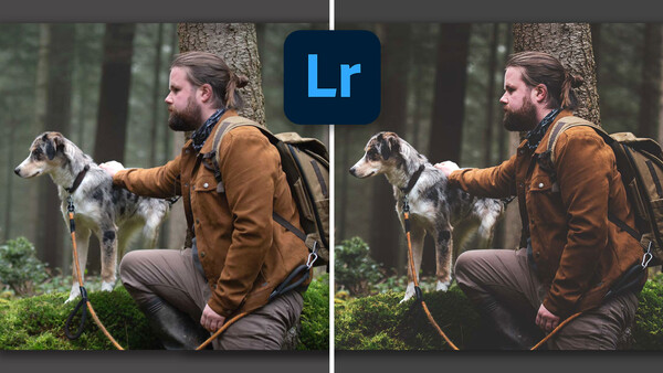
So, instead of downloading Lightroom presets from other people you could learn how to do it yourself in the time it takes to make a cup of tea. The best part of it is that once you give the editing process a go you can then customize the method to your own personal taste and feel confident in your future edits having mastered a little bit more of the Lightroom software. Move the arrow slider below to switch between my before image and my after image to see the kind of effect you could create with your own photos.

Correct Exposure Values
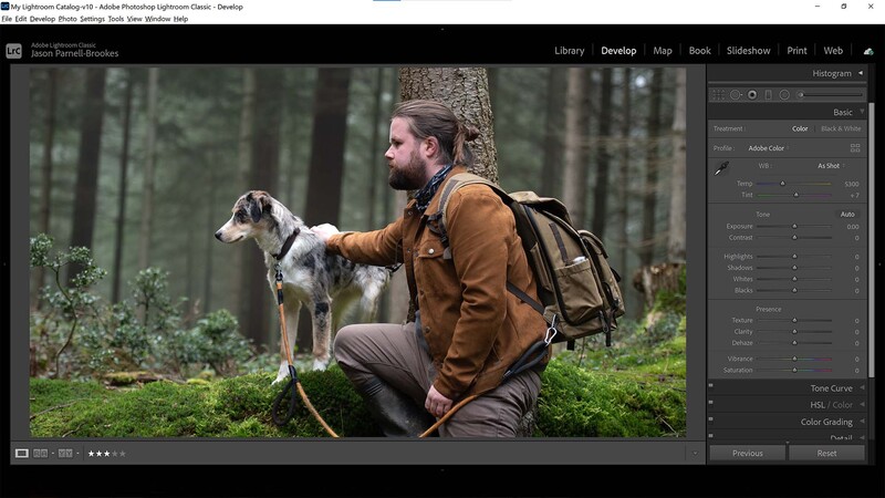
The first thing to do is correct any exposure issues with our photo. In my image, I noticed that the highlights were ever so slightly too bright. The rest of the scene looked good, including the midtones and shadows, but I had to reduce the bright highlights on both myself and my dog, Benji. So I dropped the highlights slider down by -21.
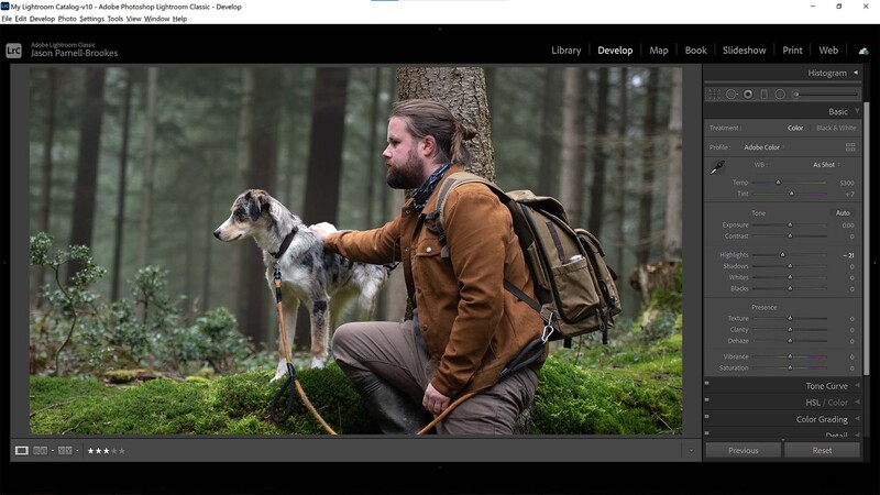
Deepen the Blacks

Now that the exposure corrections have been made it's time to make changes to the darkest sections of your shot. In a minute we'll be making a new tone curve so that we can give that filmic quality to our scene, but that will introduce lots of detail in the blackest areas of our frame. We don't really want that, so to remove that detail we should now head to the blacks slider and turn it down to deepen the blacks. I adjusted the blacks slider to -29. You may have to go further with your own photograph, but essentially you want to aim for minimal detail in the darkest sections of the frame for the film style to come across later on.
Head To the Tone Curve
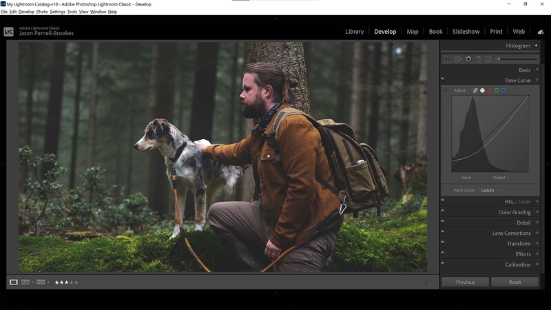
Underneath the Basic panel, we have the Tone Curve panel. Click and open it and you'll be met with a histogram with a curved line stretching from bottom-left to top-right. From here we can set control points on the line to make adjustments to the brightness of our photo. We can set multiple control points and we'll use two in this step. First off, notice how the histogram is split into squares. Locate the bottom-left square and click to place a control point in the top-right of it. Then grab the control point in the bottom-left of the graph and pull it straight, halfway up the square.
You'll see how the photo takes on this crushed, gray tone, and looks like it's been printed on matte paper. This is exactly how we want the photo to look, but there's a problem: the image is now super dark.
Correct the Curve Brightness
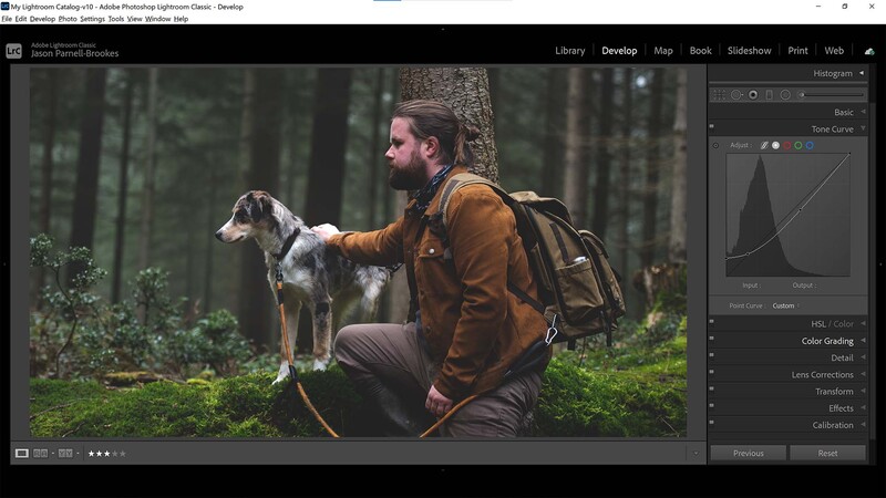
So we've got that filmic style we want, but the photo is now dark. That's because every control point you make on the graph will affect the rest of the photo. See how the line on the graph has now bent down on the right-hand side of where we set our initial control point? Well, place another one halfway up that line and drag it up nearer the centerline of the histogram. Now we have a gentle tick shape in the Tone Curve and the image is bright once more. We're nearly done, there are just a couple more tweaks you might want to do.
Apply Some Finishing Touches
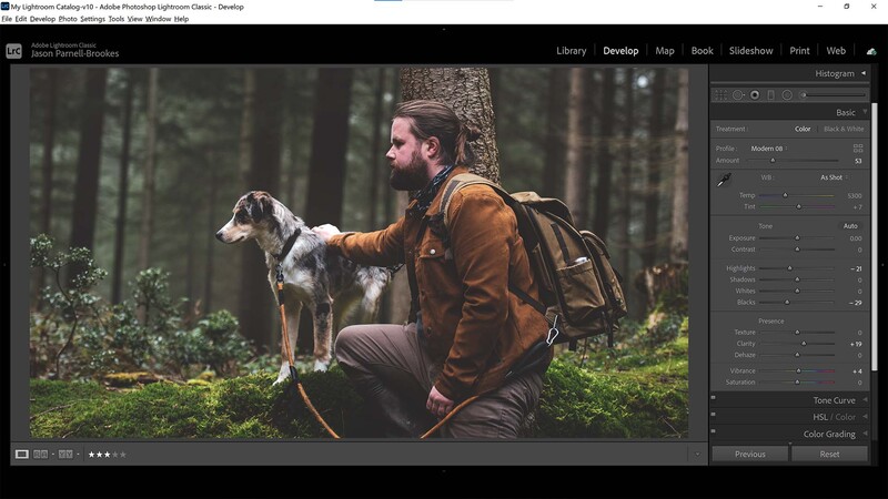
After taking the above steps you may see reduced detail in the photograph. That's okay and is all part of the faded style, but if you want to include a bit more punch then head up to the basic panel and make some tweaks. I've decided to add a bit more midtone contrast by boosting the clarity slider to +19. I also increased the Vibrance slider to +4 for a slight lift in colors.
I'd like more of a warm tonal effect, and while I can do this by tweaking my color balance, or experimenting with color grading, I can do this much faster with a treatment profile preset. Under "profile" click the drop-down menu and search for your favorite preset. I've used Modern 08 here as it adds to the faded matte filmic style I've been creating, but also adds a layer of warmth with more red in the scene.
Conclusion
Overall, we've successfully managed to apply a faded, filmic style to the photo in only a few minutes. In fact, you could speed up this process even further by choosing to only make the tone curve adjustments in steps three and four. Or you could save the edits you've made as a preset to make it much faster to recall this style for future photos. Simply head to Develop>New Preset then select all the boxes that apply in the following pop-up window, give it a name, and click Create. Then apply the preset by heading to the Presets tab in the left-hand window.


5 Comments
Why is it that people insist that film emulation be faded? Pick up some pre-digital Nat. Geographics and look at the photos made on e-6 and Kodachrome. Look at some good prints from Velvia. Even color print film could have bold and saturated colors.
It is a modern technique used in post to create different moods in films. The Lord of the Rings is a great example.
How often do you see film emulation that looks like the prints and slides we made or got back from the lab? How often in the film days did you see print work that was intended to look like faded prints? It may be used for different moods, but rarely do you see emulation that looks like what we strived for in the film days.
thanks for article!
i like it. it's like the matte effect.