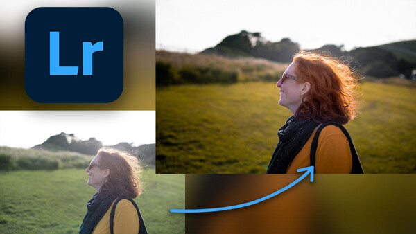
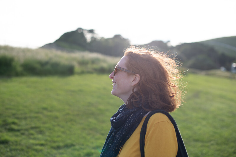
Learn how to transform a dull, washed-out portrait into something more atmospheric with a few tips and tricks in Lightroom Classic.
I'll take you through my step-by-step process to edit a portrait by using a few color tweaks, exposure changes, and some selective adjustments that breathe new life into otherwise lackluster shots. The following technique works best for outdoor portraits that feature some kind of foliage or extensive grass background due to the way we'll be changing the hues and saturation of those colors. But the same principles can be applied to any colors in different portraits, so follow along to learn this full editing walkthrough from beginning to end.
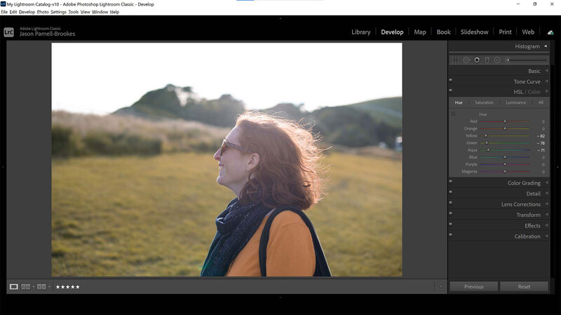
Adjust HSL
Start by changing the hue of the greens in the shot to restrict the color palette.
The first thing I want to do is change the hue of the greens in the photo. I'll head down to the HSL / Color panel in the Develop module and grab the selector button just below the word Hue. I made sure the Hue tab is selected and then clicked on a patch of grass and dragged the cursor down to alter the hue of that area. Alternatively, I could also go to the yellow, green, and aqua sliders to move them to the left to alter the hue more accurately.
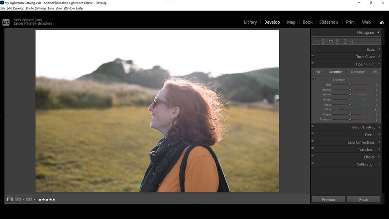
Desaturate Blues
Next, restrict the color palette further by desaturating any colors that don't add to the scene. Here, I've reduced the blues saturation.
My next step is to reduce the saturation of other colors to restrict the color palette in the photo. I did this by clicking on the Saturation tab in the HSL / Color panel and moving the blue slider to the left until I got to -77. Notice how the scarf and some of the surrounding hillside that lie in shade have now dropped almost to a dull gray.
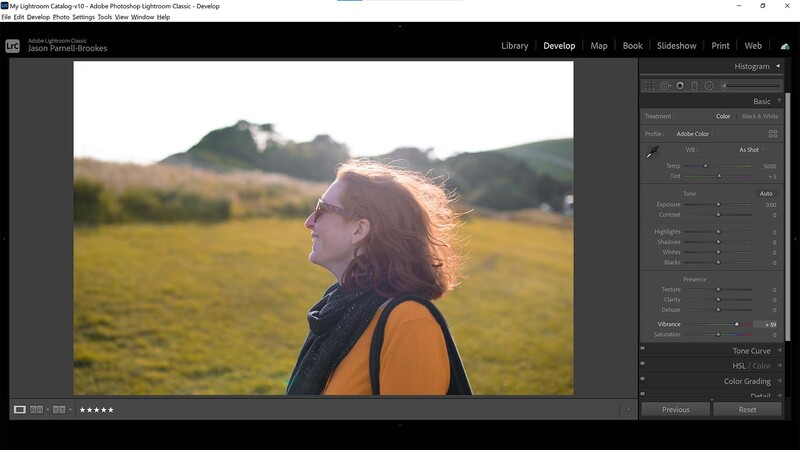
Boost Vibrance
Boost the colors in a shot by increasing the Vibrance slider.
Since I've desaturated the blues and altered the hue of the warmer tones in the photo, it now lacks impact. So, in order to counteract this, I've headed to the Basic panel and boosted the Vibrance slider significantly to +59. This not only boosts the saturation in the shot without clipping but accentuates the weaker colors to balance alongside the stronger ones.
Enhance Contrast
Enhance the contrast with fine control by using the Basic panel to adjust the Exposure, Blacks, and Clarity sliders.
The photo looks a little washed out with gray blacks and dull midtones. In order to boost the contrast in the photo, I could just lean on the Contrast slider in the Basic panel and let Lightroom do all the work, but I want to be more accurate with my tonal changes. So, I'll drop the Blacks slider to -37 to deepen the shadowy areas. I've also reduced the Exposure slider by -0.22 to underexpose the photo slightly, giving a sense of mood, and I've increased the Clarity slider to +15 to boost midtone contrast, giving things a real punch.
Use a Radial Filter
Use a Radial Filter to make the face come alive by brightening it with the Whites and Blacks sliders.
At this point, the subject in the middle of the frame, being backlit, is a little too dark. I want the subject to stand out more, so I've added a Radial filter (from the top toolbar on the right) to cover my subject's face. From here, I've boosted the Whites slider to +33 for more apparent highlights and lowered the Blacks slider slightly to -10 to turn the grays into dark black. Now, the subject's face has more contrast and stands out in the shot.
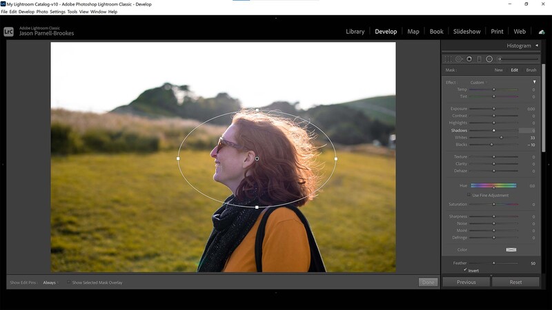
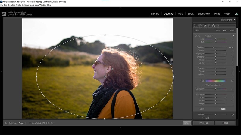
Add a Vignette
Add a custom vignette by using the Radial Filter and reducing the Exposure slider to darken the outer edges of the frame; center it around your subject, not the entire frame.
Due to the framing of my subject, she is surrounded by a large portion of the environment around her. I prefer to bring attention to my subject in two ways: one is through focusing and the other through exposure. Since my focusing is on the subject already, I'll turn my attention to the exposure. Using the Radial filter again, I've clicked New to add a new Radial filter and draw an oval around my subject. I've made sure to keep the Feathering to 50 for a nice, gradual fade between the edge and the center of the filter, and I've unticked the Invert button so that only the outside of the selected area is affected. Then, I reduced the Exposure slider to -0.89 to drop the outer edge of the frame by nearly one stop.
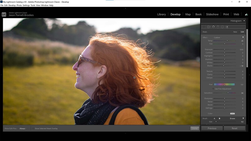
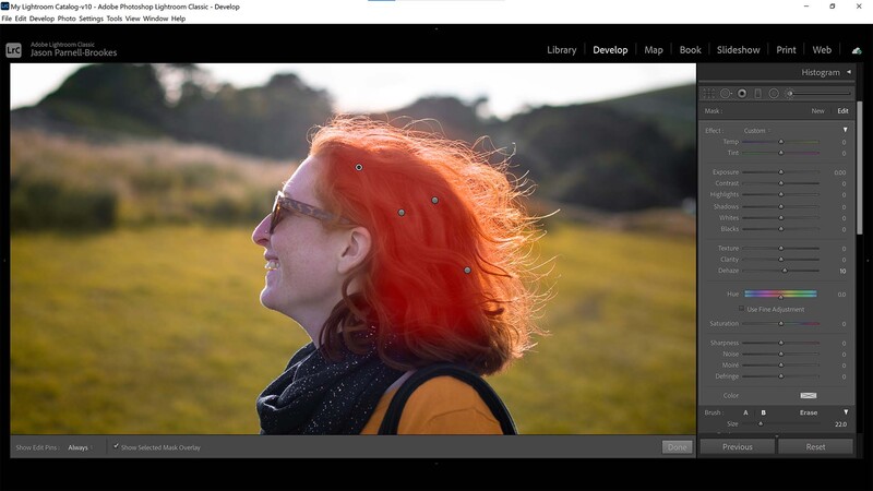
Saturate the Hair
Saturate the hair with the Adjustment Brush to selectively change the colors.
My subject has naturally bright, red hair, which glows a wonderful copper tone in the sun. So, to bring out this fantastic color, I'm going to use the Adjustment Brush to paint over her hair and reintroduce the colors I've lost along the way. After being precise with painting over my subject's hair, I pressed O to check where my overlay was. Any areas where I'd accidentally run over the face (such as around the ear), I zoomed in with Ctrl and + (Cmd and + on a Mac) and held down Alt while painting away the affected areas. I then increased the Temp slider to 25 to enhance the warm tones, then boosted Saturation to 34. I also dropped the Blacks slider to -10 for a few darker tones in the shadows.
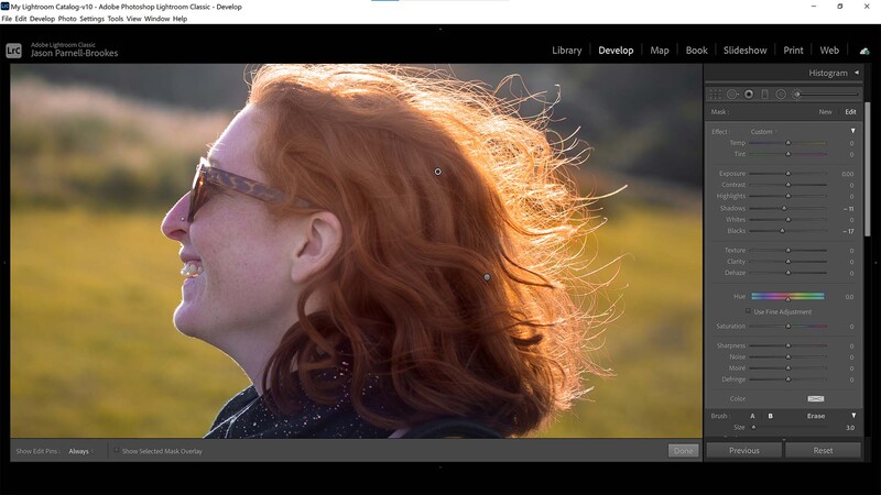
Dodge and Burn
I'm not strictly dodging and burning here, but rather enhancing the shadows and highlights in the hair to increase definition.
It's not strictly dodging and burning, but I'm going for the same effect. Using the Adjustment Brush again, I want to make my subject's hair stand out a little more, because the photo doesn't do it justice. So, I've used two brushes to paint in dark patches to the shadows in the folds of hair by decreasing the Shadows slider to -11 and the Blacks to -17. I then added a second brush to the brighter highlights on the hair and boosted the Whites slider to +21.
Dehaze the Subject
I improved contrast over the hair by using an Adjustment Brush to run a layer of Dehaze across.
One last time, I edited the hair with an Adjustment Brush. This time, I painted all over the hair and used a little Dehaze at +10 to help improve the contrast of the hair and avoid it being so washed out due to the backlighting.
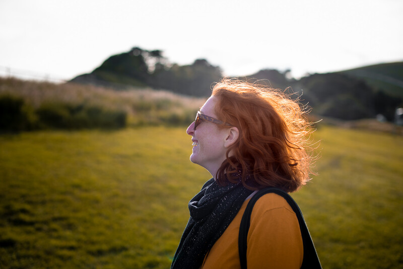
Summary
In order to create this portrait, I've restricted the color palette by altering the hues of the greens to make them more yellow, which matches my subject's jumper. I then desaturated the blues until they were a dull gray. I boosted the rest of the colors back up by using the Vibrance slider to avoid color clipping and enhance the weaker colors in the photograph. After that, I used a series of basic exposure adjustments and selective changes with the Radial Filter and the Adjustment Brush to increase contrast across both the entire frame and selectively on my subject in the center. I then polished the photo by giving the hair more detail and impact so as to match the real-life look of her hair.
Awesome, a great explanation of how one could go about editing a photo in post-processing!
Even if I don't do portrait a lot, this still contains a lot of useful information for me that can help me to get better in post processing.


1 Comment
Awesome, a great explanation of how one could go about editing a photo in post-processing!
Even if I don't do portrait a lot, this still contains a lot of useful information for me that can help me to get better in post processing.