
You probably know that getting your uploads to look sharp on screen, in print and on social media goes beyond resizing. Now, resizing is incredibly important in order to retain the optimum quality for sites such as Facebook, but there is an element far deeper than that and it is not often discussed. This is the secret to getting your images looking “sharper” no matter the medium. Specifically when talking about sizing images for Facebook, Trevor Dayley has a great tutorial you can read. What I want to delve into goes into a different direction though, and the techniques can be used no matter where you intend the images to be shown.
I have heard before that my images, once uploaded, look sharp because I shoot with a Nikon D800 (images can be found on my FB Page). But it’s important to note that resolution hardly plays a role in the “sharpness” of an image when it is posted onto Facebook. With a D800 the resolution is incomparable, but what that means is that it’s possible to zoom further into the file before seeing pixels, not that the image is sharper.
You see, you need to realize that the term “sharpness” has to be understood as an illusion. A person’s eye naturally detects edges to register sharpness, and shadows and highlights in order to record the depth in a subject. In laymen’s terms, what makes something sharp is when there is a light pixel next to a dark pixel and very little grey pixels in between. When using any method of sharpening in post process, in essence all that is being done is taking these edges (the dark pixels and the light pixels) and adding contrast to it. If you were to zoom into a photo at the pixel level and use a sharpening tool, the edges will display signs of higher levels of contrast.
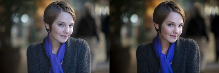
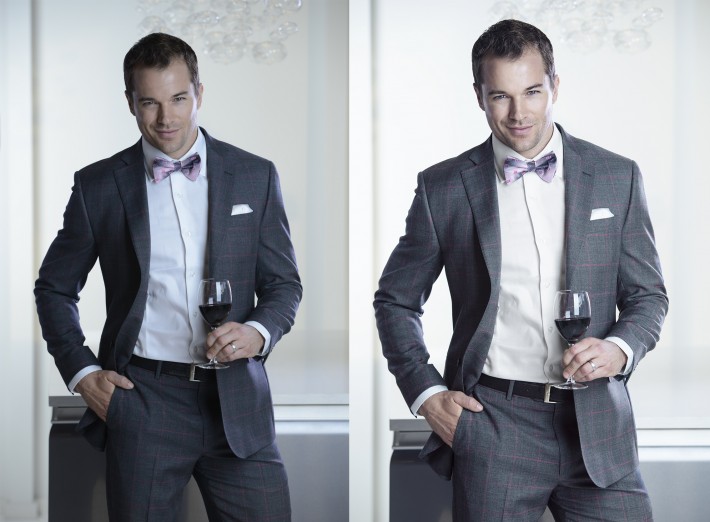
Here is a before/after example:
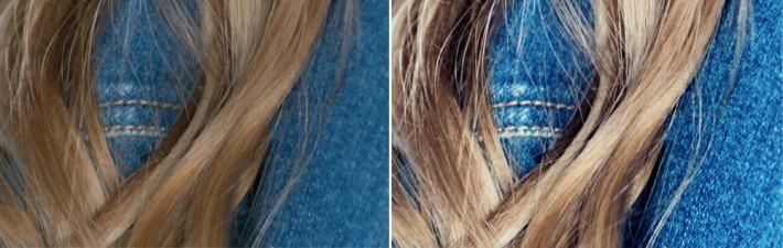
Once the concept and literal meaning of “sharpness” is understood, it can be applied on a much larger scale. Contrast is key in creating images that "pop." Dark colors need to become darker, light colors need to be lighter and highlights and shadows must be present. The main role of contrast is to give dimension and depth to a photo. And it is these elements that make a photo "pop" and appear sharper. This concept not only applies to portraits, but also to many forms of photography such as, products and landscapes.

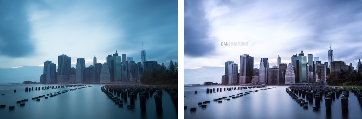
I manually dodged and burned the sides of each building. Notice the depth and sharpness in the "after" image.
Study the images of other photographers. You will find that the sharper photos are the ones that have beautiful contrast and depth. In the case of skin, if shadows and highlights are not present, the skin will look flat and that is what the eye understands to be “not sharp.”
Achieving this method of sharpening is more complex than adjusting the contrast slider in Photoshop. Again, it is important to place dark edges next to light edges. It is important to stay conscious of this when shooting. An example, if using a dark backdrop and the subject has dark hair, add a hair light to add separation. Personally, I am a natural light photographer who has a penchant for bokeh. Therefore, I always try to place my subject in accordance to the darkness or lightness of their clothing or hair color. When lighting my subject's face, it is key for me to have soft shadows in the correct spots, such as the sides of the nose, under the jaw, sides of the forehead and the like. When post processing, accentuating the shadows and highlights through dodging and burning everything from the skin, to the iris of the eye and even the bokeh will undoubtedly give the image a sharper illusion.

It is also important to consider depth of field (DOF) when trying to make an image “pop.” A shallower DOF will result in a popping subject because there is a greater contrast or point of separation between the subject and background.

Between adding contrast selectively during your editing workflow and applying the appropriate output techniques, your images will look great and stand out in social media, on your website and in print.


Join the Fstoppers community for free
-
Post comments and join in the discussions
-
Browse the site ad-free
-
Share your work and get featured in the community
-
Compete in the photo contests for fun and prizes
36 Comments
thanks for the tips.
Well done Dani...lots of great info here.
thanks!
Well written. Thanks Dani
Interesting, thanks!
Great article!! =) I'm sure it will help many! =)
awesome tips. Thanks, Dani.
i would love to see a video of him working an image, great article
Yay, I was hoping you would do an article since they posted that video of you doing headshots of photographers. Great stuff.
Thanks Christopher, glad you enjoyed.
Great write up. I hadn't really ever considered contrast as a "sharpening agent" so to speak.
I do have one honest question though. If this is true, that darker darks and lighter lights - within a certain range of course - make for a photo that pops, then why is the matte (AKA the flat/faded black) look so popular? I'm not trying to be snarky. I'm actually curious, because it seems to go against this notion that contrast is a good thing.
David, photography is a prime example that a person shouldn't generalize. There are many genres in photography and one cannot apply one rule across the board. The tips I'm giving here obviously won't apply ALL the time. it's just something to keep in mind that can be useful.
In some cases the faded look can actually help with the perceived sharpness. So long as it's not overdone.
Often times when you add contrast or sharpen it's possible to crush the blacks too much and you start to loose detail in the blacks. Lifting your blacks a bit can allow you to preserve some of those details down in the shadows.
It also, to my eye at least, has a slightly more pleasing and natural look. When was the last time you actually saw pure black shadows in real life?
Oh I know that crushed blacks aren't really what is seen in the real world, otherwise there wouldn't be such a race between companies to make sensors with 15 stops of DR.
But what I was meaning when referring to the matte images was that it seems that a lot of the time, the photographer will actually crush some of the blacks in the image (or get pretty darn close to crushing them), and then they'll add the fade.
So it's like....contrasty, but not contrasty. I see it a lot with black and whites, especially those of weddings. I was just curious, but like with the first image, there's a lot of contrast, but the shadows also have that kind of soft/muted look and it works.
Maybe it's just because I can't ever do it 'right.' Ha.
Sounds like your describing done in levels/curves. Darken the blacks and then bring the blacks out entirely by lightening them. In the levels graph, this would mean bring the black slider towards the white to increase contrast, then raise the black level up on the graph so it's a dark dark grey and not black. I think that's what you're referring to?
Contrast needs to be controlled locally when used like this, or you'll lose too much overall detail, like the woman's face with the striped shirt or man's shirt holding the wine. Otherwise certainly a useful tool.
I'd love to see an example or short article on the selective dodging and burning to achieve these results!
The first thing I thought of!!! Yes this! X20
These are the types of articles many want!
Im sorry but there plenty of websites with photoshop and lightroom tutorials. Fstoppers is one the few sites aimed at professionals (kinda), i dont think these articles belong here.
Very true a valid point. I meant more with the goal of achieving this sharpness though rather then just a certain overall exposure/tone.
I find using a high pass filter (set really low so you just make out the edges) on a duplicate layer, then set it to overlay and then tweek the transparency makes a pretty good difference too.
Exactly what I do.
really?.. is this a side for noobs?.. that stuff is so old it grew a beard....
Great article with really good examples.
Could you do a retouch tutorial? Would love to see how you retouch your images!
Other than practice, practice and patience. The article should give a more in depth of composition and post production to actually gain the desired out come. Looking at a few before and after shots only gives you the here you have and here is what you want, with no direction on how to achieve it.
I am sure this article is of great help to the pros or those who think they are pros. I do believe the industry is trying to make digital photography more difficult than it really is.
Can you recommend a tutorial on selective dodging and burning to get this sort of sharpness?
I love it !!!! Thank you I will be more aware about that! ... Thanks again
Brilliant. I've been reading a textbook on image making and the author of that book is saying the exact same thing but in a much more theoretical manner. I like Dani's explanation because he gives concrete examples. Art, like life, is all about contrast.
What an awesome photographer! :)
Dani, incredible photos! What lenses do you use for tight portraits like these? I can see the DOF is really shallow!
Nicely done @danidiamond:disqus
Thanks for the tips, will be sure to pay attention to this during shooting and PP.
Thanks for the tips!
Really nice!!! Now I have to practice alot.