There have been many books written on the subject of face anatomy and how it impacts not only our perception of someone but our reaction to them as well. There are features we deem as authoritative, feminine, funny, somber, and so on. With over 7 billion people in the world we've got quite a few unique faces out there, and yet, certain features and proportions are universally and subconsciously interpreted as "appealing". As you can imagine, face anatomy is a crucial part of commercial photography, especially when marketing anything in the beauty industry.
In this article, I want to explore with you what some experts deem to be the "perfect" face anatomy, and how we can take a regular face that doesn't exactly conform to this standard and turn it into one that does using Photoshop's liquify tool. The image I have chosen to work with here is from a recent shoot. It is a 100% crop from a much larger image and it was just a lighting test, so the quality ain't the greatest. But because this image would have been discarded, it serves our purpose quite well. Also, keep in mind, that while I did do some minor skin correction and color adjustments, this is far from a retouched photo. I only hope to show you the direction this photo could take.
So What Is The Perfect Face Anatomy?
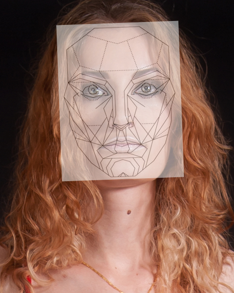
Well according to many experts, this is it:

After many years of research and studies, some facial experts have determined this mask to represent what our brains deem as "beautiful". Everything from the proportion of the lips to the distance between the eyes has been precisely calculated. Makes it seem a little cold and robotic doesn't it? However, our brains really do like order and proportions, so it would make complete sense that a face anatomy which conforms to our ideas of order and good proportions would be deemed as "beautiful".
I won't get into all the nitty gritty here, because I want to keep this article somewhat concise, but if you follow the link I provide here you can read all about how this face anatomy was determined to be the "one". Keep your eye out for the very interesting tidbits about the golden ratio's in face structure, which as some of you may know, also apply to photography in general: http://www.beautyanalysis.com/index2_mba.htm
So What Can We Do With This Mask?
The face anatomy mask provided here can serve as a guideline to help you visualize the changes you need to make with the liquify tool in order to achieve a pleasing result. Many people will simply go ahead and slim the face without any regard for proportion. This can easily lead to unrealistic results that don't make the face any more pleasing then before we started. With this mask we can begin to understand face anatomy and make focused changes that will actually benefit our images.
Let's get started! This is the original image we will be working with.

As you can see, our model has striking features, but how do they stack up to the "perfect" face anatomy?

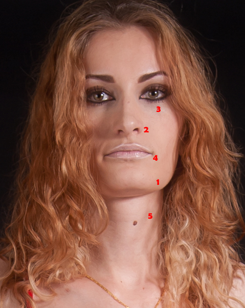
Not too bad actually, but there is clearly room for improvement. Let's break it down, point by point, on the areas of focus.

1. The Chin And Jaw
This is where we see the biggest difference between our model and the face anatomy mask. Our model has a very wide jaw giving her a rectangular face. This face shape is good for portraying a strong and dominant personality but it can also be interpreted as mean and angry. By softening the jaw and bringing it in line with the face anatomy mask we instantly get a more feminine and friendly face. This is something that is extremely important in commercial photography because we want the face to be inviting and warm.
While we are changing the shape of the jaw, we also want to minimize the chin ever so slightly. Not too much, or it will be pointy, but as we soften this models wide jaw, we don't want the chin to become overbearing. The face anatomy mask has a good guideline with rings around the chin area to give you a sense of perspective and how gradual the slope should be. This is something you could further emphasize with dodging and burning to create the right protrusion of the chin and jaw area.
2. The Nose
The nose should be kept as symmetrical as possible. You want to focus on slimming the bridge of the nose and straightening any curvature it may have. In our example here, the right side of the nose is ever so slightly higher then the left. The bridge is a little wide, and it curves slightly towards the right. The length of the nose however is right on point, so we do not need to make any changes there.
3. The Eyes, Brows, And Cheek Bones
Our model happens to have a great pair of eyes. They needed very minor adjustments. They are perfectly spaced and the exact shape and size they need to be. We needed to make small adjustments to the eyelids, because the eye on the left has an eyelid that slightly droops at an angle steeper then the right eye. Again, we want to keep the eyes fairly symmetrical, so any glaring differences should be corrected.
The brows were left untouched because they slope at an angle that is just about perfect and they are also quite well placed. Things to correct here would be brows that slope too much (forwards or backwards), brows that are too small or too large, and brows that are too far apart or too close together.
The cheek bone placement for our example is perfect. You will notice, it is the line that protrudes and stops half way across the cheek, just under the eyes. That denotes where the cheek bone should begin to raise. On a very wide or very narrow face this may need some minor adjustment.
4. The Lips
The lips are such a crucial part of face anatomy. They convey so much emotion. In our example, the lips appear a little wide, but more importantly they are down turned. This makes it appear as if our model is a bit sad. In order to correct this, we adjust the lip length and pulled their placement just a little lower to fit the face anatomy mask. We then straightened the lips and upturned the edges ever so slightly to get away from the sad expression our model was conveying.
5. The Neck
The neck is a big focus area. We want to elongate and slim the neck. While this is not part of the mask anymore a slim and elongated neck is classier and more elegant then a short and wide neck. It also puts more emphasis on the face because the neck doesn't take up as much real estate in the image. In our example we had to slim the neck and we were able to elongate it by eliminating some of the excess under chin that we could see.
The Result
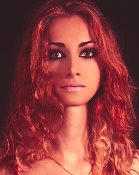
After making all those changes, and a few skin corrections that were bugging me, this is the result we have achieved.

Not bad for a quick example. Sure further improvements could be made if one really had the time, but you can clearly see here that the liquify tool in Photoshop is extremely powerful when used properly and not excessively.
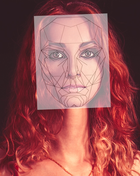
Let's take one last look at how the new image stacks up to the face anatomy mask.

There you have it! I hope this little tutorial gives you all an idea of where to focus your liquifying corrections and the proportions we are supposed to aim for. Now that you've read all this, it is important I tell you that this is NOT the only way to do things. Unique facial features are beautiful and while this face mask has the potential to expose our primal instinct of what is beautiful, it also has the potential to turn things bland. Use your own judgement, because as the photographer, we see the world you choose to show us!
Hope this helps. Feel free to visit me anytime at Peter House - Commercial Photographer to follow our work. Till next time.
If you'd like to take your photo editing to a new level, make sure to check out the variety of Photoshop tutorials and plugins that will speed up your workflow and help you create stunning, professional work. Save 15% by using "ARTICLE" at checkout.


Great advice. However, in before the argument starts on this one...
I think the key here is subtlety. Certainly, the model wants to look like her, so its important that you maintain that aspect of her face, while improving it slightly. There is absolutely a science behind physical beauty, and if you're a fashion/beauty photographer, you look for that in your subjects. As shallow as it is, you need to use that science to your advantage and if that means altering things a little in photoshop, so be it.
Thank you Zach. Yes, I hope folks do realize this is all in moderation. This example is on the drastic side, more so meant as a guideline to proportions, but also a thought experiment on what we deem as "appealing".
As much as we strive for perfection in advertising, we need to keep our models recognizable for future clients!
:) I aint no pro.
But maybe if ya get time, show the NON drastic "AFTER" look?
it should shut the nay sayers up. and show whatcha really mean.
This is not subtle at all! It looks like another person.
What he meant by subtle was that if you had only seen the finished image and never seen the before picture you would have never guessed that her face had been altered. Subtle=Natural
Great explanation. Thanks!
The only thing bugging me is her unnatural long neck. For the rest if the model likes these changes why not do them?
You are absolutely right, thanks for the explanation! :)
I understand what is being said here, I haven't missed the point. But still... would it not be better to simply shoot the model from an angle that enhances her features? She is not unattractive by any means, but the base photo is taken from an angle that does not do her strong jaw any favours. Even if manipulation still come into play, such drastic measures wouldn't need to be taken... If you MUST have that angle... Why not hire a different model?
Oh, and in raising the chin, you've made her neck look a little too long..
You are completely correct. The main reason I chose this particular image to work with was because it was shot at an unflattering angle. For the purpose of contrast it was easier to use something that would offer a more drastic difference. In a real scenario we would of course do everything to minimize post. Thanks for the input!
Fair enough man! Interesting article.
As a working beauty and fashion photographer and a professional retoucher, I just couldn't ignore this comment.
Here's a list of things anti-retouching and pro natural-beauty people say:
1. Why not shoot at a better angle,
2. She is already beautiful why change anything
3. Why not hire another model
And here's a list of real-world scenarios that commercial photographers deal with on a daily/weekly basis:
1. The client (a company) hires the models and you have to make them pretty. You often don't have a say in this and those models are often not Cindy Crawford. How you deal with that may affect whether or not this client will hire you again.
2. Your models are not sitting or standing still, they are not statues, so they move as you shoot. And often an image your client selects to retouch was not "shot at a better angle". How you deal with that may affect whether or not this client will hire you again.
3. You just never know to what degree your private client may ask you to "enhance" her photos. I work with female clients 99,9% of the time, trust me when I tell you that most women do want to look beautiful, and they don't care how subtle (or not) retouching makes them that. And, of course, how you deal with that may affect whether or not this client will hire you again.
Bottom line - photographers who are educated on the things that Peter describes in his article, who also are highly skilled in retouching to make heavy retouching look like it wasn't touched at all, win every time.
What a great reply Julia, thanks for posting! This is exactly it. The more you educate yourself, and open yourself up to various concepts, the more tools you will have at your disposal when creating images. Commercial photography is a very competitive field and a commercial shoot has so many variables that understanding complex concepts and studying subjects that go beyond regular photography is often required.
As a professional, you know very well the demands of clients!
I am 1000% with you on this, Peter!
I will take the liberty of guessing, most of people who comment and criticize anything retouching, are actually not commercial photographers and don't know what it's all about working with demanding and well-paying clients.
wow i cant believe how many people are getting butt hurt over this article. I appreciate it for the fact that it shows how much you can use liquify to manipulate an image if you NEED to. And as far as commercial photography, your absolutely correct, they are the highest paying clients and what they say goes, regardless if you like it or not. If you want to get paid and hired again you give them what they want. If your all about "natural" beauty then start a photography business in that and tell us how well that works out for you.
It's unnatural. Get a model that complies with these silly 'demands' and don't play Dr.Frankenstein with your tools. It insulting to the model. And it looks horrible too...
What a letdown. This crap literally defaces the models face insofar has it has gone from natural with distinct features to the ubiquitous supernatural non-human beauty face, featured on every skin care product. Pathetic. That is no progress.
Thanks for the comment. I'm sure you must have heard about the handful of retailers who are pushing against this sort of editing. Some are going so far as to disallow retouching beyond color correction and sharpening. There is certainly a reason why this level of retouching is used, but its very refreshing to see a higher level of realism in advertising.
The main issue with PS is the fact that there is a strong tendency to completely overdue all sorts of modifications. Like there STILL (!) is a wrenching and excruciating trend towards super skinny ailing models just to fulfill some sick fashion designers dreams.
It's all too much because of saturated senses craving for an ever increasing dose of whatever.
"skinny ailing models just to fulfill some sick fashion designers dreams" - fashion designers are not sick for selecting skinny models, a lot of garments look better on skinny models. And fashion designers, like any artists, want to present their work in the best possible light.
Have you ever created a garment of your own and showed to thousands of people at a fashion show, so you can judge them?
Even among today's "plus size" models there are still VERY strict guidelines to be met. The fact is, as you pointed out Julia, clients want to display their work in the best light. If a garment hangs better on a skinny model, that is what they will demand. If a cream is meant to fight aging, they want beautiful skin and perfect pores. It's just the nature of the industry.
Hopefully, when human cloning begins, we won't need to spend so much time on Photoshop...
I know this is just a "how to", but damn she looks like a plastic barbie doll now. Creepy.
You succeeded in making the model look more like a robot, and less like a human being. Was that the plan? If so, mission success.
Starting with an image not shot at chin level would help ALOT.
Well, the face anatomy mask can be used as a general rule, one of it I mean.
Different races has different perfect anatomy mask, or more that one I presumed.
Why don't you ask the woman in the picture to chin down a bit?
Will make her chin smaller...
The image was chosen in part because of the poor angle. It would serve to exaggerate the contrast between the initial image and the final product. In a real situation, this would not be the image we would choose, and the face would be shot more "chin down". Makes a good image for a case study though.
Also, if you read through the link I provided about the mask, they actually suggest that these features are universally "appealing" going beyond race. Interesting study.
Cheers!
Are edits this drastic fairly common in the industry? I don't know much about it but it sounds like a good portion of dramatic adjustments are directed by what the client asks the retoucher to do.
It's impressing how much you can change a face to a "perfect" face but I'm also curious if a model would look at this picture and still identify themselves with it? It's like looking in a warped mirror, you get the idea of what you look like but it's an interpretation of reality.
incendiary, yes they are. Not always to such a drastic extent, but some clients can have very strict guidelines, especially in the beauty industry. They are in the business of selling perfection after all. As a photographer I try to get it as close to perfect in camera, but real life is never "perfect".
Perfect example, when britney spears came out with her perfume, the manufacturer told her she was too fat, her body wasnt what it was a few years ago. So they took her head and paste it on a model with a great body and that was the photo that ended up on the packaging of the perfume. Heres a link of her of a magazine shoot. http://www.breatheheavy.com/exhale/index.php?/topic/396784-article-about...
Cesar, thanks for posting that. You know what else is interesting? Take a look what happens when I layer the mask from this article over Britney's new face. These proportions are more common then many people think.
Thanks for the post Peter! This has been something I have been thinking about for the past few months and was curios about the science behind it. I think your demonstration does a great job of showing how these dimensions are, in general, more appealing to us as humans. (not sure why everyone is so critical of the skin or other details since it was not the point of your article) It would have been interesting to post both photos on some photo site (flickr, 500px, etc) under two different accounts and see which one gets more likes, pins, hits, whatever.
Also, thanks for the link to the website that speaks more about the research. I originally thought that they must have developed the mask by testing hundreds of people using various images and derived the ideal dimensions. I was surprised to discover that it is all based on golden ratios and mathematical relationships. This explains why there is not a different mask for males and females. (I never thought of applying the golden ratio to a straight line, I can see using this simple concept in my photography as well)
In the end there are many who do not fit this mask that we as humans find attractive, demonstrating that it is just a guide and not a rule, It does, however, help me understand how I can shoot someone to emphasize their "golden ratio" features and hopefully show them their best look.
Thanks again!
Great point, Bryan: "It would have been interesting to post both photos on some photo site (flickr, 500px, etc) under two different accounts and see which one gets more likes, pins, hits, whatever."
Thanks Bryan! What a well written reply. I really appreciate that. I too find the entire subject of golden ratio's very fascinating. I've spent a great deal of time studying it, and it is certainly something I am trying to incorporate in my work.
You had a great idea there about running a little social experiment. You know, I may just try that! Some sort of method to derive quantitative results, although I imagine sales figures for beauty products are proof enough, HAHA.
The "after" doesn't resemble the original person even a little bit. I just don't see this being a particularly useful way to think about retouching.
Would it not be cheaper to just pay an illustrator to draw the subject. Its amazing how digital and flat art have merged to the point they are near indistinguishable. All thats happening here is you have to pay for lighting, model, studio ect, then all the post? You can get an image to fit the clients requirements better when you draw it as well. Now i know this isnt a serious suggestion, but it shows a point
You know, perhaps with CGI, that is where we are headed down the road. As it stands, there are things CGI can not yet do, that we photographers can.
Or just dont fucking shoot up on people with double chins?
Great advice. Good thing we can always pick our clients, and only shoot what we want while still making a living...
Oh, wait...
Why not just use a completely computer generated woman! This obsession with perfection is boring.
This was very helpful indeed. I never knew about that "percetion guideline" mask, something to think about from now on. I still think it's funny that some people don't understand the purpose on this article... Maybe the lack of patience to digest what is being read? Anyway, thanks for writing the article Peter!
EderNovacki you are most welcome! I think a lot of people simply gloss over the images they see every day without realizing the extent of the manipulation that goes into them. It can seem overwhelming when you learn about it, but that is the reality. Just another tool to add in your arsenal :)
Cheers!
Why the red tint?
Just a really quick and crude way to warm up the skin tone a tad bit and further differentiate the two images.
There is also the difference of what the camera sensor captures, and the the human mind can in trying to please the owner, make lies about what we remember we saw compared to what reality is.
ha! am I the only one who immediately pulled this into a program to see how I stack up? guess I'm vain. but at least it was pretty close! :) even with terrible bathroom lights and my hair a mess
Peka Peka, thank you for posting that up! Looks great! I was hoping a few people would be willing to do just that. Don't think I didn't try this on my own face too haha.
No worries! I'm just glad to know I'm not the only one who tried it!
I dug around on the linked site some... Do you know if these are the same people who had the special - I think on Discovery - a while back? I believe they deemed Elizabeth Hurley as the "perfect face" based on the ratios.
Yes there was a TV special featuring this study, but I can't recall if it was the same one. It may very well have been :)