
Feeling stagnant in your editing recently and looking for some fresh ideas? While you might not use all of these tips, they should help reinvigorate your editing flow and get you thinking outside of the box for tools you might be familiar with or completely new to.
Every photographer goes through periods where their editing feels stale and uninspired. There are only so many tools you can learn in a program such as Lightroom, but sometimes, we can find new uses for these tools with a little creative thinking. Personally, I've been trying to approach photos in different ways to try and freshen up my editing so it doesn't feel as if I'm doing the same thing to every photo. The tough part for all skill levels in photography is knowing what you want to do to a photo once you get it into your editing suite. The more tools you have and the more hours you put into editing, the easier it should become, but you'll always encounter images that might stump you.
Whether you're an experienced photographer that has been editing for years or brand new to Lightroom, there should be something in here for everyone. Some of these tips might use techniques you've never done before, and I'll be sure to link to more in-depth guides for each of those.
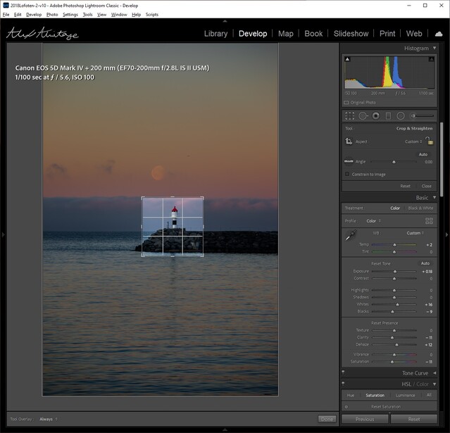
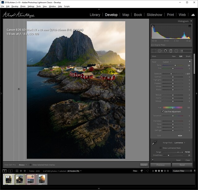
1. Cropping for the Histogram
This is a very simple technique that just requires you to know how to use a histogram. If you're still new and want a little more information, you can find a ton of content out there, but this video should cover anything you need to know.
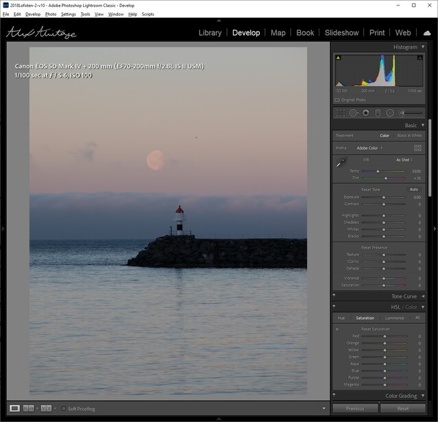
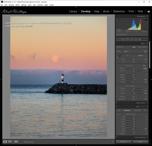
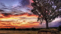
Above is the final edited image compared to the original image. One of the challenges in editing this particular image was trying to highlight the small lighthouse without making it look unnatural and to balance all the other tones throughout the image. If interested, I live-streamed this entire edit, but it is a lengthy video, so you might want to skip around a bit.
I use this trick in many of my edits that have the main subject to get a better idea of how I've controlled the light on my subject. Histograms are wonderful for keeping our eyes honest about what we are seeing, especially after a long edit. This tip can be fantastic for high-contrast scenes where your main focal point might be an object, a face, or anything that you want your viewer to focus on.
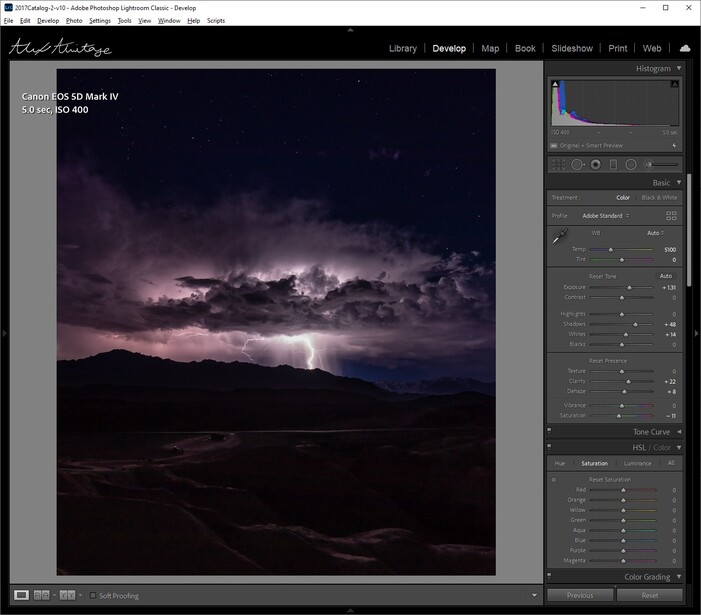
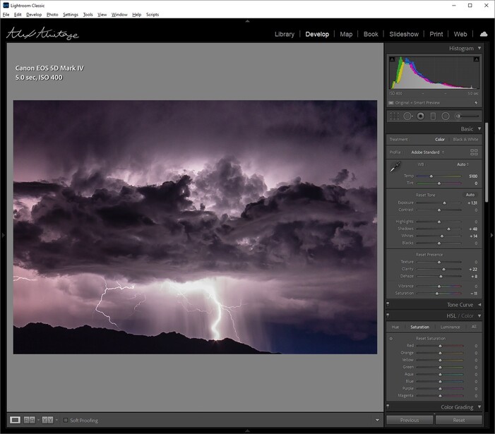
This example highlights the concept really well considering the majority of the image is completely dark; thus, most of the histogram just tells us what we already know without helping us very much. The important part of the image is where the lightning is, and by cropping into that area, we get a much better idea of our levels for our focus in the image.
2. Using a Graduated Filter for Precise Tone Control
If you've ever used luminosity masks in Photoshop, this part will make perfect sense to you, but I know many people out there don't edit their photos out of Lightroom or simply don't have the time for many edits, so this might be a great solution. We'll be using a graduated filter for this section, but not really using it for what it's intended use is; instead, we just want to use its luminance range mask to manipulate our entire photo for more precise tone control. If you're unfamiliar with range masks, check out my tutorial on the subject, and it should catch you up to speed.
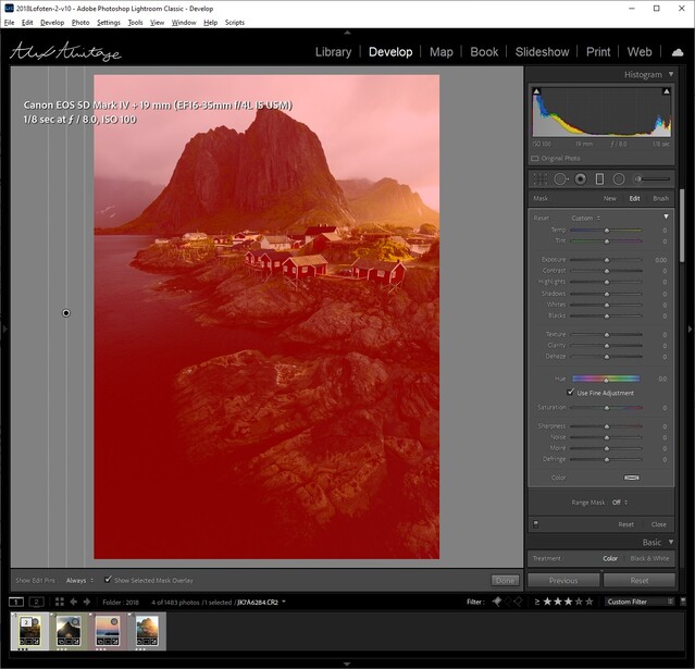
The basic controls in Lightroom allow us to manipulate whites, highlights, shadows, and blacks. What if we want to get more precise with our adjustments? We can do this by applying a graduated filter on the entire image, again not actually using the tool for its intended purpose, but unlocking our ability to apply range masks to the entire image. You can do this by simply applying the filter off-screen and making sure it's affecting the entire image.
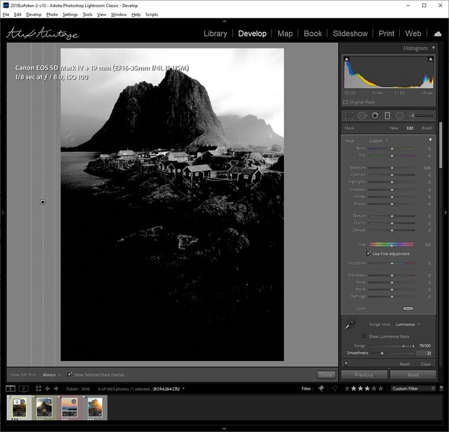
Next, we'll use the luminance range masks to select the exact areas of the image we want to edit. By holding alt (option on mac) while dragging the two control sliders in the range mask selection, we visually see everything in white will be affected and anything in black will be untouched. Thus, in this above mask, my goal is to target the whites and some highlights in the image.
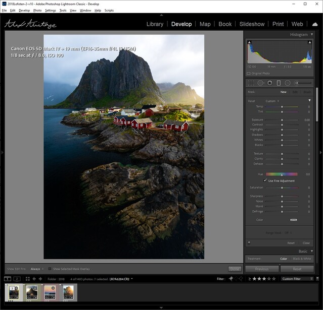
Now, with that luminance selected, I can bring down the exposure of only those values while also giving me the ability to change the color temperature of just the brightest parts of the image. You might be asking why I simply just didn't bring down the highlights or whites in my main image, and while I could do that, this gives way more control over the tones in my image, somewhat replicating the more advanced luminosity masks in Photoshop. This also allowed me to warm up the light in the image to give a contrast of cool and warm in the final edit.
The options for this are endless; you can add multiple of these graduated filters to your whole image and edit different luminance values individually, giving you more control over your edit.
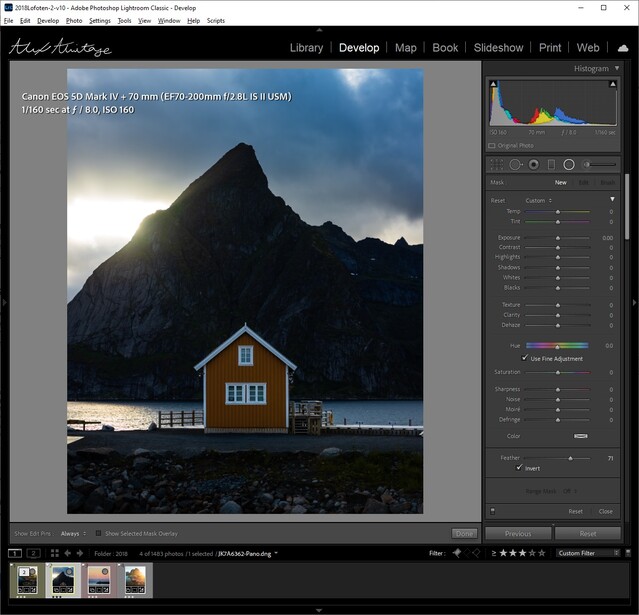
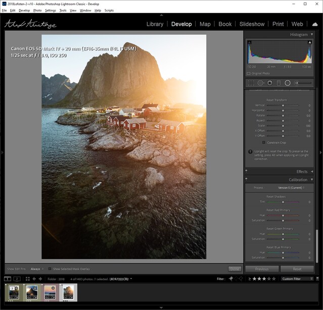
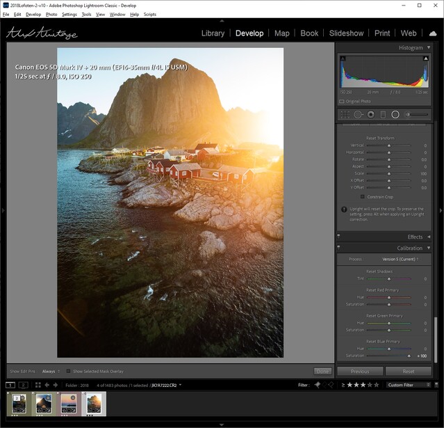
3. Radial Color
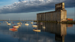
Next up, we'll be adding a bit of color to our image using a radial filter. If you're unfamiliar with using radial filters as sources of light, this short video should help you out. Basically, in this image, I've gone ahead and darkened the entire image to then brighten up parts of it using a radial filter that imitates what the natural light from the sun would do. However, this time, we'll be adding a bit of color to our light.
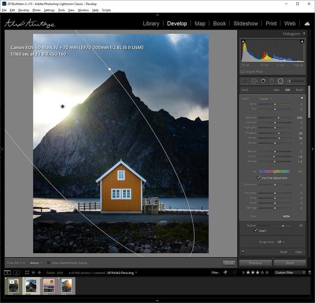
Above, you'll see the before and after of our image using a radial filter to cast light into our image. Notice the image is a little bluer than it should be, which is on purpose to prepare for the next part. Once you've balanced the overall darkness of the image with your light source, you can add some color into your filter.
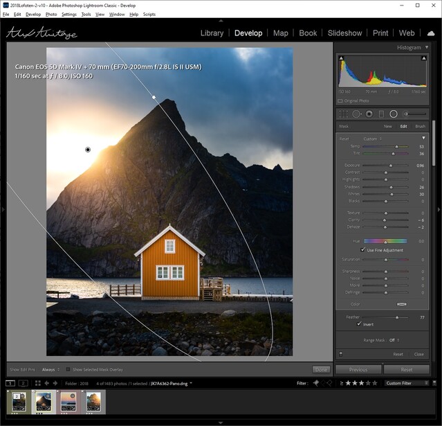
All I've done here is increase the temperature by 53 and tint by 36 on our light source. This will be something you'll have to balance within your own photo. Remember, I purposely left my image a bit blue/cool before manipulating our light source and adding some life back into the image.
4. White Balance for Black and White
I don't export in black and white very often, but realizing that white balance can make or break a black and white image was eye-opening for me. Why does white balance matter at all once I've converted my image? Sometimes, it doesn't, but many times, it gives us another dimension to manipulate the contrast within an image. Let's take a look.
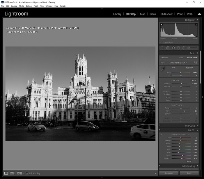
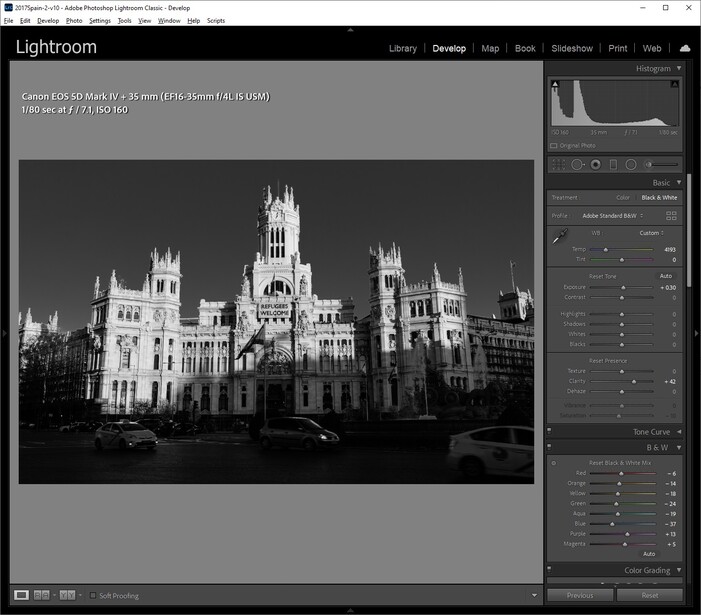
The left image is using a warm white balance, which was closer to accurate for the color version of the image; however, when converted to black and white, it's not quite what I wanted. By just decreasing the temperature to be cooler, it has completely changed the contrast in the image. This happens because you're shifting the entire image to be bluer, while the brightest areas tend to be warmer from the sun. I highly recommend trying this out in your conversions, because it's not intuitive that white balance does anything in an image void of color!
5. Magic with Blue Saturation
This is the easiest and most straightforward tip in here. I wrote an entire article on it here if you want a better and more in-depth explanation; however, it's very easy to do.
All you have to do is scroll down to the calibration panel and bump your blue saturation slider to 100. This will depend on the camera you're using; for example, I can't use 100 on my DJI Mavic 2 Pro, so your mileage may vary. It's that simple, though; you may have to decrease your blue saturation in the HSL panel. It should add a little magic to your image with very minimal effort.
Conclusion
I hope at least one of these tips was new to you and at the very least get you thinking outside the box with editing. Sometimes, just learning a new technique can inspire us to look at an old photo differently. Even seasoned veterans get stagnant in their editing and many times feel uninspired by their own work after long enough periods. No matter where you are on your journey, there's always room to learn and improve. As a matter of fact, the tip here about radial color was suggested by a viewer of my livestream, so shout out to him!
As always, thanks for reading, and feel free to share some of your edits or comments down below!
Join the Fstoppers community for free
-
Post comments and join in the discussions
-
Browse the site ad-free
-
Share your work and get featured in the community
-
Compete in the photo contests for fun and prizes
3 Comments
#4 is very interesting and I hadn't thought of it. I just did a quick bit of experimenting in Capture One Pro (all of these work there too of course) I'll have to tinker more on a real conversion but it has me thinking for sure. It is somewhat akin to adjusting a and b channels in Lab mode when you think about it.
I end up desaturating blue in more photos than I saturate it because to my eyes a hyper-saturated blue sky is just too much but to each his or her own.
Yeah I think it's a little like adding a warming or cooling filter when you were shooting on black and white film? Don't quote me on that though considering I've never shot film myself haha, just imagine it's doing similar stuff.
I actually like # 4 also...did change the entire photo...looks good!