
There's a tool in Lightroom you have likely never touched or maybe just don't understand its purpose. The calibration panel is something I use in nearly every single photo I edit; let me show you why.
Last week I went over Lightroom's new color grading module and the week before that I took an in-depth look at using tone curves for more than just contrast. This time around we are going to be using a panel many of you have likely never touched, "Calibration". If you're like me a few years ago you simply just never touched the setting because of its name. Why would I need to calibrate the image out of my camera? And if I did need to, how do I even do that?
Well, the truth is I’ve never used it to actually calibrate the color coming from my camera using a color chart or anything of that nature but I continually use it to add a bit of magic to my images. It's hard to describe in words what it does to your images so I'm going to use three different examples in this article and even more in the video above to show just how versatile it can be. With that said, let's get started!
The Standard
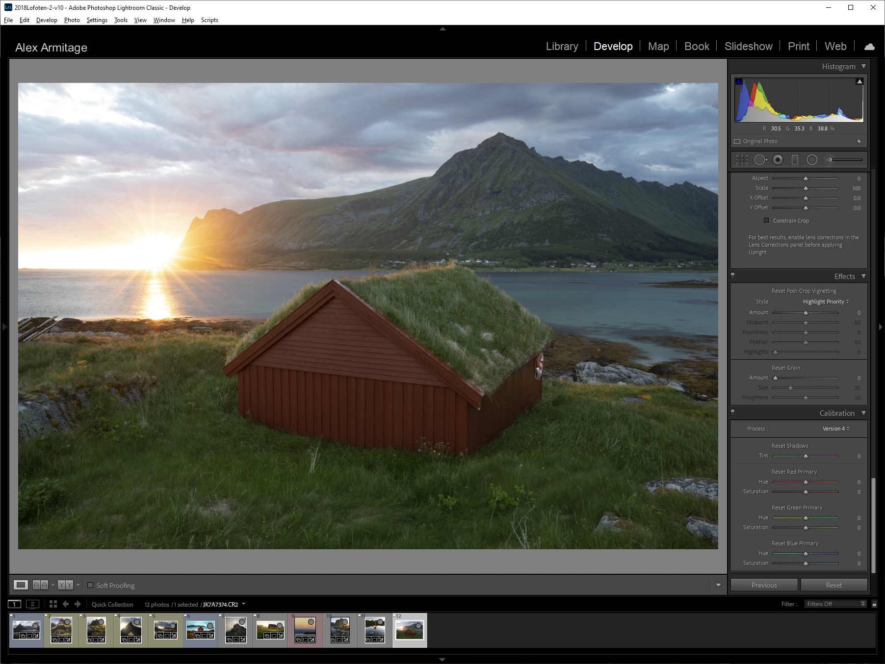
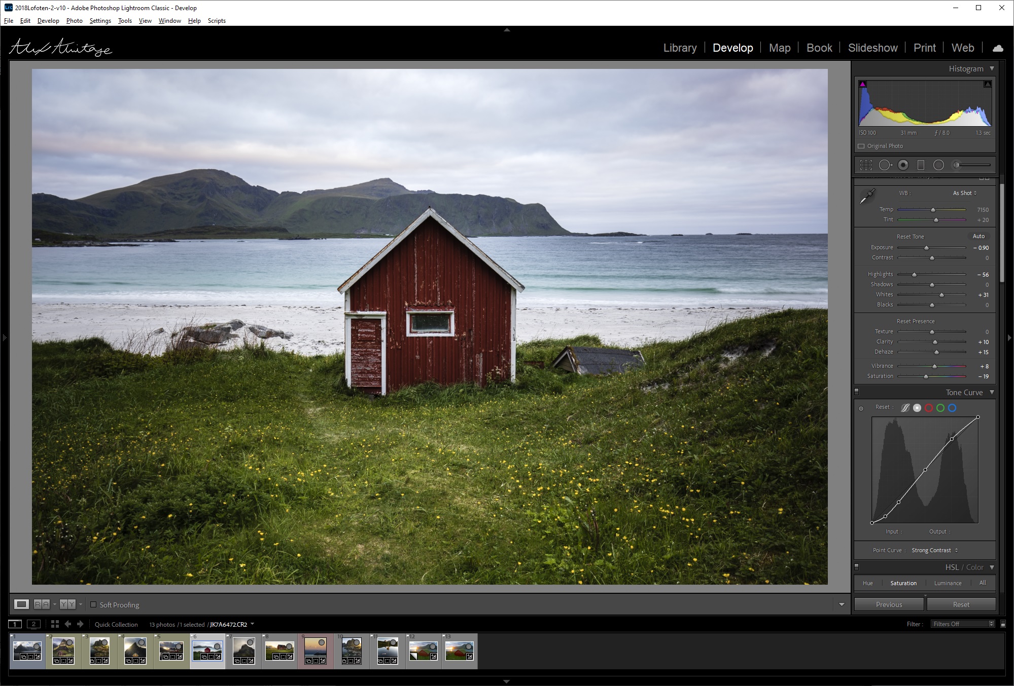
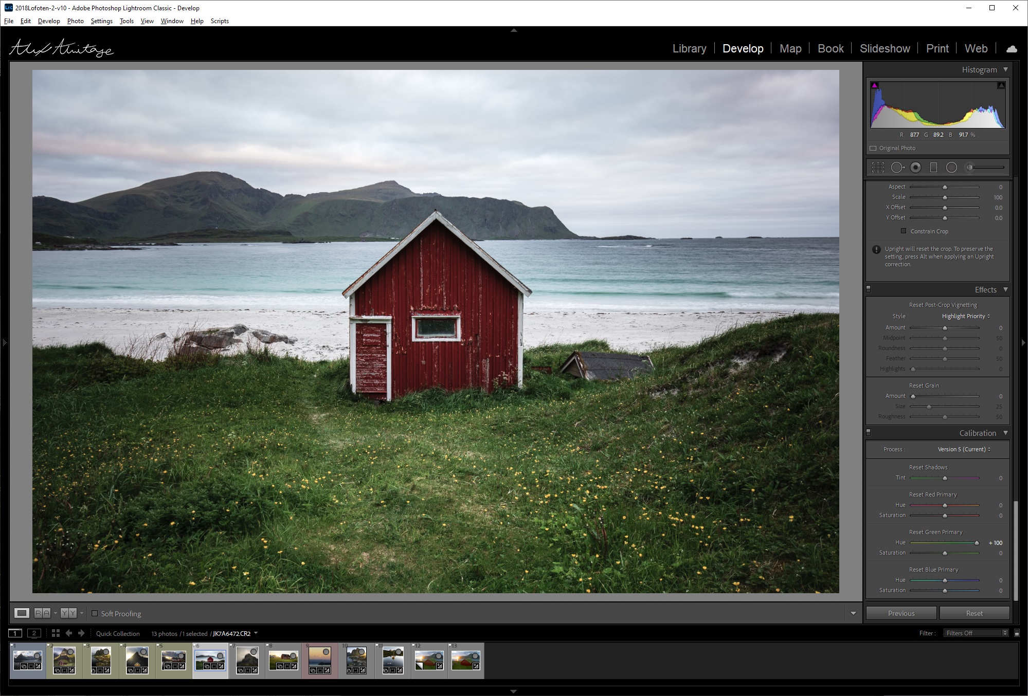
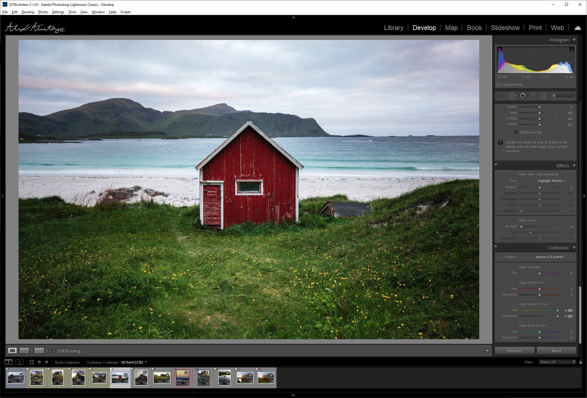
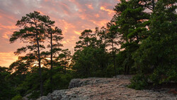
I'm going to start by using a blank canvas: a photo I have not touched and I will go through how I use this tool 95% of the time. One of the first things ill do when I edit an image is set its white balance and then scroll all the way to the bottom to adjust my calibration.
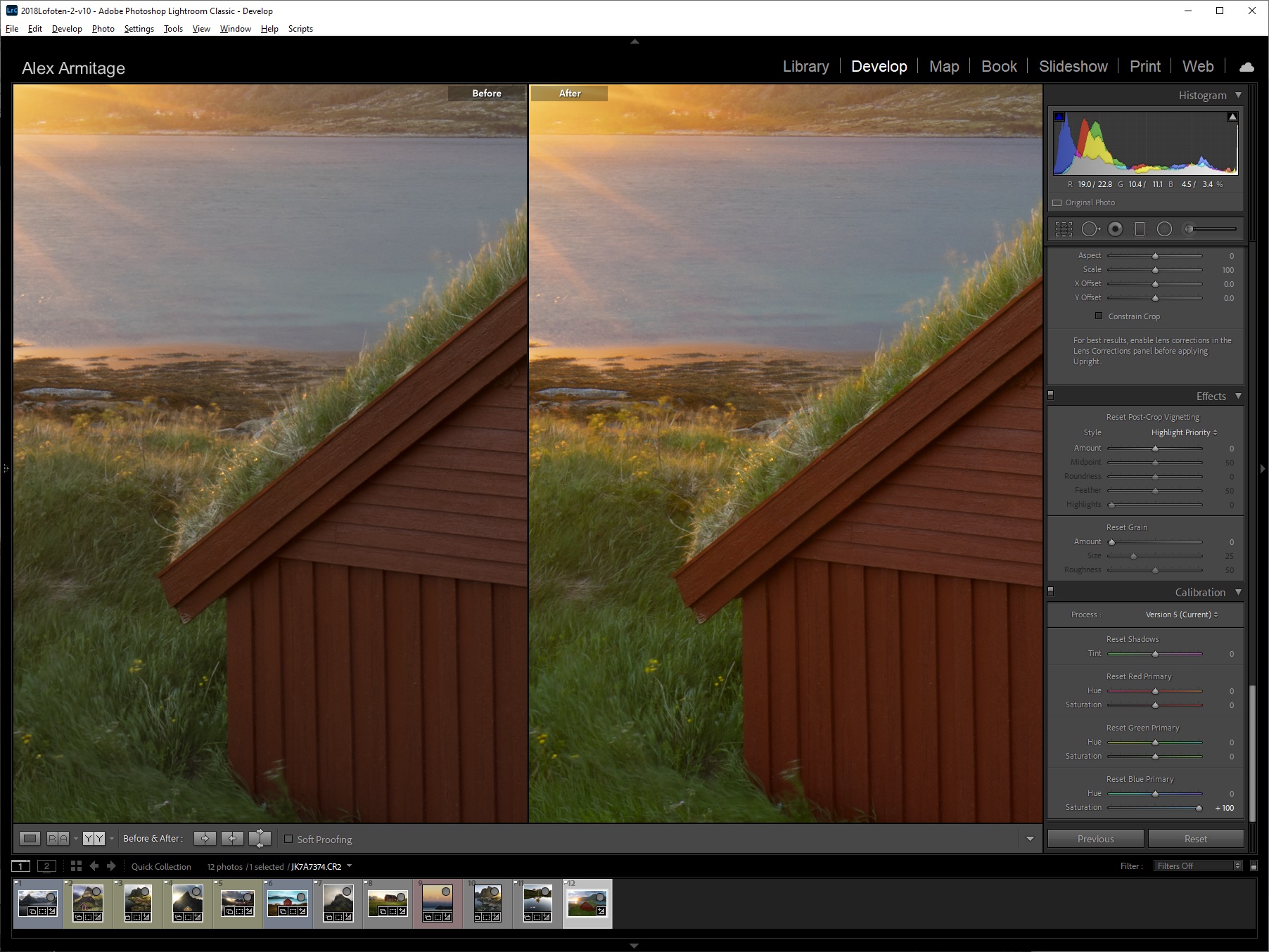
The majority of the time I simply boost my "Blue Primary" saturation to 100. I do this for basically every photo I publish. Above I've made that change and zoomed in to show exactly why I do this. Notice those golden highlights in the grass but also pay attention to the shadow areas in the bottom left of the frame, see how it almost brings that area to life in such a subtle yet beautiful way? This is without any other edits.
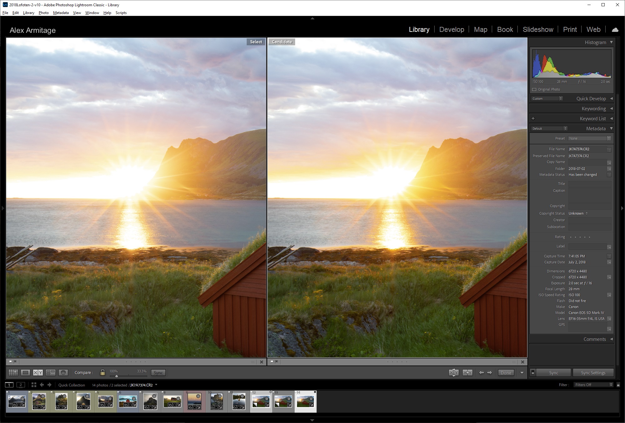
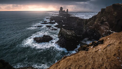
You might be asking why I'm using the blue saturation slider rather than the green or red. In the image above you'll see on the left the image with blue saturation set to 100 and on the right, you see the red saturation set to 100. Notice how crunchy and just a tad overdone the red handles the sun's colors. Green acts in the same way but is slightly less intense. What you can do is only increase your red or green values to a comfortable amount like +40 for this image, however in my experience simply using the blue saturation slider yields the best results for these types of scenes. If it's hard to see in these images you can jump to around 4:50 in the video to see it in more detail.
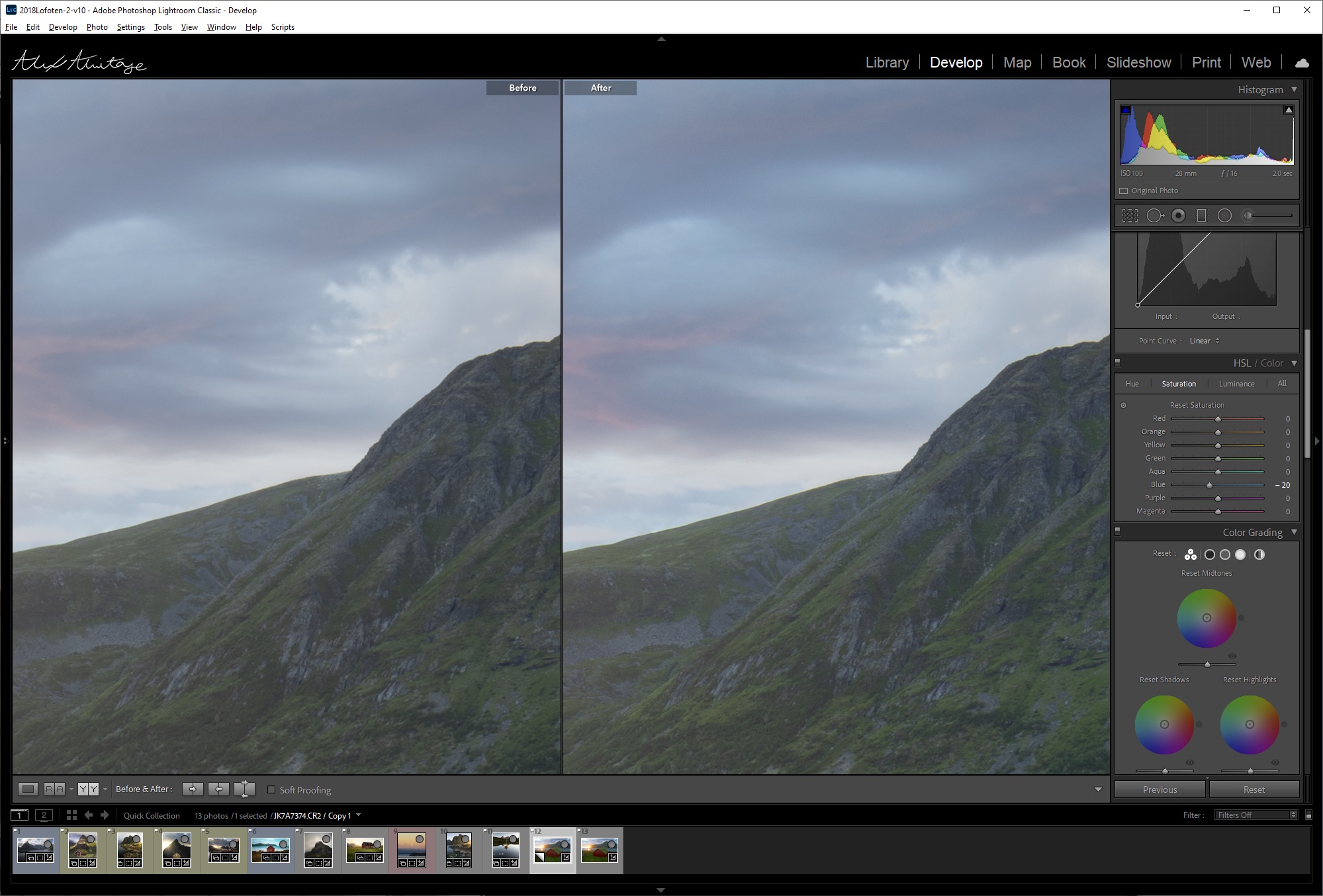
It gives me the most punch and enhancements to the colors I want while still having a nice roll-off in the majority of the colors in my scene. The one problem you will run into is that it pushes your blues into oversaturated territory. To fix this simply go into your HSL panel and decrease your blue saturation by about 20. This will vary based on how much blue is in your scene and how much editing you push your final image.
Above is a photo with very light editing that wouldn't be possible without using the calibration setting directly in Lightroom. If it didn't exist I would have to go into Photoshop and use masking techniques to get the vibrance and light that it creates in this image. Sometimes that is something I will do but on many photos not only does it save me time, but it also creates great results. It's that simple. As I said before, this is something I use on the majority of the photos I publish and I absolutely love the results. However, we can use this for much more.
The Look
Next up I'm going to start with an image I've already edited. My recommendation when editing is to adjust your calibration settings before you do basically anything else but white balance or basic adjustments. However, for example's sake I wanted to show just how powerful this tool can be and it honestly might enhance images you've already edited as well. Take note in the above image how dull the red hut looks yet the grass in the foreground looks brighter and more saturated which isn't a balanced look.
Sometimes I want the greens in my image to be less yellow and more of a muted green, to do this I'll adjust the calibration hue of green to the right which will remove yellow and add more blue into the image.
Last I want to make the image, especially the hut, pop just a bit more. By simply pushing the green saturation slider up not only do we add a little life into the image, the red in the hut comes alive. Also, interestingly enough, the intensity in the green areas doesn't change all the much if you compare the before and after. I love this tool! Again if it's hard to see the color shifts in the pictures jump to around 8:40 in the video for an even more detailed look.
The Style
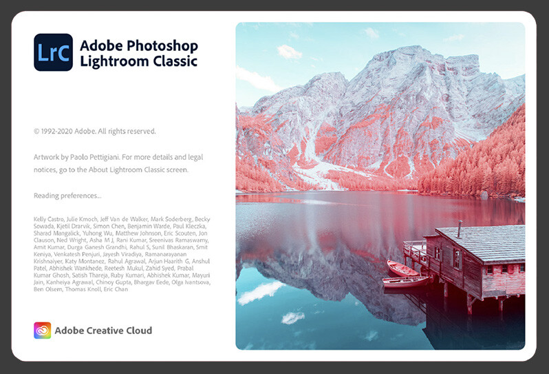
Last but not least let's talk about stylizing your image. Long ago I wrote an article about posting to Instagram everyday for a month using a very stylized type of image throughout those posts. While my feelings on Instagram are far different than they were then, I actually used the calibration tool to make the stylization I used for every image. Coincidentally when I opened my catalog to find this next image, I noticed Lightroom's new loading screen is using an image taken with an infrared filter applied, which looks vaguely close to our image.
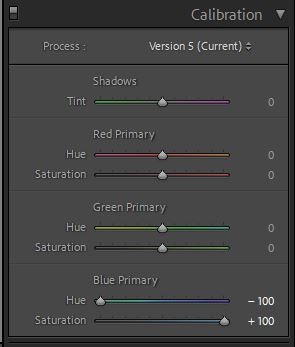
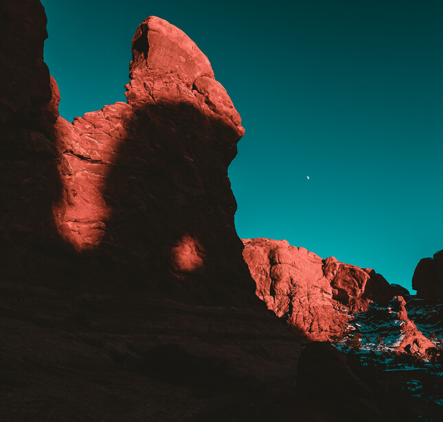
A classic look in cinematography is orange and teal. This might not be quite that but it's in the same ballpark and it's really simple to do with calibration. In nearly every photo if you push the blue hue to the left you'll result in that style. Now I'm not saying to rush out and turn all your photos teal and orange, it's definitely very specific and can be quite extreme. It might not even be to your taste but there is no harm in learning just what a tool can do for you, even if you don't plan on using it. As I just learned while writing this article, it could even replicate an infrared look!
Conclusion
I hope after three completely different styles of images you'll go out and try this on some of your photos or future edits. As I said before I typically stick with using this to put a bit of life into my images, but it can also come in quite handy to get creative with your images as well. As I mentioned a few times throughout the article if it's hard to see the color differences through the pictures within this article be sure to check out the video as it should do a better job showing those differences. The calibration on your monitor or phone while looking at the images through a web browser will vary.
As always I would love to hear what you think below, if you've ever used this tool before or if this is your first time even knowing it exists. Thanks for reading and watching!
If you'd like to learn how to use Adobe Lightroom more efficiently on any device, make sure to check out our Mastering Adobe Lightroom course with Pye Jirsa. The content Pye covers will appeal to every level of photographer and will save you an incredible amount of time on your image editing. Save 15% by using "ARTICLE" at checkout.
Join the Fstoppers community for free
-
Post comments and join in the discussions
-
Browse the site ad-free
-
Share your work and get featured in the community
-
Compete in the photo contests for fun and prizes
78 Comments
So many useless words: “As I said before I typically stick with using this to put a bit of life into my images, but it can also come in quite handy to get creative with your images as well.”
Better: I use this tool to put life into my images. Or use it get creative with your images.
What's the point of criticizing the author?
Without constructive feedback how can he improve?
Constructive criticism is always great. I'll never claim or tell anyone I'm a good writer. That said I continually read your example above and while I could see it being wordy I don't see any issues with it. It expresses a bit of my personality and isn't a complete train wreck of a sentence.
That's not constructive criticism.
That's showing how to write in a less uninteresting and impersonal manner.
Agreed, that's not constructive criticism. That's about the hit of dopamine from putting someone down. It's under the guise of being helpful. A very web comment thing to do these days. Thank you Alex I enjoyed the ton of work you put into explaining this technique.
“...how to write in a less uninteresting...manner.“
Alex, keep believing these guys and you will never improve.
At least he took the time to write down his views, rather than only doing a video.
I'll gladly concede I am definitely not a linguistic master or even that great at writing.
Better: I suck at writing
okay there we go :)
No nothing at all wrong with your writing. Delighted to see some text with videos.
Thank you! It does take a decent amount of time to try and explain things in text rather than video.
it is greatly appreciated
Yes, much improved.
But you don’t suck at writing. You’re not copyediting your work.
After you’ve finished writing read your work critically, with the eye of the reader not the writer.
Are my thoughts organized correctly? Are the sentences too long? Do I define new words? Are there useless words? Etc.
You can fine good editing/copy editing tutorials online.
2. Click bait titles are juvenile and diminish the quality of your work.
Did Hemingway write _most awesome old man out on the waves for days and nights fights literally the biggest fish you’ll never see and he did it in a dime-sized boat. You won’t believe the selfies!!!_ ?
What is click bait about the title? When I discovered this a few years ago it quite literally changed my editing flow forever.
Sam is a troll. Empty profile. Nothing that give him any credentials to criticize anyone's work. He has no work for anyone to critique. Therefore his opinion has absolutely no weight. We need to ignore him. Myself included.
I found your article helpful.
Sam, you need to work on your own writing and editing skills. Pot, kettle.
Well, last I looked this was a video on Photo Editing Techniques, not an English course. Everyone has different writing and speaking styles, that's what makes us different. IMO, unless you have some knowledge that corrects misinformation, keep your negative comments to yourself! You have the choice to NOT watch the video or get your info from Alex. I personally thought the video was excellent and well explained. I am one of those who has never touched the calibration sliders but look forward to seeing what they will do for my images! I am so happy I stumbled upon your videos.
I look forward to more!! Thank you Alex!
Anytime Marguerite and thanks for taking the time to let me know you enjoyed it :)
LOL
What I am annoyed about, to the level of stopping the video after 20sec, is the metal sticking out of his nose. Looks like a booger, please blow your nose, yuck... Some of this "piercing" fashion should be carried out in a more private fashion, to not to offend folks being shocked by it.
Or worse yet, those huge unnatural things resting on the bridge of his nose. No one wants to be looking at that! If the soul of a person is seen through their eyes, why put some obtrusive barrier between your my eyes and your soul? Got something to hide?
Ok. I'm done trolling, but some of this "commenting" fashion should be carried out in a more private fashion...
“if it's hard to see the color differences through the pictures within this article”
Then how do we know the tool is doing anything
...much less impressively and forever powerful?
Try it for yourself. The point is to inform you that the change is subtle and difficult to see when you go across different monitors and resolutions but in the printed picture you will see the difference. The POINT of teaching is to get you to try the technique and see if YOU like the results. Thus the artist in each one of us who claim to be photographers.
Sorry. but that nose stud is so distracting that it makes it hard to even watch... :(
I don't even know it's there anymore!
Really? thats what you got from this? Thanks for a great video...very informative
Don't watch it then. You have a choice to get info or not. I personally don't care for piercings but I was so enthralled with the new information being presented that I didn't even notice!
Haven't logged on in ages but nice to see the FS comment section is as happy as ever
Just part of being on the internet, no big deal.
Awww......That's very true...I enjoy that sarcasm :D
This was super helpful to me. I thought it was well done. Thanks so much for sharing.
Thanks Matt! What did you use more, the video or article?
For me, I didn't really see it so well until the video. I strongly suspect that is because of the resolution of the photos. It was helpful to reference the article, though. Now if you'll excuse me, I have to get back to putting a teal and orange filter on all my photos. :p
Yay!!! teal and orange, straight to instagram sir!
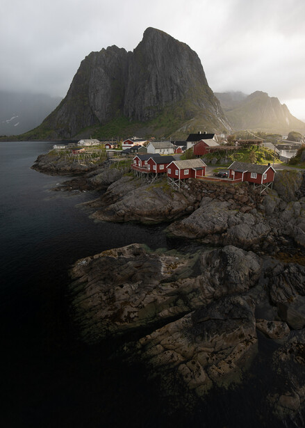
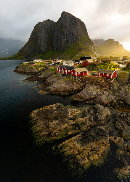
The originals often look mich closer to something that could be sold for much more money than the after, overly warm and colourful versions that simply look fake.
Take the red houses on the cliff in front of the mountains ... make the reds stronger add a tiny bit more dynamic range, sharpness and contrast... BANG.
Now it looks like a ChildrenCartoon...
I presume we are all entitled to our opinions. Personally I like the after quite a bit more. That said I doubt either photo could make me any money haha
Every piece of art look fake in some way, but it does not diminish the value of the photograph in any way. Sometimes post-processing could make a photo look fake, but then what the artist sees and felt in the scene is emphasized, including the emotion "given" to the photo through editing. Nevertheless, I still agree that to us photographers, sometimes lightly processed photos would appeal more, cause we all know how fake a photo could be (think surrealism and the Peter Lik debate).
All of this can be achieved by the other, more appropriate tools in LR.
Use the dang DNG profile editor for this like you're supposed to!
A ways down the page at:
https://helpx.adobe.com/photoshop/digital-negative.html
Think I'm a bit confused here. What am I supposed to find that will help do what I did to the images above?
Make a profile! Which is in essence what you're doing here, with less versatility, using a weird control.
A profile for my camera? I usually just use a preset with the main settings I have here but I do change it up sometimes. Ill take a look to see if it does the same thing
JN doesn't believe in using tools creatively it would appear.
The profile editor is where the calibration panel first came from. Adobe's raw profiles for some cameras used to be a bit off. You couldn't tell oranges and reds apart in Canon files for example. So you had to shoot a colour chart, analyse in PS and then save as a colour profile preset. Thankfully Adobe later baked these in as options in addition to the Adobe profile. See photos below with just calibration applied to raw files out of camera. The LR Canon profile matches the in camera profile applied to the JPEG version
Later again we got the calibration panel where we could tweak things on the fly. This also meant we could use it creatively as shown in article, as well as set a good starting point.
Excellent tip! Thanks for taking the time to share your workflow in LR. I tend to get stuck doing the same things. You got me to run back and play around with those settings. I'm sure there's many different ways to achieve the same, but basically 2 sliders and you get some pop. I also use Luminar and I wonder if the AI slider is doing a similar tweak. Anyhow keep up the videos and ignore the jerks/trolls. Press on being you!
Thanks for taking the time to comment and be encouraging. I think the only thing I've found that does what this does as efficiently is the color profile selector right above the basic editing tool, however that didn't exist until recently and you also don't have full control over it.
Thanks again!
Thanks for sharing your workflow. Nice to see the comment trolls are still in full force since my days at FS.
I feel people who watch too many images on some sites get used to overprocessing, particularly oversaturation, and that becomes their default.
It may happen to me as well, but right now I just feel pressed by incredible pile of oversaturated images.
Other than that, Lightroom "impressive" tool is an ordinary tool for ages in Affinity Photo, one of the simplest tools in Luminar etc.
Really appreciate Alex taking the time to make these videos. I learned tone curves from him and now use them heavily in my post processing. This is a great tip he found my taking the time to really get to know the Develop module
Thanks Stephen! I'm glad to help even just a little.
Yeah, you're not using this panel correctly at all.
It's not designed to be a creative color tool, it's for adjusting the color science of your cameras sensor.
Ex: Nikon's have a tendency to shift their reds toward Orange and yellows toward green. Moving the red hue slider and the green correct this shift. The saturation is to fix a sensor that over saturates colors.
Don't get me wrong you can get creative with this panel, but since it's a global adjustment and it determines the values all the other sliders work from; it should be the first thing you do, not the last in your workflow.