Sometimes you might not have time to take every photo you’re editing into Photoshop but you still need to make significant changes to make an image look great. This tip can make your photos stand out without spending a lot of extra time in your editing suite.
Last week I wrote about using Radial Filters to help create drama in your photos by using them as a light source. I got multiple questions about the examples I had at the end of the article so I decided to keep the topic going. This week we are painting light with Radial Filters and making sure your images don’t look too overdone.
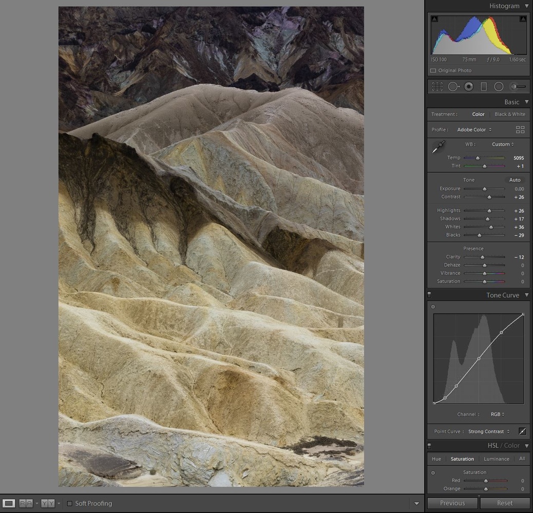
As someone who has spent 10+ hours on a single photo, I know how time consuming the editing process can be. Many times it’s actually one of the parts I enjoy the most about photography. With that said, there are quite a few photos that might not need that much attention or maybe you are processing a lot of images from a shoot and simply don’t have the time. Radial Filters are wonderful for the minimal time invested to produce great results. Enough talking, let’s get to editing. This is what we are working with:

Yuck! It's so flat!
I think it’s important to explain my thought process through an image, which starts right at the beginning. You can immediately see why I might skip over this image when going through my catalog. It’s extremely flat, even knowing that most images out of camera are quite dull looking. The most important part of this particular image was remembering how the colors of the hills looked in real life and using that knowledge to bring the colors out in our final edit.
Basic Edit
Every image is different in terms of how you want to do your basic edit. Some tips I recommend is to leave some latitude in your histogram for when we will add the radial filters. What I mean by this is don’t add the max amount of contrast or pull your whites up all the way yet because we will be doing that selectively. Typically this is something I go back and forth on trying to find the right balance. I suggest you’ll have to do the same. Also take note that my clarity slider was not at +50 this time, phew!
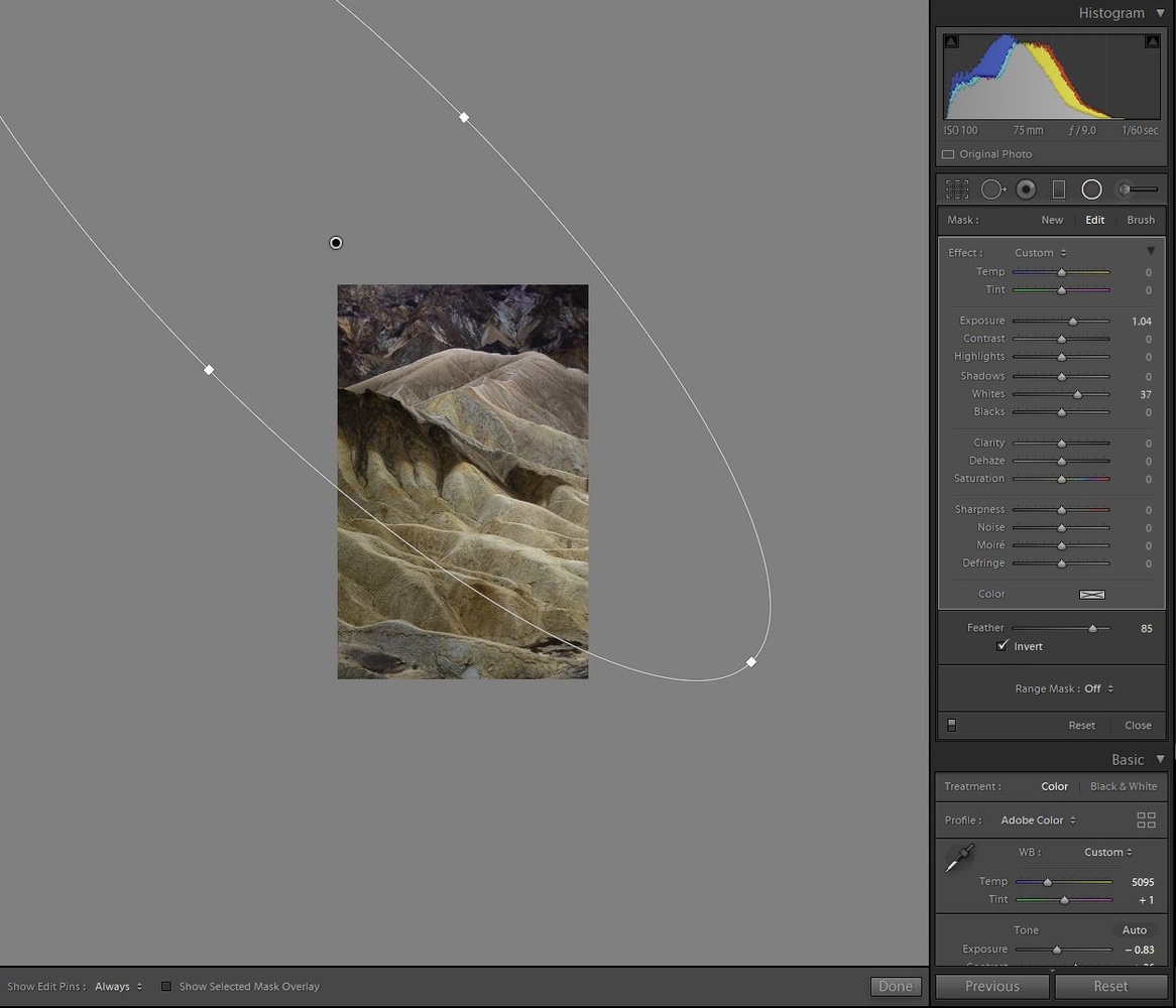
Just like last time I am going to darken the entire image so I have more control over where we want to paint our light into the picture. Keep note of how dark you make your overall image so you know how much latitude you have to use within your filters. What I mean by this is that if you darken your entire image by -1.5 EV (exposure), that means you can add +1.5 EV to a filter to get back to your original exposure, keeping in mind that we might go further than +1.5 EV in some spots to create bright spots.
Create Light Source
I won’t go into full detail about how to create your main light source because I explained everything you need to know to do that in my last article. For this edit we don’t want our light source to be really bright because we plan on painting in more light using extra filters. You might even want to skip this step if your image already has a defined light source, the example I’m using clearly didn’t have any defined light source so we made one!
Painting Light
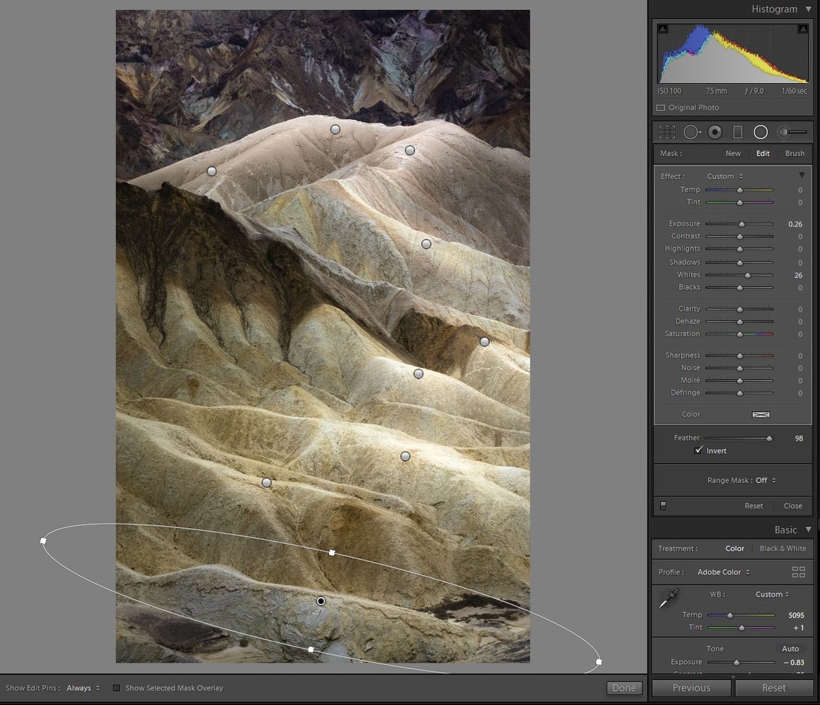
This is where the photo really comes alive and can honestly be quite satisfying during an edit. We are going to start by creating one radial filter and build upon the entire image using that filter. The first one I create is going to be closest to our light source and should generally be a bit brighter than the other spots because it is the closest spot to our light source. Also I’m specifically choosing spots in my image that would naturally be highlighted by light. This is very important to make the final photo look realistic. You’ll want to add some amount to the Whites and Highlights if those are already in your image. In my case, the original image was so flat that I need to boost the EV a bit to get any results. Just be cautious with using too much exposure as it becomes obvious very quickly. This is the part where you might need to go back to your overall edit and adjust some sliders to balance out the rest of the image. Remember to select “Invert” on your filter!
Right click on the radial filter you just made and duplicate it. You can duplicate it once and continue to do that throughout the image or you can duplicate it 6-7 times depending on your image and place all the radial filters in your desired locations at once.
Once you are done finding the spots you want to highlight, make sure to shape the filters to the desired orientation. The final step is simply balancing your light throughout the image. The important thing is to brighten the spots that would naturally look brighter and remembering to keep things as subtle as possible. Once again I recommend using the Whites slider as often as possible because it creates the most natural application of light for this method, followed by Highlights. I specifically used the EV slider for this image because of how dull the original light was. Typically having the feather at 85+ is recommended unless you’re trying to target a very specific area, this helps the falloff of your edits and overall keeps things more natural.
Check out that before and after. I think it’s quite an improvement from where we started off and we did it without ever leaving Lightroom. The great thing about this method is if you had 10 photos like this and need all of them to look relatively the same you can simply copy and paste your settings throughout your selections. This is not a method to replace the techniques you can use in Photoshop as you have far more control there, but it certainly produces decent results for the time invested. I enjoy using this particular technique for images I might use on social media, ones that are not going into my portfolio but I enjoy enough to share with the world.
Speaking of editing, I want to do a weekly series that mainly focuses on editing, maybe focus on one particular method for an edit, or simply just show the entire process from start to finish of an image. If that’s something that interest you please leave a comment letting me know. I’d love to hear what you think and feel free to share any of your before/afters using radial filters.


I really like the end result. Nice work.
Thanks Michael! It's definitely a good example of how editing can save a photo but certainly not the best example of taking a photo in the best conditions.
I would love a weekly series!
Made that photo shine.
Looks great, do you intentionally under exposing in order the use the technique to paint in the light?
Are you referring to my histogram being a bit underexposed after the basic edit? That was not intentional, I was probably just a tiny bit under when I shot the photo. Thankfully the scene is so flat that it didn't matter too much :)
Thank you for the articles. I really enjoyed reading them both. I'm wondering if you can share with us the long and more serious technique in photoshop. Since I'm a cityscape photographer and I try to use this technique a lot in a precise way. Thanks again! I want to share also one of my photos that I used this "layering" in it. It is not on the "top" but still learning! Thanks again :)
Ahmad, Thank you for sharing! That picture is looking great. My only critique would be to lessen the effect on the tower in the background, or try to erase part of the filter in the clouds as it's a tiny bit noticeable. Other than that, what a great shot!
As for the more advanced technique, I'm trying to think of the best way to go about doing that as it requires more explanation, maybe a video will suffice. It's on my to do list! Thank you again for sharing and letting me know your thoughts.