
One of the most obvious telltale signs of an unprofessional commercial or product image is color. The most famous and readily cited issue is color grading, but it's not the only problem and the uniformity of color is often neglected. That is, the even color of the object or two objects' colors truly matching. As always, I will couch my method in the sentiment that it may not be the optimal technique, but it works very well for me.
What are the applications for this method?
When I first figured out how to go about achieving what I was aiming to, I believed the application of the technique to be too niche to be of interest to many people. Then I began to use the method for applications outside of what I originally intended it and before long, it had become a staple in my editing arsenal. Here are a few examples of where it's valuable:
- Ensuring a product has a uniform color all over
- Matching the colors of two objects
- Creating complementary colors in an image
- Correcting a skin tone to be more balanced and even
Some noteworthy considerations: I'm not offering this information with the intention of it being used for skin tone corrections so all you hardcore beauty retouchers can put your pitch forks away. That said, when used in conjunction with other methods, it does work. With regards to creating complementary colors, you will need to combine this method with Adobe Color Themes or something similar and most likely mask in a few different iterations. Matching the colors of two objects requires them to be either grey or similar in color and exposure. The greatest strength of this method is the correction of objects with blotchy colors (due to light or even physical defect) and can quickly make a product image look more commercial, particularly when used in conjunction with color grading and other ordinary retouching techniques.
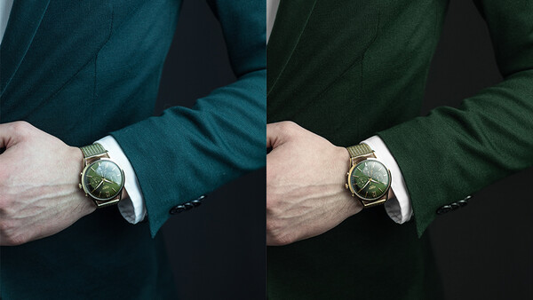
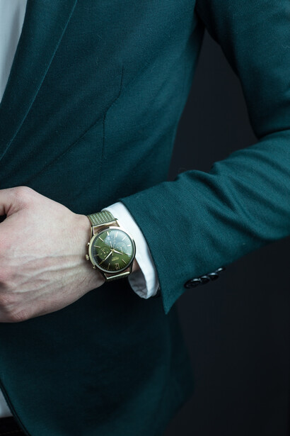
In the above example, due to low-key lighting, the color of the jacket to the eye was lost and so not only was my method used to apply an even color across the whole garment, but it corrected the color too.
The Method
First I'm going to give a text step-by-step tutorial on how to put this method to work as it's much easier to refer back and can be written relatively succinctly:
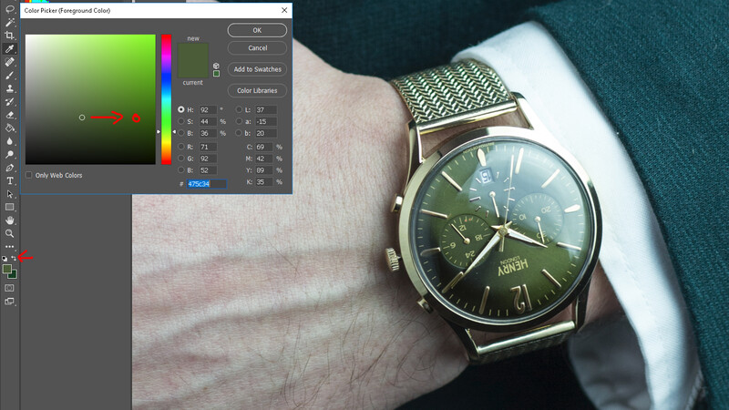
- With the Eyedropper tool select the color you want from your image that's closest to its highlight; a part of the object where the color is near its lightest. Then move the selection to the right to gain a richer shade. Keep this color as your Background Color.
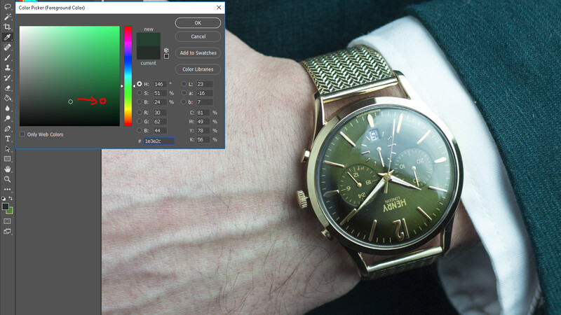
- With the Eyedropper tool select the color you want from your image that's closest to its shadow; a part of the object where the color is near its darkest. Then move the selection to the right to gain a richer shade. Keep this color as your Foreground Color.
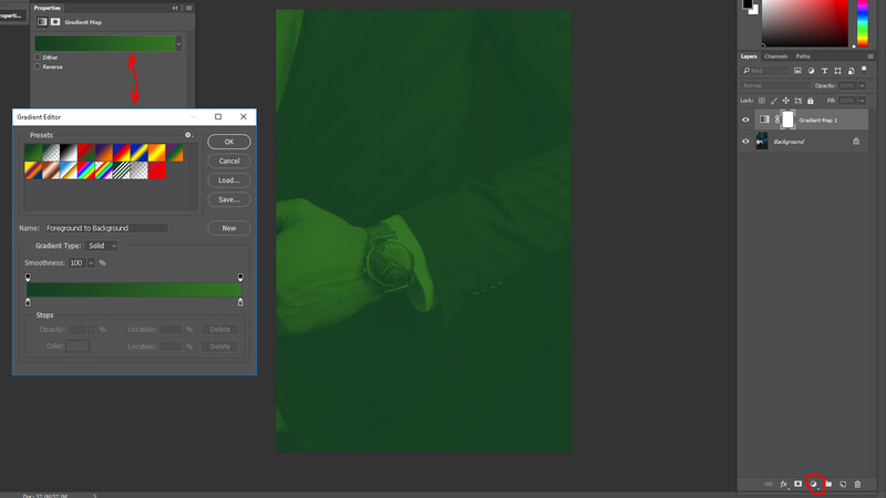
- Create a Gradient Map adjustment layer above your image. It should automatically use the colors you selected and so double click the color gradient bar to bring up Gradient Editor.
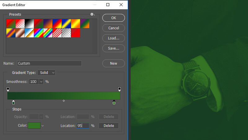
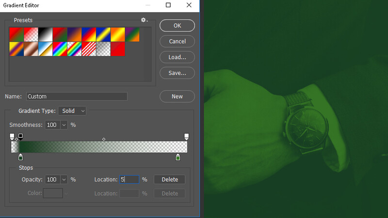
- Select the Color Stop on the far left and change its location from 0% to 5%.
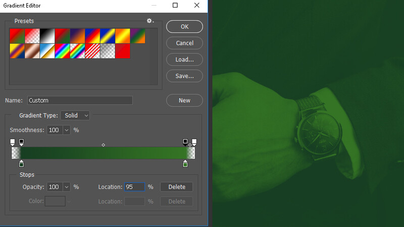
- Select the Color Stop on the far right and change its location from 100% to 95%.
- OPTIONAL: Your midtone color will be generated as the middle ground between the light and dark shades of your color. This is often perfectly fine, but with certain products and often with skin, this can sometimes leave the color feeling flat and dull. You can counter this by repeating step 1 and finding a midtone of the color in your image and adding a new Color Stop at a location of 50%. You can do this again at a location of 73% and 27% but I've yet to gain noticeable benefits from doing so.
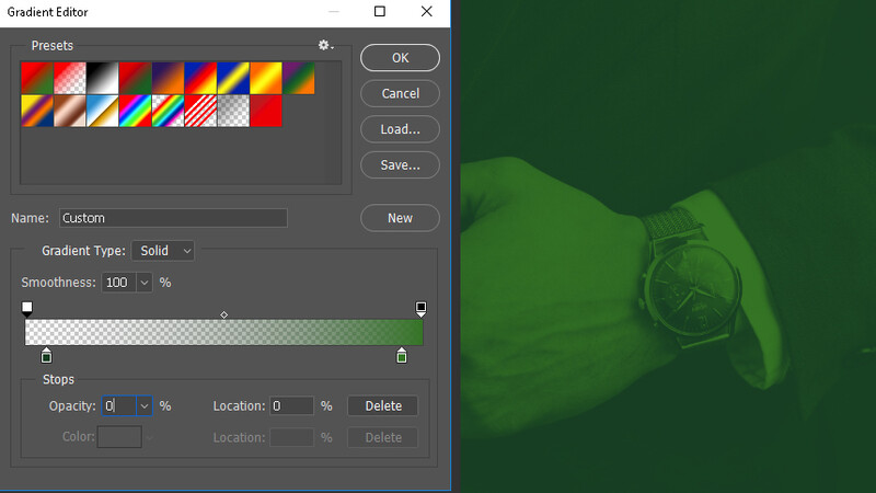
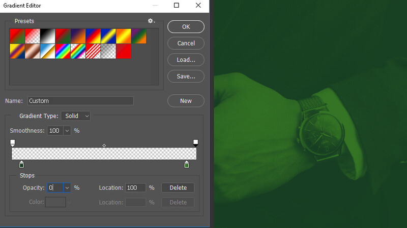
- Select the Opacity Stop on the far left and change its opacity from 100% to 0%.
- Select the Opacity Stop on the far right and change its opacity from 100% to 0%.
- Create a new Opacity Stop and set its opacity to 100% and location to 5%.
- Create a new Opacity Stop and set its opacity to 100% and location to 95%.
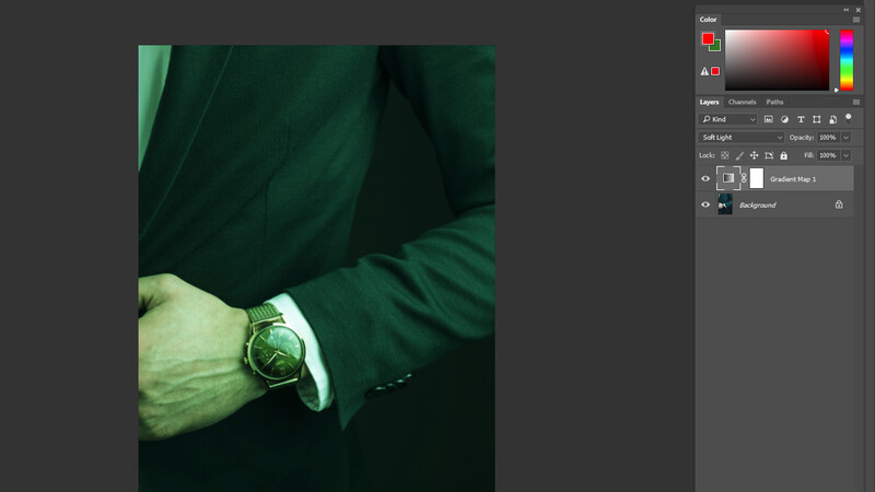
- Set Gradient Map adjustment layer's Blending Mode to "Soft Light".
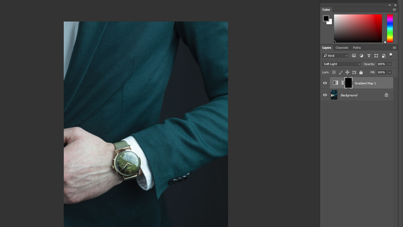
- Fill the layer mask with black and then paint white on the object(s) you wish to color.
- OPTIONAL: Adjust the opacity of the Gradient Map layer to suit your tastes.
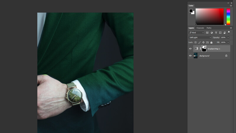
Now for a step-by-step guide in pictures. The method killed two birds with one stone in the below example as it not long created a more even color, but I matched the color of the jacket to the color scheme of the watch.
Step 1
Remember to move the color selection to a more vibrant and saturated shade as later step will sap a lot of the saturation from the gradient map.
Step 2
Refer to step 1.
Step 3
Make sure that your Gradient Map is above the layer you're working on. Double click the bar in the top left of the below image to bring up the Gradient Editor.
Step 4
You can drag the marker to the location or just type in 5% to the relevant box.

Step 5
Refer to step 4.
Step 6
Step 6 is optional and skipped in this case.
Step 7
Don't worry about the gradient becoming completely transparent, that will be fixed shortly.
Step 8
Refer to step 7.
Step 9
Click next to the first marker above the gradient bar to create a new marker and then change it to 100% opacity and a location of 5%.
Step 10
Refer to step 9 but with a location of 95% instead.
Step 11
Change the Blending Mode to "Soft Light"; other modes may work but I have had the most success this way.
Step 12
Fill the layer mask with black to remove the color cast from the entire image.
Step 12 (continued)
Begin painting white on the mask to change the color of the desired areas.
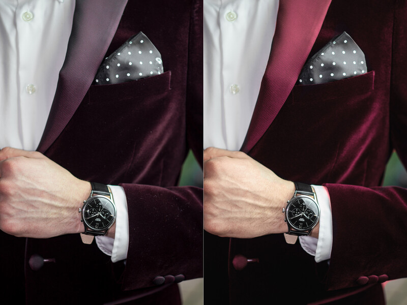
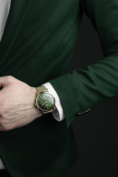
The before and after of the final result (after other retouching too):
Color work is very important stuff to us 'togs and so any additional tips or refinements are always welcome and I implore you to leave them in the comments. Conversely, if you're having difficulties with this method, feel free to ask questions in the comments or send me a private message.


Join the Fstoppers community for free
-
Post comments and join in the discussions
-
Browse the site ad-free
-
Share your work and get featured in the community
-
Compete in the photo contests for fun and prizes
11 Comments
Despite your "noteworthy considerations", many retouchers use an almost identical technique when color correcting skin. The only major differences are the blending mode set to color instead of soft light and the use of one or two points for the mid-tones for best results ;) Other than that, it's the same.
I've actually never run into this until, I saw clay cooks tutorial implementing this, is there a specific source u would reccomend for a thorough lesson on applying this to skin?
I wrote a detailed article on the technique I use about two years ago here: https://fstoppers.com/education/gradient-map-perfect-skin-color-61864 I hope this helps ;) Be sure to join the beauty, makeup & portrait group if you need any help regarding this technique or just want to share the result: https://fstoppers.com/groups/beauty-portrait-editorial-makeup-photograp…
very cool, exactly the article i was looking of, thank you!
I use a slightly different and more complicated version of this for skin as I found that the skin sometimes became flat and almost matte. I'm by no means a beauty photographer though; I'd just been told be a retoucher that people don't use this method on skin anymore. You know what retouchers are like though!
There are as many techniques, tips, and tricks as there are retouchers out there :P In the end, the client doesn't know what we use and doesn't care as long as the result is there. I still use the method I linked above for most of my retouching work, but I do tweak it with a curve or two afterward to add some contrast. I find that using the color blend mode usually takes care of the "flat looking" issue many encounters.
I've used a similar method, albeit not as involved, of sampling the proper color, using a solid color fill adjustment set to color, and then changing the "blend if" sliders to mask black and white.
None-the-less this is a well written and pretty easy to follow guide, probably better results than my method too!
Thank you so much for actually writing out this tutorial. I'm sick of wasting my time going thru videos that are always twice as long as necessary and then at the end, having to painstakingly go through the video over and over looking for the specifics to accomplish the task at hand.
great stuff !!
great work!
Hi,
Thank you for this tutorial and the step by step instructions are great. Quick question, I'm not sure if I'm missing something, but opacity stops have no affect in gradient maps as far as I can understand, is this an important issue in the grand scheme of this tutorial?