
In this week's article and video I go over my process of capturing an image from start to finish. Everything from how I found my location, captured the photo in the field, and my entire Lightroom editing process.
For this entire article I'll be using a photo I captured recently in my excursion to the San Juan mountains in Colorado. I'll cover my thought process on why I picked this location, how I decided on my composition in the field, and dive into some editing techniques that might be considered intermediate. I'll also face two tough choices many photographers might encounter in their work: choosing between two strong compositions and how they want to edit a photo. In regards to the edit I will try to explain my process as best as possible but also link to other content that may explore each technique further otherwise this article would be far too long!
With that said let's make some art shall we?
Location
I was on a 5-day photography trip in Colorado, and the specific location of this spot was not planned or thought out at all. This section is less about trying to plan for a spot and more about using a specific spot to your advantage. That said if you are trying to plan an entire trip I highly recommend checking out how to create a map to plan every spot you are visiting. My main issue this entire trip was the haze I encountered everywhere, mostly caused by a mixture of wildfire smoke and lack of precipitation.
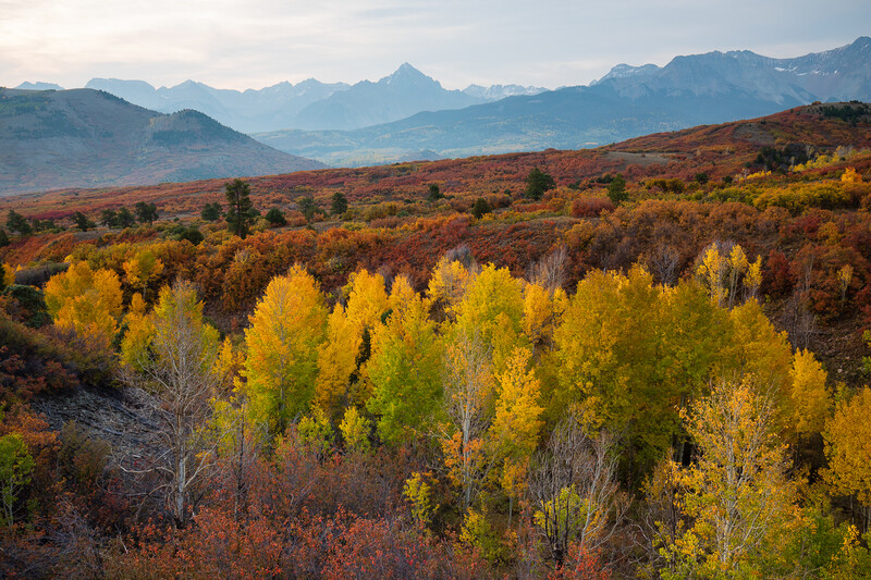
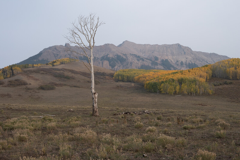
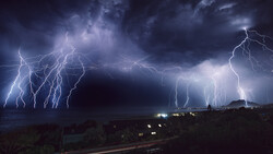
The photo above was taken the morning of my first day there and as you can tell the haze was absolutely miserable. Thus I spent most of that day looking for smaller compositions, shooting scenes with trees, and mostly avoiding anything with long distances in my shot. During that time I drove past a location and noticed a lone dead tree that caught my eye but I continued on because of the haze. It wasn't until sunset that I found myself back on the same road as the lone tree, and it also happened to be one of the only sections the haze wasn't completely ruining the scene.
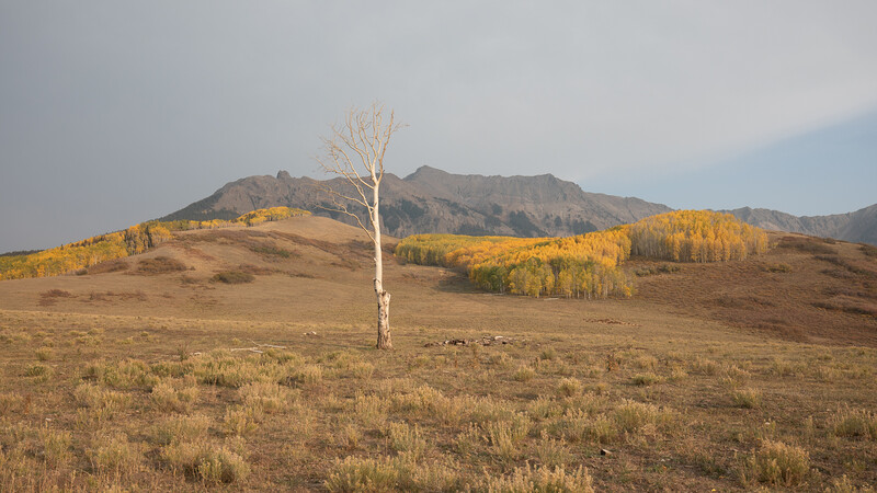
I was able to visually see nearly every other range or mountain around me was covered in haze so it became quite obvious this will be my spot for sunset. Above is what the light looked like on my composition and the cloud coverage behind my camera right before sunset. It might not be obvious but even though the light started out poor it was looking like there were enough gaps in the coverage to shine some red or golden light on to our scene. Thus our location was chosen, now let's take a look at compositional choices and camera settings.
Composition and Settings
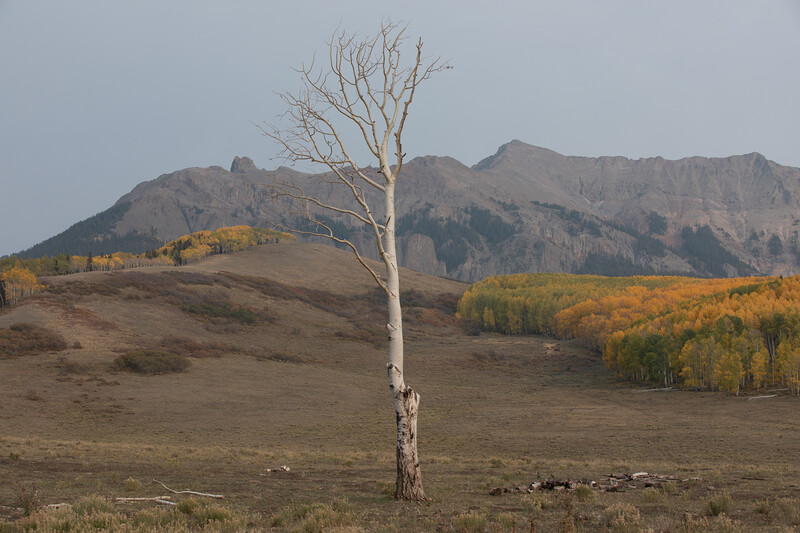
The composition was relatively simple but involved a tough choice. I could position the dead tree directly in the middle of my frame or I could balance it on the left-hand side with the right-hand side being filled with colorful aspen trees. To this day I'm not entirely sure what was a better choice and it is likely subjective however I'd love to know which one you would choose between the two?
I decided the scene would likely look wonderful as a wide panorama with the tree directly in the middle of the scene. The added bonus to this choice was that I could crop the final pano into my alternative choice of having the dead aspen tree on the left of the frame balanced with the living aspens on the right. This is where creativity and decisions in photography can be difficult. On one hand, I really enjoy the contrast of old and living, each filling up the opposite sides of the frame. However, I also felt like the tree being so much closer in the scene and standing out so strongly deserved to be the absolute focus.
I ended up taking exactly one panorama as I expected the light to continue to improve but my luck on this trip was not with me so this is the only shot I ended up with. I don't have a video (yet) on how to take a panorama but this should get you started if you've never shot one.

Camera settings for each shot:
- ISO 100 as this gives us the highest image quality from the camera sensor
- 80mm focal distance shot in portrait to give us 6 shots rather than 3 if I had shot in landscape orientation. This just gives us more resolution in the final edit or potential print and a bit more sky/foreground in our frame using my 70-200mm lens.
- f/8 aperture because it's the sharpest for my particular lens.
- 1/20s exposure shooting on a tripod with little movement in my scene. If there had been movement I likely would have increased the shutter speed while also increasing my ISO slightly to compensate.
- Manual focus set to the dead tree.
- 2s timer between each shot because my tripod was fully extended potentially causing a bit of camera shake in between each capture.
- Auto white balance because I'm shooting in raw thus I can always change it in post.
I think that covers all the technical parts of the shot, next up is selecting our image and processing it!
Processing
So typically I'd explain my thought process behind why I picked a specific photo over a few others from the same time period but as I said before, I only captured one panorama and it was also during the best light thus our choice is quite simple. Let's dive into Lightroom!
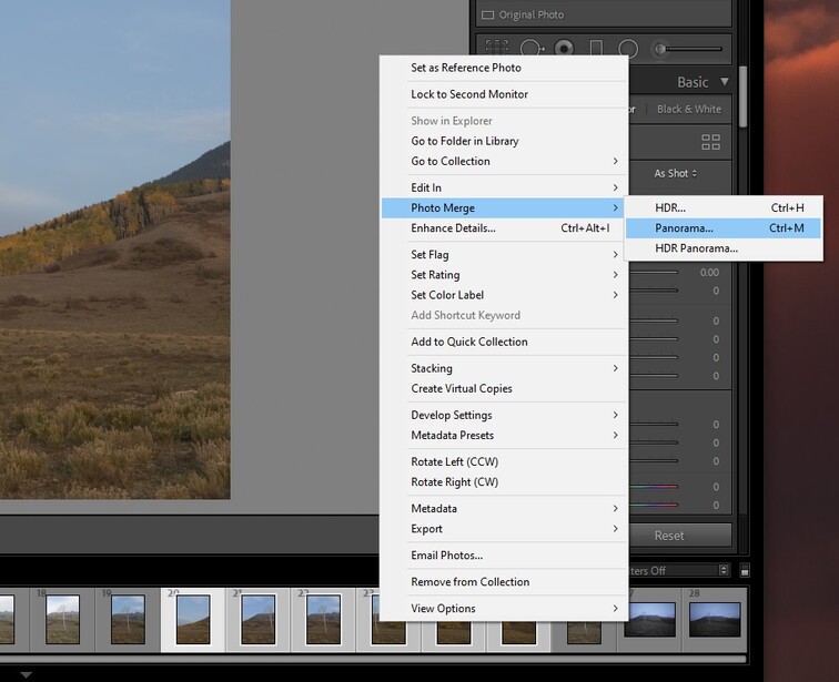
The first thing I'm going to do is merge the panorama by selecting all of the shots > right click > photo merge > panorama.

The panorama merge preview window will show up and you'll notice the images weren't taken on a perfectly level surface. That happens because I didn't take the shots and pan with a level head but it's totally fine because as I said above I shot extra space in my frame with the intention I'd likely crop the top and bottom out. In this case though I'm just going to use the boundary warp tool set to 100 because there is very little that needs to be stretched and as I said, I will likely crop this part out anyway.

Now that we have our starting image we have to make a tough choice, how do we want to edit this photo? Honestly, it's not an easy answer but the beauty of editing is that if we want to dedicate the time we can try multiple avenues. In the video this shot originally premiered in I went with a somewhat flat look with muted tones, slightly raised blacks, and overall I tried to emulate a vintage film look. I did this for two reasons. The first reason was that as you can tell the original scene doesn't have strong dynamics, it's quite flat, and overall doesn't have any dramatic light washing over the scene so it made sense to process it in such a way to not dramatize what wasn't there. Secondly, I personally enjoy printed panoramas to be less colorful or vibrant and prefer a film or muted look.
This time around I'd like to process this with a heavier hand creating a much higher dynamic scene, add some drama into our image, and overall bring it to life with some techniques you may or may not know about.

First thing's first, if you read my article from last week this shouldn't come as any surprise, I'm going to set my blue saturation in the Calibration panel to 100. In doing that you'll notice our blues are just a tad too strong so I'm going to go into the HSL tab and decrease my blue saturation by about 20. Once that's done I'll figure out where I want my white balance. For this image, I'm going to push it to the warmer side because the light was actually quite warm contrary to what the flat raw looked like. I also increased my tint from -4 to +2 because the light was also red.

Next, we'll do some basic adjustments. The first thing I will increase is the whites in my image to give us more contrast and brighten up the image overall without raising the darker areas in the image too much. Then I will darken the blacks to continue to put contrast into the image while also raising the shadows just a touch to counteract lowering the black levels. I set my Clarity to -10 because I don't want anything to look crunchy and personally have been enjoying edits with less clarity. Last but not least I pushed the Dehaze slider to about +15. You have to be careful with this tool because it can become overdone quite quickly when editing. In our case remember back to our initial goal which was to take this flat image and make it pop a bit more. Dehaze gives us a bit of what we are looking for. It should be noted that we will touch the saturation sliders at the end to balance the image where we want it because many things we do will affect their levels, such as Dehaze.

Now let's add a touch more contrast using the tone curve preset "Medium Contrast." We can also apply our lens corrections here removing chromatic aberration and enabling profile corrections. These are things I do on a standard basis.

For the next two parts, we'll be adding some local adjustments to our image and this is where the magic will happen to really make the image stand out. First, we'll add two graduated filters to the top and bottom of the image. The top filter is bringing down the highlights and the exposure very lightly. I also added a tad of warmth by increasing the color temperature by +5. This helps combat our overly blue sky while also giving a bit more glow onto the mountains.

The bottom GND darkens our foreground by decreasing exposure and the shadows. I also set the Clarity down a little bit so it gives a subtle blur to that area. All of this helps keep our eyes in the middle of the frame.

The second local adjustment we'll use is the radial filter. I recently made a video about this that I'd highly recommend if you have never used these filters before or in this way. The goal is to highlight specific areas in our photo but not overdoing it to make it look unnatural. Above you'll see 4 radial filters all with the same setting, the key here is to adjust the correct slider. Notice I pushed the whites up instead of the exposure, this will affect the bright spots that are already there like the aspen trees instead of the entire area which is exactly what we want. Also, notice my filter is set to inverted and a feather from 50-70 for each of these.

The last radial filter we'll add is to really bring attention to the tree. I created a large filter, turned off the inverted setting thus affecting all the areas out of the circle, feather to 100 so it looks natural, and decreased the surrounding exposure and shadows. The result is a touch too dark but we'll fix that in the next step.

Next, we go back to our basic corrections and modify our initial settings just a bit. Push our overall exposure to .10 and raise our whites even more to about 55 from 37, and decreasing our highlights by about 10. This is looking like we are almost done!

Now we'll pull our saturation down by about 10 to fix some of those colors becoming a bit too strong from our local adjustments. And I'll also set my Sharpness in this step to around 75 and Masking to 15. This will put some detail into our image and this part is entirely up to you.
Our last step is to crop the image, which I could have done as the very first step but as I said before there are two strong choices. The tree directly in the center of the frame or balanced with the aspen grove in the background. I'll let you decide which one you prefer and would love to know in the comments.
Final Images and Conclusion


Here are our starting image and our final image with two different crops. The end result isn't a world-class photo by any means, but I think this is a great example of how editing can really bring to life an image without making it look overdone. The key is to adjust incrementally and approach things lightly even though we specifically planned on pushing this edit to its limits. I'd love to revisit this spot with some better lighting someday and try this shot over again but overall I genuinely like the results but I may be more partial to a flatter image with less dynamic range.
As always thanks for reading and I've been loving all the feedback recently. I can't wait to hear which image you'd prefer in the comments below and please let me know if you have any questions!
Bonus
To make things even more complicated, what about black and white?

Join the Fstoppers community for free
-
Post comments and join in the discussions
-
Browse the site ad-free
-
Share your work and get featured in the community
-
Compete in the photo contests for fun and prizes
12 Comments
Very nice video. I love the San Juan Range. It truly is of the most beautiful places on the planet.
I like the cropped version of the photo a little bit better. I think it makes the tree a stronger element, which focuses the photo a little more. The full panorama has a little too much empty space on the left, which causes the tree to somewhat blend in with the background.
I think the photo works well in black and white, and I like the full panorama. I would probably whiten the tree a little bit to make it stand out just a tad more. With the contrast and the broad scope, the tree stands out more than it did in color, and it evokes a feeling of the isolation of the tree. And the contrast in the stands of aspen to the left and right make bright areas that draw the eye from the edges of the photo to the lone tree. The cropped version in black and white would likely have too many contrasty areas that are prominent near the center, which would divide attention and de-emphasize the tree.
Thinking about the black and white versus color made me realize something that I had not thought of before. I often render my photos in black and white, but I don't think I have ever considered how the luminance contrast in BW vs. the tonal contrast in color can lead to a different crop for the most pleasing image. I have a tendency to crop my image and then render in BW without thinking of whether I should recrop. I went back to some of my favorite color landscapes and converted them to BW, and sure enough, in some of the images, a different crop worked better for the BW images. Thanks for making me think!!
What a great comment! I think there's a lot of room for discussion about each photo and it seems lots of people have different opinions. I would need to spend more time editing the black and white to get it to the right place, this was me clicking a button and adjusting the colors to just pose the question. It's a photo that still isn't done and will likely sit there until I come back to it with fresh eyes. Glad it go the juices flowing as well :)
Great video and i think you chose a great photo to showcase your editing. it had hood composition but w thebad lighting really needed good edits
i like how you used the whites to brighten the image, also didnt really over do it or over edit the image
i liked the tighter crop in color
would like to see more start to finish editing videos
I will be doing them! Maybe not every week though haha.
I liked the video and the article and I think the result is better than expected considering the haze and the difficult light. This brings up the dilemma I have. Is it worth to take photos under this condition and then spend quite some time with post processing? Or should one wait for (much) better light and return another day. I think nothing replaces good light and although one can achieve reasonable results with post processing, it will never be the same.
So my question to you is, if I may ask: Will you return some other time, maybe in the fall next year, to give it another try? Now that you know where to go to.
I will absolutely return and would love better light. If you check out any of my videos from that trip you can see the conditions couldn't have been worse. I think I would have preferred rain and overcast to what it was. With that said I can't wait for next year knowing the area a lot better and what to expect. It can be overwhelming going to a place for the first time without much knowledge.
I think this photo can be much better but also think the look I went for works "enough."
Thank you, Alex. Let's wait and see what you get next fall.
I can't wait!!
I just joined fstoppers so I could comment on your tutorial. It was exactly the kind of training I was looking for. I really like your delivery and pace. The Lightroom editing was very helpful to me.
I’m an old retired guy that’s having fun with photography and very motivated to improve my skills. Hope to see more of your stuff in the future.
Bill! Thank you so much. Welcome and I hope to continue to provide insight and help through the future.
I really enjoyed this video. My choice would be for black and white, but I would crop the left side much more, just a little to the left of the bump on the mountain ridge. By putting the tree on the left side of the photo, you emphasize the contrast between the lone, leafless tree and the rich stand of trees on the right. Also, the clouds play a more important role if the left side is cropped out. I would also make the tree whiter. In the color version, it has a strong yellow cast, yet the sky indicates mid-day.
Hey thanks Colin! Great input. I think that color cast happened because the conditions were not normal. If you happened to watch the video you'll see the sun gets blocked by a mixture of smoke before it sets behind some clouds. I think that's why the foreground is a slight warm cast on it compared to the sky. I also think I warmed it up a touch but that was just a choice. Cooling it off wouldn't be hard but that's just what I remember from the day.