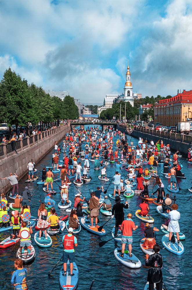
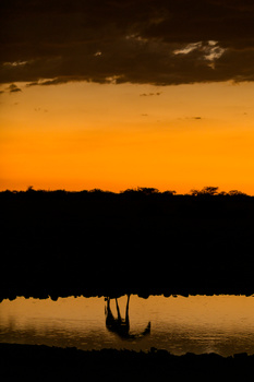
A great turn makes a great traffic.
Contest Submissions
Click on the thumbnails below to comment and rate each image.
Click here to learn about the Fstoppers rating system and what each star value means.
Click on the thumbnails below to comment and rate each image.
Click here to learn about the Fstoppers rating system and what each star value means.


2 Comments
The image might work better if you were further to the right. So you would be able to center the canal and leading lines.
But mainly, it's over processed.
The colours are way too saturated. especially the reds and oranges. They're way too red, and way too orange
Thank you, yeah its was a bit tight so I try to be on distance, so it's a choice between better angle and "situation" probably
About this, its like old song about screens and settings on them - one color on smartphone, different on monitor (and different monitors), different on tv... I check that the colors not flat, I would say its about taste.