
If you’ve ever looked at National Geographic’s “Your Shot” favorites and thought, “I could never compete with that,” you’re not alone—and you’re also probably aiming at the wrong target. Most photographers assume editors are hunting for the sharpest file, the cleanest composition, or the most technically “correct” exposure. A picture editor’s job isn’t to find the most perfect photograph. It’s to find the photograph that can carry attention, meaning, and credibility—fast—and still feels worth returning to later.
National Geographic’s ten favorites from the Your Shot Pictures of the Year 2025 challenge were curated by photo editor Anne Farrar from “thousands of stunning submissions.” Farrar has said she kept returning to the images that stayed with her “visually and emotionally,” and that each final image stands out “for a different reason.” That’s the key: there isn’t one “Nat Geo look.” There are diverse ways a photograph earns its place.
When I asked Farrar what she prioritized most while curating this selection, her answer was a blueprint: emotional resonance (images that linger and spark curiosity), visual strength and craft (composition, light, originality), and storytelling impact—how effectively a photograph contributes to a larger narrative or deepens understanding of its subject.
That framework instantly clears up what “Nat Geo-quality” means in practice. It’s not about exotic locations or a bigger lens. It’s about whether your image does three things at once:
-
It sticks emotionally—you feel it before you analyze it.
-
It holds up visually—the craft supports the idea instead of distracting from it.
-
It says something true—it’s not just pretty; it deepens understanding.
And there’s a non-negotiable under everything: truth. Farrar is blunt about it—staging or fabricating images is never acceptable, and National Geographic does not support heavy manipulation, removing elements, or “over-toning” for clarity. The world is already incredible. The job is to be observant, curious, patient, and let the moment arrive without bending reality to fit a pre-visualized fantasy.
That last point is more practical than it sounds. Farrar told me she often sees photographers put pressure on themselves chasing a “what if” image they imagined ahead of time—because, of course, the world doesn’t always cooperate. Giving yourself room to breathe in the field can open up more surprising ways to see, especially with moment-driven photographs where the best frame can’t be forced.
Here’s how I’m going to break down Nat Geo’s Your Shot selections. Because usage requirements limit publication to four images online (and cropping isn’t permitted), I’m not going to do a slideshow. I’m going deep instead: four case studies that each win for a different reason—one built on character, one built on atmosphere, one built on hidden story, and one built on unmistakable stakes. For the full set of ten and the original captions, start with National Geographic’s story.
Before we jump in, one more thing Farrar made clear: captions matter. For this set, she considers context and captions just as important as the photos themselves—because details about how, why, and what is happening clarify the story, especially in moment-driven wildlife images where behavior is key. In other words, the image comes first, but the caption is what turns a solid frame into an understood one.
Chapter 1: Emotional Resonance: Images That Linger and Spark Curiosity
Anne Farrar’s first criterion for curating these Your Shot selections wasn’t technical perfection—it was emotional resonance: photographs that linger, images that spark curiosity and keep pulling you back for a second look. That’s a deceptively high bar, because “emotion” doesn’t mean sentimental. It means the picture has adhesive power. It grabs you quickly, then rewards you for staying.
One way to spot emotional resonance is simple: the image feels like a meeting, not a viewing. You don’t just register a subject; you feel a presence. That’s why portraits can do it. It’s also why wildlife can do it when it isn’t treated like a checklist. The best frames don’t shout, “Look what I saw.” They whisper, “Come closer.”
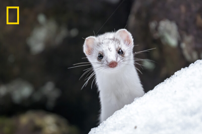
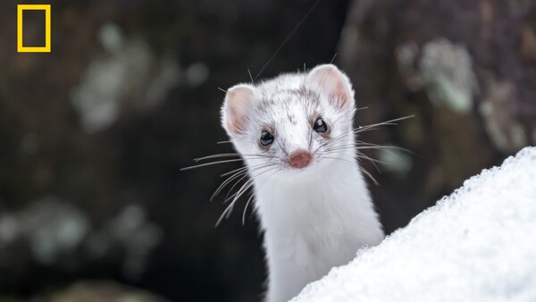
This stoat in Hokkaido, Japan, emerged from a gap between the rocks slowly, as if checking that everything was still quiet. It looked at me for a second. It did not seem scared, just curious. All white in the snow, with those tiny spots on its head, it looked like a little mountain ghost. (Photo by Michel Godimus)
Case Study: The Stoat in Snow (@yosomono.photography)
This photo works immediately because it’s built around a universal human reaction: “Who are you?” The stoat isn’t mid-sprint or mid-hunt. It isn’t presented as “rare wildlife.” It’s presented as a character—bright, alert eyes, a small pink nose, whiskers like punctuation marks. It’s the kind of face you don’t just look at—you answer it.
Here’s the quiet brilliance: the photographer doesn’t try to fill the frame with the stoat. The stoat emerges from the environment like a thought, not a trophy.
-
The snowbank becomes a stage. That hard, bright wedge in the foreground gives the animal a “peek” moment—like it’s stepping into the frame from behind a curtain.
-
The background stays dark and soft. That’s not just shallow depth of field; it’s restraint. The scene doesn’t compete with the subject. The stoat is allowed to be the entire point.
-
The expression does the heavy lifting. This is the part photographers can’t fake in post. It’s timing and patience. The moment feels curious rather than frantic, which is why it reads as intimate instead of chaotic.
And because Nat Geo’s usage requirements don’t allow cropping, it’s worth saying aloud: this is a composition that earns its space. The negative area isn’t wasted—it’s mood. It’s the quiet around the subject that makes the subject feel louder.
If you want to sound “smart” in your writing, don’t over-technicalize this. Call it what it is: presence. Editors see thousands of technically competent photos. The ones that linger are the ones that feel alive.
How to Create Emotional Resonance Without Chasing Rare Moments
Most photographers think emotional resonance requires a once-in-a-lifetime encounter. That’s the trap. What it requires is a repeatable skill: building anticipation into the frame.
The Enemy of Resonance: The “What If” Fantasy
This is where Anne’s advice gets quietly brutal—in an effective way. When I asked her what “rule” photographers obsess over that matters less than they think, she didn’t talk about the rule of thirds or ISO. She talked about the obsession that ruins photographs in the field: the mental pressure of chasing a pre-visualized “what if” image.
We all do it. We imagine the dream frame—perfect angle, perfect behavior, perfect light—and then we walk into the real world and try to force reality to cooperate. That pressure can make you miss the better picture happening right in front of you. Anne’s point is that giving yourself space to breathe often opens more creative ways of seeing, because moment-driven images are often impossible to preplan. The world doesn’t care about your storyboard.
Read that again, because it applies directly to why the stoat photo works: it doesn’t feel forced. It feels discovered.
If you’re shooting wildlife, this matters even more. The strongest frames often come from observing behavior rather than trying to stage “action.” If you’re shooting everyday life, the strongest frames come from letting life unfold rather than directing it into something performative.
So, here’s the real “emotional resonance” workflow:
-
Show up with an idea, sure.
-
But don’t strangle the scene with it.
-
Stay curious long enough for the scene to give you something you didn’t plan.
What Emotional Resonance Looks Like in Editing (Without Breaking “Truth”)
Emotional resonance is not created by nuking contrast until the image screams. If anything, over-processing kills resonance because it makes the viewer aware of the edit instead of the moment. The stoat photo is a great model here: it feels clean, natural, and calm. The emotion comes from the encounter, not the slider work.
That lines up perfectly with Anne’s bigger non-negotiable (which we’ll hit harder later): truth first. The editorial standard isn’t “make it dramatic.” It’s “make it honest—and strong enough that it doesn’t need manipulation to hold attention.”
Transition: Why This Matters for the Rest of the Selections
The stoat wins on resonance because it creates a tiny, intimate collision between viewer and subject. Next, we’re going to look at a different kind of “linger”—not character, but atmosphere: a winter landscape where light and color do the emotional storytelling. That’s the craft side of the equation, and it’s where a lot of photographers accidentally sabotage themselves by pushing too hard.
If you’re trying to build “Nat Geo-quality” work, this is your first checkpoint: Can your image make someone feel something before they read a caption? If the answer is yes, you’re in the game.
Chapter 2: Visual Strength & Craft: Composition, Light, and Originality
If Chapter 1 is about the photograph’s heartbeat, Chapter 2 is about its bones. Anne Farrar’s second criterion for curating the Your Shot selections was visual strength and craft—composition, light, and originality. That might sound obvious, but here’s the difference between an editor’s view of “craft” and the internet’s view: craft isn’t a style. It’s a form of clarity. It’s the set of decisions that makes an image readable, believable, and memorable without needing explanation.
Anne also described what this looks like in practice when you’re reviewing thousands of submissions: she’s used to comparing images against one another, especially those with similar content, and narrowing based on surprise, visual strength, uniqueness, color palette, authenticity, and the moment captured. That’s the real context for craft. It isn’t judged in a vacuum. It’s judged against other “good” photos of the same subject, which is why technical competence alone rarely wins. Competence is common. Specificity is rare.
The Editor’s First Pass: Why Familiarity Kills (Even When the Photo Is “Good”)
One of the most revealing things Anne said—because it’s both gentle and ruthless—is that a common reason a strong photo doesn’t make the final cut is a sense of familiarity: images that feel like ones we’ve seen before. Add to those challenges with light or toning, composition, or the strength of the moment captured, and a photo that’s objectively “nice” becomes editorially invisible.
That’s a hard truth for photographers because we’re trained to chase proven formulas. The problem is: proven formulas create proven-looking pictures.
From an editor’s perspective, the craft question becomes: What did you do with this scene that isn’t automatic? What did you notice that someone else would miss? Did you use light intentionally, or did you simply record what was there? Did the composition create meaning, or did it merely avoid mistakes?
That’s why this next image is a perfect case study. It’s a scene we’ve all seen versions of—snow, a church, a hill, winter blue hour—and yet it doesn’t feel generic. It feels authored.
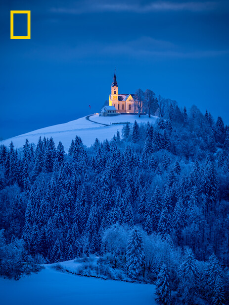
In the early morning blue hour, St. Lenart Church in Crni Vrh, Slovenia, stands like a beacon above the snow-covered landscape. Its warm lights cut through the cold, creating a perfect contrast between winter stillness and human presence. (Photo by Nina Lozej)
Case Study: Blue Hour Church on a Snowy Hill (@ninalozej)
This photograph is a masterclass in craft because it uses restraint as a weapon.
At first glance, it reads simply: a church perched on a hill, surrounded by a winter forest. But “simple” is the trick. The image doesn’t rely on spectacle—no exploding sky, no gratuitous flare, no forced HDR crunch. The scene is quiet, and the craft is what makes that quiet powerful.
1. Light as Story (Not Decoration)
The emotional engine here is the relationship between two kinds of light:
-
The world is bathed in deep blue—cold, still, almost soundless.
-
The church glows warm—human, sheltered, alive.
That contrast isn’t just pretty. It’s narrative. In a single frame, you understand something about winter: the outside is vast and indifferent; the inside is refuge. It’s a visual metaphor that doesn’t need a caption.
And the photographer doesn’t oversell it. The warm light is controlled, not blown out. The blue isn’t pushed into neon. The balance feels intentional, which is what makes it believable.
2. Composition That Feels Inevitable
The church isn’t centered in the frame like a postcard. It’s placed with enough room to breathe, with the hill acting as a natural stage. The foreground snowfield leads you in gently, not aggressively. The dense trees below create texture and scale—so you feel how isolated the building is without the photographer having to “explain” it.
There’s also something quietly smart about the way the image is layered:
-
Foreground: a soft, open field of snow—space, calm, silence
-
Midground: dark, frosted trees—density, texture, depth
-
Subject: the church on the hill—meaning, focus
-
Background: a clean, minimal sky—nothing competing for attention
That layering is craft. It’s how you keep a landscape from turning into a flat wall of “winter stuff.”
3. Color Palette Discipline (The Underrated Superpower)
Anne mentioned she narrows selections partly by color palette.
The palette is basically three notes:
-
Deep winter blue
-
Neutral snow
-
Warm amber light
That’s it. The image remains controlled, giving it a cohesive, intentional feel rather than chaos. Landscape photos often falter when photographers over-edit with excessive saturation or clarity, but this photo embraces mood instead.
4. Originality Without Forcing It
A church in snow isn’t a new subject. The originality here is in the feeling. It doesn’t scream, “Look at this amazing place.” It whispers, “Listen to the silence.” That’s how you beat familiarity. You don’t need a new location—you need a new way of seeing.
This is what editors respond to: not novelty for its own sake, but specificity—a photo that feels like it could only be made by someone who waited for this moment, in this light, with this restraint.
How to Apply This Craft Lesson Close to Home (Without Turning It Into a Postcard)
If you want to use this chapter’s standard—composition, light, originality—here’s a practical framework that doesn’t feel like a YouTube checklist.
The “One Landmark, Three Moods” Assignment
Pick one local subject you think you’ve “seen a million times.” A courthouse. A church. A water tower. A bridge. A downtown corner. A lone tree on a ridge. Something ordinary in your world.
Then shoot it three times, aiming for three different emotional reads:
-
Blue hour/winter light: quiet, stillness, restraint
-
Hard midday: graphic shapes, contrast, clarity (not “pretty,” but strong)
-
Weather moment: fog, rain, snow, wind—let the atmosphere do the storytelling
The goal is not to collect three versions. The goal is to learn how craft changes meaning. Your “Nat Geo-quality” upgrade is learning that light is content.
The Craft Trap: “Fixing” the Photo Until It Stops Feeling Real
This is where Anne’s non-negotiables start to matter even in a landscape. She’s explicit: truth comes first. Staging or fabricating is never acceptable, and Nat Geo doesn’t support heavy manipulation—over-toning or removing elements “for clarity.” That matters here because winter scenes tempt photographers into over-processing: deepening blues until they look synthetic, pulling detail from shadows until everything becomes flat, turning snow into a strange glowing substance that no longer feels like snow.
The irony is that the more you try to force “wow,” the more you often lose the very thing that made the scene worth photographing: atmosphere.
If you want your landscapes to feel editorial, take the church photo as a model:
-
Let the scene stay quiet.
-
Let the palette stay disciplined.
-
Let the light be the story.
-
Don’t polish the life out of it.
Transition: Craft Is the Bridge Between Beauty and Meaning
The church image proves that visual craft isn’t a separate category from emotion; it’s how emotion becomes legible. It’s the scaffolding that holds the mood in place.
Next, we’re going to shift from atmosphere to storytelling impact—the images that don’t just look good, but deepen understanding. And we’re going to do it with a subject most people literally walk past: a tiny, close-to-home moment that becomes a full Nat Geo story once you really see what’s happening.
Chapter 3: Storytelling Impact: Images That Deepen Understanding
Anne Farrar’s third criterion is where “Nat Geo-quality” stops being an aesthetic and becomes an editorial standard: storytelling impact—how effectively an image contributes to a larger narrative or deepens understanding of the subject. This is the category most photographers think they’re doing when they say, “I’m telling a story,” but in practice, a lot of photos only deliver a vibe. Editorial storytelling is stricter. It asks: What does the viewer understand after seeing this that they didn’t understand before?
That’s why this chapter pairs so naturally with something Anne emphasized about the Your Shot picks: captions and context are just as important as the photos themselves. The image comes first, but explaining how, why, and what is happening adds real value—especially with wildlife and moment-driven images, where understanding behavior is the difference between “cool” and “meaningful.”
So, let’s define what “storytelling impact” looks like in a single frame before we get into the case study:
What Storytelling Impact Looks Like in One Photo
A photo has storytelling impact when it does at least one of these things:
-
Reveals the unseen: it turns a hidden process into something visible.
-
Clarifies behavior: it shows an action and helps you understand what you’re seeing.
-
Creates implication: it hints at a before and after (you can imagine what happened and what will happen next).
-
Changes scale: it makes you feel the size, fragility, complexity, or intimacy of something real.
-
Teaches without lecturing: it makes you curious enough to learn more.
The easiest way to evaluate storytelling impact is simple: If you removed the caption, would the image still create a question? If the answer is yes, you’re halfway there. If the caption then answers the right question—without overexplaining—you’ve got the full editorial package.
Case Study: Macro Insect + Eggs on a Leaf (@ali_nature)
This is the kind of image that separates “good macro” from editorial storytelling.
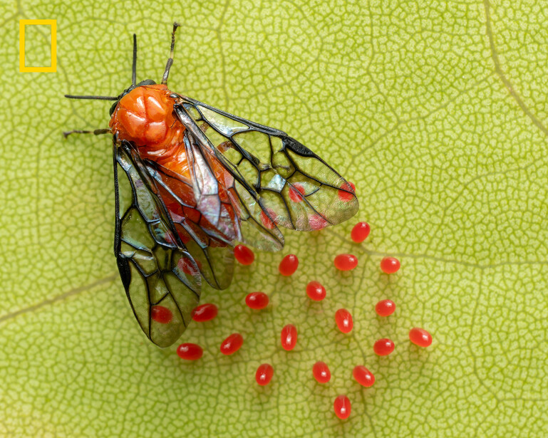
At first glance, it’s striking: a small insect with an orange body and glassy, veined wings, positioned against a leaf that looks like a topographic map. Then you notice the red eggs scattered nearby—and suddenly it isn’t just a clean close-up. It’s a moment in a life cycle. It becomes biology, not decoration.
This is why macro belongs in Nat Geo’s orbit. It’s not a niche. It’s one of the most powerful ways to show the world as it is: layered, intricate, and happening whether we pay attention or not.
1. The Photo Doesn’t Just Show a Subject—It Shows a Process
The eggs change everything. They convert the image from “here’s a bug” to “here’s a consequence.” Something has happened. Something is about to happen. The frame becomes a story with tension—quiet tension, but real tension. In editorial terms, that’s impact.
The most common failure in macro is obsession with surface: sharpness, magnification, perfect bokeh. This image uses craft in the service of meaning. The detail isn’t the goal; the detail is the delivery system for the story.
2. The Background Isn’t Background—It’s Context
That leaf isn’t just green. It’s a patterned field of veins that reads like a landscape. It gives the subject a world. It also creates a subtle hierarchy that helps the viewer “read” the image:
-
The orange body pulls you in first.
-
The wings hold you there with structure and translucence.
-
The red eggs become the “oh wait” discovery.
That “oh wait” moment is storytelling impact in miniature. Editors love images that offer a second reveal, because they keep the viewer engaged longer than the first glance.
3. Color Supports the Narrative (Without Feeling Artificial)
This is one of those images where you can tell restraint probably mattered in post. You’ve got three dominant color notes—green leaf, orange body, red eggs—and the whole image reads cleanly because the palette doesn’t get chaotic.
This is a good place to reinforce Anne’s truth-first standard in a non-preachy way: macro photographers are tempted to over-tone and hyper-saturate because the subject is small and the details are fun. But the moment the color starts to look synthetic, the story starts to feel staged—even if it wasn’t. The viewer stops trusting the frame.
Editorial storytelling depends on trust. You can’t deepen understanding if your photo feels like it was “built.”
4. Accessibility Is Part of the Story
Here’s the point that’s easy to miss: macro storytelling is one of the most democratic forms of “Nat Geo-quality” photography. You don’t need a passport. You don’t need a guided expedition. You need curiosity and repetition.
Anne touches this principle directly in her advice to photographers shooting close to home: your home can be someone else’s unique experience. Familiarity gives you time to experiment and create without the pressure (and cost) of travel. Macro is the purest version of that philosophy because the subject matter is literally everywhere—if you train your eyes to see it.
In other words, the “Nat Geo” part isn’t the location. It’s the attention.
How to Build Storytelling Impact in Your Own Work (Without Becoming “Caption Dependent”)
Now let’s turn Anne’s caption point into something practical.
The Editorial Caption Rule: The Image Comes First, the Caption Clarifies the Right Question
If your image doesn’t create curiosity on its own, your caption won’t save it. But if your image creates curiosity and your caption clarifies behavior, context, or stakes, you elevate the work into editorial territory.
Here’s a tight caption template that works for almost any Your Shot–style submission:
-
Where are we? (location + setting)
-
What is it? (species/subject, in plain language)
-
What’s happening? (the action/process, not a guess)
-
Why does it matter? (one sentence of meaning—ecology, behavior, rarity, timing, human connection)
Keep it short. Keep it honest. No poetry-as-smokescreen. The goal is clarity.
The Biggest Storytelling Mistake (and Why It’s So Common)
A lot of photographers confuse “story” with “vibe.” They post an image that feels dramatic and then write an emotional caption to assign meaning to it. That can work on social media, but editorially it’s fragile. If the story isn’t in the frame, it won’t last.
Macro is a great teacher here because it forces you to be honest. You can’t rely on epic scenery or dramatic weather. The image either reveals something real, or it doesn’t.
The @ali_nature image reveals something real: a small creature in a moment that implies a larger biological narrative. That’s Nat Geo storytelling in its purest form.
Transition: Storytelling Impact Becomes Unmistakable When Stakes Enter the Frame
Next, we’re going to look at the kind of image where story isn’t subtle at all—where the stakes are immediate, the behavior matters, and Anne’s point about captions becomes critical. It’s the capstone case study: the moment where emotional resonance, visual craft, and storytelling impact collide in one frame, and you can feel your body tense before your brain catches up.
Chapter 4: The Capstone: When Resonance + Craft + Story All Collide
Chapters 1–3 are the building blocks—emotional resonance, visual strength and craft, and storytelling impact—while Chapter 4 is what happens when all three come together. This is the kind of image that doesn’t need an argument. You feel it immediately, you understand what matters, and the craft is strong enough that nothing distracts from the moment.
It also happens to be the kind of photograph where Anne Farrar’s caption point becomes non-negotiable. She was clear that for this set of images, context and captions are just as important as the photos themselves. The image comes first, but explaining how, why, and what is happening adds huge value—especially for moment-driven wildlife where behavior is key to appreciating what you’re seeing. That’s not PR-speak. It’s editorial reality. Wildlife photography without truthful context can slide into spectacle fast.
This image avoids that. It’s spectacular—but it’s also legible.
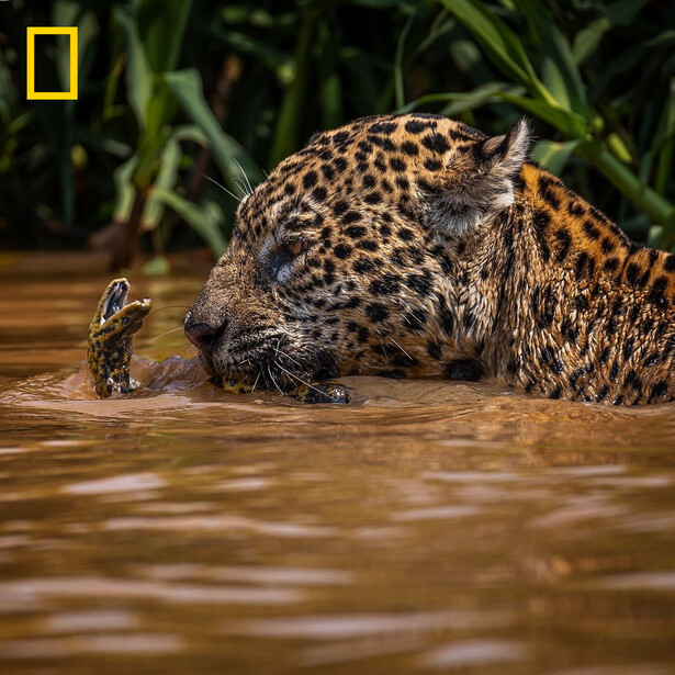
Case Study: Jaguar Confronting Prey in Water (@arybassous)
At first glance, this photo is pure tension: the jaguar’s face nearly meets its prey, both suspended in muddy water. The scene is intimate to the point of discomfort. You can practically feel the resistance of the current. You can imagine the sounds you’re not hearing.
That’s emotional resonance. It’s visceral. Your body reacts before your brain finishes labeling what’s happening.
But the reason this frame earns “capstone” status is that it isn’t only visceral. It’s also crafted and informative in a way that deepens understanding.
1. Resonance: The Image Feels Like a Breath Held Mid-Chest
This is one of those frames that makes you lean forward. The tension lives in the space between faces. Not a dramatic distance—an intimate one. There’s no room for the moment to feel abstract.
That’s the first “Nat Geo quality” marker: the photo doesn’t merely show wildlife. It makes you feel present in a real moment that could turn at any second.
And unlike a lot of wildlife images, it isn’t using aggression as the only emotional lever. The jaguar isn’t screaming or leaping. It’s concentrated. It’s close. It’s controlled. That calmness makes it more intense, not less.
2. Craft: Perspective and Simplicity Make the Moment Unavoidable
The craft in this frame is doing something important: it removes escape routes for the viewer.
-
Eye-level perspective: You’re not looking down from a safe distance. You’re in the same plane as the animal, which compresses psychological distance.
-
Clean subject hierarchy: The jaguar’s face is the anchor, and the prey is the counterpoint. The background exists, but it isn’t screaming. It gives context without stealing attention.
-
The water becomes negative space: The muddy surface is not “empty”; it’s a stage. It isolates the action and keeps the viewer’s focus where it belongs.
This is the difference between “I saw something crazy” and “I made a photograph.” The scene is dramatic, yes, but the photographer’s decisions are what make it readable in one second.
This also ties directly to Anne’s comment about a common reason strong photos miss the final cut: problems with composition or the strength of the moment. This image doesn’t have either issue. The moment is unmistakable, and the composition supports it instead of complicating it.
3. Storytelling Impact: Behavior You Can Understand (And Learn From)
The power of this image isn’t just that it’s wild; it’s that it contains a narrative you can read:
-
Predator and prey
-
Confrontation
-
Uncertainty
-
Imminent resolution
Even without a caption, you know something is happening right now.
But the caption is what elevates it into editorial storytelling because wildlife photos are often misunderstood when viewers don’t know the behavior. Anne pointed out that she isn’t familiar with every species or location, and details about setting and action help clarify the story, especially for moment-driven wildlife images where understanding behavior is key.
That’s the subtle editorial standard here: a great wildlife photo isn’t just a dramatic frame; it’s a truthful frame with interpretable behavior. The viewer doesn’t just feel something—they learn something, even if it’s as simple as understanding what’s at stake in the interaction.
The Guardrail: “Truth First” Matters More Here Than Anywhere Else
This is the chapter where Anne’s non-negotiable becomes more than a philosophical stance. It becomes the foundation.
Anne was blunt about “Nat Geo-quality” in community submissions: truth in photography always comes first. Staging or fabricating images is never acceptable. National Geographic does not support manipulation like heavy toning or removing elements for clarity. Reality is the point, and building your craft to capture moment-driven images takes time and patience.
That standard matters most in high-stakes wildlife work because the temptation is strongest right here:
-
To push toning until the scene looks more violent or cinematic than it was
-
To clean up the frame to make the narrative “clearer”
-
To exaggerate reality into mythology
But editorial wildlife photography lives or dies on credibility. You can’t deepen understanding if the viewer suspects the image has been “built” rather than witnessed.
So, if you want the editorial version of this genre, don’t chase drama. Chase truth. The drama will show up on its own when the moment is real.
A Note on Ethics (Brief, but Necessary)
This is where many writers either sound preachy or sound naive. The professional move is simple: acknowledge the ethical stakes without assuming facts you don’t have.
You can say something like:
-
“Nat Geo’s standard is clear: no staging or fabrication.”
-
“In wildlife imagery, that also means responsible practices in the field—avoiding behavior manipulation for the sake of the shot.”
-
“Captions and context matter because they show the viewer what’s real, not what’s implied.”
Then you move on. You don’t accuse. You don’t speculate. You simply anchor the standard and show that you understand why it exists.
The Practical Lesson: Stakes Don’t Require Danger
Here’s where you turn a jaguar image into a useful tool for every photographer reading Fstoppers—without turning it into a motivational poster.
Most people hear “stakes” and think danger. But editorial stakes can be smaller and still powerful:
-
A decision about to be made
-
A tension between two people
-
A near-miss in sports
-
A quiet goodbye
-
A kid about to jump and then not jump
-
A storm about to break
-
A moment of discomfort someone is trying to hide
The jaguar photo teaches the principle: a story peaks at the threshold. The moment just before something changes often contains the most energy.
If you want to apply this to everyday work:
-
Look for thresholds: before/after, approach/retreat, yes/no, reveal/hide.
-
Compose so the threshold is obvious.
-
Don’t over-edit. Don’t over-narrate. Let the moment carry itself.
Transition: Why Great Photos Still Don’t Make the Cut
At this point, it would be easy to think, “So the trick is just finding great moments.” But Anne’s answers point to a harsher reality: plenty of strong photos still don’t make the final selection—often because they feel familiar, or the light/toning undercuts the authenticity, or the composition doesn’t elevate the moment.
That’s where we’re going next: the rejection pile. Not to roast anyone, but to show what editors quietly filter out—and how to avoid making the same mistakes, even when your subject is strong.
Chapter 5: The Editor’s Triage: How Strong Photos Get Cut Fast
When Anne Farrar says a strong photo can miss the final cut because it feels familiar, she’s describing the most brutal part of editing: selection isn’t about finding “good” images—it’s about eliminating images that don’t hold up in comparison to hundreds of other good ones. Once you accept that, “Nat Geo-quality” starts to look less mystical and more like a set of practical filters you can apply to your own work before you ever hit submit.
Below is an editor-style triage pass—what gets cut quickly, why it happens, and how to fix it without turning your photo into something fake.
1. Familiarity Flags: The “I’ve Seen This” Problem
Familiarity rarely means your photo is weak. It means the visual idea is common. Editors see the same subjects and the same treatments repeatedly.
Red flags:
-
Iconic subject + predictable viewpoint
-
A trendy grade that makes the image feel borrowed
-
A “great location” doing all the work
-
A subject that reads as generic without context
Fix: Change one meaningful variable—perspective, timing, or story context. If your photo could be swapped with 50 others and still feel the same, it’s at risk.
2. Toning Tells: When the Edit Announces Itself
Anne’s “truth first” standard applies here even when the subject is spectacular. Heavy toning can make a real moment feel manufactured.
Red flags:
-
Crunchy clarity/micro-contrast that turns texture into grit
-
Neon blues/greens that don’t feel natural
-
Over-sharpening halos on edges
-
Plastic-looking noise reduction or skin/water smoothing
Fix: Back off until the moment is the first thing you notice again. If viewers comment on your “edit” before your subject, you’re likely overcooking it.
3. Composition Dead Zones: When the Eye Won’t Settle
Many images fail compositionally without looking “wrong.” They’re hard to read quickly.
Red flags:
-
No clear subject hierarchy (everything has equal weight)
-
Background merges with subject (especially wildlife)
-
“Interesting stuff” scattered everywhere, no focal anchor
-
A frame that only works if you crop later
Fix: Ask one question: Where does the eye land first? If you can’t answer instantly, simplify the frame in camera.
4. Moment Flatness: Pretty, But Not Decisive
A technically strong image can still feel like a screenshot of a scene rather than a photograph with consequence.
Red flags:
-
No gesture, no tension, no behavior, no change implied
-
The image describes, but doesn’t reveal
-
The “best part” is the atmosphere only, with no story spark
Fix: Look for thresholds—the instant before/after something changes: approach/retreat, reveal/hide, contact/miss, decision/hesitation.
The 20-Second Self-Edit (use this every time)
-
What’s the story in one sentence?
-
What’s the first place the eye lands?
-
Does it still feel believable after processing?
-
What makes this version different from the “standard” version of the subject?
That’s the triage. Next, we’ll flip it into a solution: why shooting close to home—returning to the same places with patience—can be the fastest way to escape familiarity and make photographs that feel genuinely new.
Chapter 6: Shoot Close to Home: The Anti-Travel Advantage
There’s a reflex photographers have when they see a National Geographic gallery: “Of course it’s good—they traveled.” It’s an understandable assumption, and it’s also one of the fastest ways to talk yourself out of making better work. Anne Farrar’s advice cuts right through that mindset: your home can be someone else’s unique experience. Familiarity doesn’t make a place less meaningful—it gives you time, comfort, and repetition, which are exactly the ingredients that help photographs become less familiar and more specific.
In other words, shooting close to home isn’t a limitation. It’s an advantage.
Why “Close to Home” Is Where Nat Geo–Quality Is Built
Travel can give you novelty. Home gives you access—and access is what editors respond to. When you keep showing up to the same place, you start to notice what casual visitors miss: patterns, rituals, behaviors, weather shifts, and insignificant changes over time. You also stop performing for the camera. You can experiment, fail, try again, and build a real relationship with your subject. Anne called it a low-pressure environment, no travel costs, no ticking clock, and more room for curiosity.
That ties directly to her three criteria:
-
Emotional resonance grows when you understand a place deeply enough to anticipate the moments that will “linger.”
-
Visual craft improves because you can return for better light instead of settling for whatever you got on one trip.
-
Storytelling impact becomes possible when you can photograph a subject as a process, not a one-off event.
And it also solves the biggest triage problem from Chapter 5: familiarity. The irony is that the best way to beat “I’ve seen this before” is to photograph the same environment long enough that you start seeing it differently.
Captions: The Part Most People Skip (And Editors Don’t)
Anne emphasized that for this set, context and captions are as important as the photos themselves. You don’t need to draft a novel, but you do need to respect the viewer’s need to understand what they’re seeing, especially with behavior-driven images.
Great captions don’t decorate the photo. They clarify it.
Closing: “Nat Geo–Quality” Isn’t a Look—It’s a Discipline
If you take one thing from these Your Shot selections, let it be this: “Nat Geo-quality” isn’t a preset, a lens, or a destination. It’s a discipline of attention. It’s emotional resonance that lingers. It’s craft that makes a scene readable. It’s storytelling that deepens understanding. And under all of it is truth—no staging, no fabrication, no manipulation that breaks trust.
If you want to see National Geographic’s full set of 2025 Your Shot favorites and read the original captions, start with Nat Geo’s story here.
Farrar also emphasized that the Your Shot community is “truly special” for its depth and global reach, and that she’s excited to see what photographers create next. That’s the right way to think about this project—not as a contest you’re trying to “game,” but as proof that strong photography is still built the old-fashioned way: curiosity, patience, and honest craft.
And if you’re trying to build your own Your Shot–caliber work, don’t wait for a trip. Pick one place near home, return until it stops feeling ordinary, and photograph what it’s really like to live there. That’s the kind of authenticity editors recognize—because it can’t be faked.
All images used with permission.


Join the Fstoppers community for free
-
Post comments and join in the discussions
-
Browse the site ad-free
-
Share your work and get featured in the community
-
Compete in the photo contests for fun and prizes
26 Comments
One of the best articles I have read in a long time. Full of interesting ideas and a clear way to think about what is really important in a photograph. Bravo!
Thank you Steve, much appreciated!
national geographic had a very fine open photo-community for everybody (not only subscribers) - with a lot of amateur's photos way better than the images shown by national geo-professionals :)) what happened then? soon after they nat-geo was sold to disneys, they closed that photo-community - whithout any explanation.
this user/reader challenge above is a far cry from former quality pics - once again, photo treated with ai-photoshop & co till they bleed colors and shimmers: pure kitsch.
Appreciate you sharing that, Fabio — I remember that community too, and a lot of the work in it was genuinely excellent.
My article was focused on why editors pick certain frames (readability, story signal, emotional pull), not on saying every pick is “better” than what the community produced. And I’m with you on the bigger issue: when processing (or AI tools) starts to feel like the subject, it can pull the photo out of documentary territory and into illustration/kitsch pretty fast.
Where I think we can all agree is the line should be clarity + disclosure: if something is heavily composited or AI-assisted, label it; if it’s presented as documentary, keep the edits honest.
One of your best ever stories. I photograph sports and marching bands. Much of this applies to those also.
That means a lot Harry, thank you.
Great article. A ton of great info.
Much appreciated Jeffrey, thanks for reading!
After all the information and helpful suggestions, doesn't an image that "lingers and sparks curiosity" lie in the subject of the photo itself? The critters in these images are of no particular interest to me. My curiosity is not sparked, and I won't remember them beyond writing this comment. Ansel Adams said it better: "The photograph either speaks to you or it doesn't."
Thinking about National Geographic, it seems like the magazine has evolved in significant ways over the decades, which may have something to do with how they respond to images. When I was a youngster in New Jersey (like 50-60 years ago), the stories in Nat-Geo would take me to a place for which I was totally unfamiliar. I could see lands and people that were very different than suburban New York City. It was mostly a visual experience.
Presently, Nat Geo seems to focus on social issues of our time: migration, pollution, climate change. Social commentary has become more important than visual awareness of different cultures. Their pictures need a strong story beyond just showing a place. Images merely provide visual evidence and support for the text. What used to be a comfort and refuge by making the world feel more connected, the magazine now makes the world feel like a disconnected and hopeless mess. Maybe I'm looking back in time with rose colored glasses, as adults looking back at childhood are inclined to do. It just feels like the magazine has changed, which potentially impacts criteria for judging a photograph.
And not to be overlooked, National Geographic has also published a number of composited and artificially enhanced images lately, which seems a little odd considering pure unretouched image honesty is a top priority. From the article: "So, if you want the editorial version of this genre, don’t chase drama. Chase truth. The drama will show up on its own when the moment is real." How do they justify publishing images such as this? The moment is definitely not real.
Thanks for taking the time to write this out. I hear you on the “does it linger and spark curiosity?” test—when an image doesn’t connect, it doesn’t connect, and that’s a real viewer experience (and a valid one).
What I was trying to do in this article wasn’t claim every selection will resonate with every reader, but to break down the editorial craft behind why certain images get elevated—readability, clarity, story signal, and emotional impact, even when the subject itself isn’t personally interesting to a particular viewer.
On the bigger shift you’re describing: National Geographic has definitely evolved over decades, and it’s fair to feel nostalgic for the era when the assignment was primarily “take me somewhere unfamiliar.” I’d argue the best work can still do both—reveal a place and carry meaning—without turning the frame into a lecture.
On composites/AI/“not real” moments: I’m with you that honesty matters. The key distinction (for me) is disclosure and intent. If something is an illustration/composite, it should be labeled as such; if it’s presented as documentary photography, the standard has to be higher. My “chase truth” point is aimed at how we shoot and edit documentary images—not a defense of undisclosed manipulation.
If you’re up for it, I’m curious: which kinds of images do reliably “speak to you” now—people/culture, wildlife behavior, landscapes, or something else?
Great question. Thanks for asking. I'm not sure that I've ever had to put my preference for what speaks to me into words. I believe it was Ansel Adams who said: "You don't take a photograph, you make it." Images which resonate most strongly with me are those which appear to showcase that intentional, creative process. I like to see the hand of the photographer (figuratively speaking) in a picture. A common or mundane subject in a distinctive or unusual manner, perhaps. To the point of "making" an image, I like being able to take all the time I desire to shape, style and craft a photograph. I like more complex vs minimalist images for that reason. Minimalist photos are fine for wall art. When I sit with a book or print in my lap, I prefer something which gives me the opportunity to take my time exploring the fine detail.
More specifically, images that have some sort of a human element appeal to me, especially historical images. I enjoy shooting inanimate objects where I'm not bound by client time or expectations. I've made a small collection of images of musical instruments (which I consider to be human elements) because I feel that they're simply beautiful objects. Our piano is my favorite piece of furniture in the house. I like up-close and personal views... images of subjects that fill the frame catch my eye. I always tell newer photographers to look for the picture within the picture. In other words, get closer to your subject. I find that sort of composition generally more compelling. I love texture so old buildings and gritty workplace images appeal to me. I can spend hours making photographs in a dirty old machine shop. If I was a lot younger and starting out, I'd choose portrait photography over anything else. I'm attracted to portraits that feel real rather than unnaturally posed for the sake of fashion. I enjoy environmental portraits more than formal studio shots; they open the door for creativity. Images that speak to me are the ones I could say: "I wish I had made that." If there's a story implied in the image, fine, but that's of no great importance to me. I think that's a concept largely overrated. I enjoy a photograph for the sake of the image, as it stands on its own, without any backstory or explanation.
I suppose I have to say something about landscape photography since virtually everything for the first ten years of my journey in photography was taking landscape pictures. Notice I said taking rather than making. But now after a couple decades, common landscapes might catch my eye for a moment but rarely hold my attention. When I started shooting landscapes, I never held back on the saturation slider... now it makes me cringe. These days, I much prefer rich tonal values and detail in a black and white photograph, especially with my landscapes. It's not very fashionable to say so these days (to the point of the Nat Geo), but I'm attracted to technical qualities. Subtle gradations of tone in black and white really captivate me.
Speaking of vintage photography, I've held on to a collection of photographs and picture postcards from when I was a kid. This is actually a photo of a postcard of the Oklahoma City Airport in 1963. Thought you might be interested in seeing it, living in that area. My mom was raised in Duncan, Oklahoma, met my father who was stationed at Fort Sill during WW2, and settled in New Jersey after the war. The family, or at least mom and I, flew to Oklahoma most summers for a couple weeks. To the point of subject matter, many of these old photographs of prop airliners trigger more emotions for me than anything I've made in over 20 years of serious photography. But they might say absolutely nothing to another person. That's why I said compelling images are found in the choice of subject matter.
Anyway, hope that answers your question. What about you? What type of photography captures and holds your attention?
Ed, I really appreciate you taking the time to unpack that—especially the part about wanting to see the hand of the photographer in the frame. And that postcard is fantastic; I’m a sucker for the history that lives inside old photographs.
For me, black and white photography is what speaks the loudest. It feels like reading a book instead of watching a movie—less noise, more imagination, and more room to sit with the image. Street photography is where that really clicks: candid, unstaged moments, real light, real gesture, real life. That’s what thrills me about black and white film—whether it’s a landscape or a portrait, I’m chasing honesty more than perfection.
I shoot sports for work, but black and white film is what I shoot for myself. Also—your note about vintage imagery hit home. I once had a scanning job where I digitized a big archive of mounted slides from the 1960s for a client, and it was like time travel.
I ended up writing an article about that experience, too.
Thanks again for sharing your perspective (and the postcard).
Do you have a website? I would enjoying seeing some of your work but don't have Facebook or Instagram accounts so I can't see your photos there.
Not at the moment, but I'm going to start adding to my portfolio on here. Thank you for reading and your honesty. I'll reach out soon.
I suppose a Facebook page acts as sort of a website, and I'm probably the only person on the planet in business without one. But I think a website allows us to fashion our portfolio and messaging in a way that social media accounts do not permit. I've been uploading a few images to Fine Art America, but already frustrated by the barriers and limitations of the way it's structured. It might be a short-lived experiment.
Time travel 1960s, indeed. It's even weirder for those of us who were alive then, and looking backing now from a vantage point that is so different. Sixty years ago seems like a different lifetime. When I pulled out that postcard, my wife asked me if I actually remember that old airport in Oklahoma City, to which I replied... yes, of course. I was nine years old in 1963 and we had flown there on a 707 jet. I remember distinctly my grandmother greeting us and exclaiming in amazement how huge that plane looked to her. For someone born in 1900 when airplanes hadn't even been invented yet, I can only imagine her awe and wonder from something that big taking us so far in only a few hours.
As you can tell, airplanes were my passion as a kid. My favorite part of vacations to Oklahoma was the flight to and from. There were no direct flights so we usually stopped in St. Louis and Tulsa. The more stops the better, getting to experience the thrill of takeoffs and landings. I'd hop off the plane, run into the terminal and buy whatever postcards of the airport I could find. My brother was seven years older, and mom and dad would take us out to one of the NYC airports and let us roam around the terminals and observation decks. You could do that back then without fear of your kids being abducted, or limited in where you wandered by airport security.
This photo of the TWA Constellation is possibly my favorite photo of all time... even more than anything I've created in the last 20 years with a digital camera and tens of thousands of photos. I can't claim for sure that I clicked the shutter on this picture... the camera was shared between me and my brother. But for posterity, I'll claim authorship. Either way, I dearly love this picture. The Constellation was the most beautiful plane ever built, in my humble opinion. The fact that the image is slightly soft adds to, rather than diminishes, its impact. And the fact that color is sort of washed out simply reminds me of a typical dreary day in Newark in the 60s.
Some people claim photography has adversely affected the human capacity to remember. Their argument is that a picture replaces development of neural circuits in the brain. Without photographs, we would arguably exercise our minds to a greater extent. Kind of like when written words following the invention of paper may have relaxed the mind from the discipline of memorizing stories and texts. I don't know... pictures from my childhood are some of my biggest treasures, and they keep the memories for me alive.
Ed, this is incredible. That “yes, of course” moment made me smile—those kinds of memories live in the body, not just the brain. And your grandmother’s awe at that 707 perspective is exactly why I love old photographs: they don’t just show what was there, they show how people felt about what was new.
Also—your description of roaming terminals and observation decks hit me. That freedom is hard to imagine now. And that Constellation frame? I get why it’s your favorite. The softness and that slightly washed color feels like memory itself—like the image is aged the same way the moment is.
On the “photography vs memory” thought: I’ve wrestled with that too. I don’t think photos replace memory so much as they anchor it. I’ve scanned boxes of mounted slides from the 60s for a client, and it felt like time travel—every frame was a doorway, and you could almost hear the era.
Thanks for sharing this. It’s the kind of story that makes me want to slow down and really see again.
Yeah, that image is AI or composited rubbish; fakery, a falsehood that doesn't even make sense. How can anyone with any type of integrity publish such an obvious lie?
As I recall, the image was a composite of several images in a time lapse sequence. The idea was to show the activity over the course of a day. National Geographic featured other images by that particular photographer composited that same way. The picture does seem to show how animals in large numbers are attracted to water, but I suspect most everyone already knew that. We get puddles of water that collect on our hot tub cover after it rains, and the birds flock to it.
Nevertheless, to my point, the picture seems out of character for a magazine that normally objects to manipulated images.
Great article Steven.
I don't plan to have my photos published by NatGeo but the selection process you describe can apply to any of us, on how to self-critique our own photos and be able to recognize the real value of them.
Thanks !
Thank you so much, Yannick! Yes, these tips can be applied to almost any style of photography. Thank you for reading and enjoy your week.
This is a good article! Keep up the good work Steven
Thank you Zhen, I try...
I am going to photograph in the way that is being true to myself. Regardless of what this editor says, it would be disingenuous to change the way I shoot, based on what someone else says they are looking for in a photograph.
Besides, photographers are artists, and artists have been taught for centuries that they should have a vision in their mind's eye, and then work to create a tangible form of that mental vision. This is the way in which imagery comes from one's heart and soul - to have a thing in mind and then strive and work to create that vision, so that it can be expressed tangibly to others. This editor's "advice" seems to fly in the face of this ages-old and time-proven creative process.
Totally fair, Tom — you should shoot in a way that’s true to you. I don’t think the goal is to replace your vision with an editor’s checklist.
The way I read this kind of breakdown is more like learning a second language: it doesn’t change what you want to say, it just gives you options for how to say it when you’re aiming for a specific venue (Nat Geo, a contest, a client, etc.). Your personal work can stay 100% “you,” and if you decide to submit somewhere, you can choose whether to adapt—or not.
Also, I don’t think the editor’s point is “pre-visualize less.” It’s more “don’t manufacture drama.” Vision and craft matter, but in documentary/editorial spaces, the moment still has to be honest. Two different lanes: fine art is often built, journalism is earned.
what an excellently worded response to my comment! thanks for that