
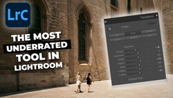
Lightroom is the most widely used photo editing application in the world, and for good reason. It is powerful, nondestructive, and flexible enough to handle everything from a casual vacation gallery to a professional wedding shoot. But that flexibility comes with a cost: there are dozens of ways to make your images look worse instead of better, and most of them feel like improvements while you are doing them.
The mistakes below are not obscure technical gotchas. They are the errors I see most frequently. Every one of them is fixable in minutes, and correcting even two or three will produce a visible improvement in your output. If you are relatively new to Lightroom and want a comprehensive walkthrough of the application from import to export, Fstoppers' Fstoppers Introduction to Adobe Lightroom covers the entire workflow. What follows here is not a tutorial on how to use Lightroom. It is a guide to what to stop doing.
1. Cranking Clarity to the Moon
The Clarity slider is the single most abused tool in Lightroom. It increases midtone contrast, which at moderate values adds a pleasing sense of dimension and texture to landscapes, architecture, and detail shots. The problem is that moderate values do not feel dramatic enough when you are sitting in front of the screen, so most beginners push it well past +40 and sometimes all the way to +100. The result is an image that looks crunchy, aggressive, and unmistakably over-processed. Halos appear around high-contrast edges, skin texture becomes exaggerated to the point of being unflattering, and the overall tone shifts toward something that looks more like an HDR rendering than a photograph.
The fix is simple: set your Clarity where it looks right on screen, then back it off by 10 to 15 points. What looks subtle on your monitor will look correct in print and on mobile screens. For portraits, Clarity should almost never be positive at all. A value between 0 and minus 10 on skin is usually more appropriate, and if you need localized texture enhancement on eyes, hair, or clothing, use a masking brush rather than a global adjustment.
2. Nuking the Blacks
There is a trend in modern photo editing toward deep, crushed shadows. Part of this comes from the film emulation look that has dominated Instagram aesthetics for years, and part of it comes from the fact that dragging the Blacks slider to the left makes images look more dramatic on screen. The problem is that there is a difference between rich, deep shadows and shadows that contain zero information. When you crush your blacks to the point where entire regions of the image are pure black with no detail, you lose dimension, you lose the ability to print well, and you create images that look flat on any display that is even slightly brighter than yours.
A good practice is to hold down the Alt key (Option on Mac) while dragging the Blacks slider. Lightroom will show you a clipping preview: any area that appears in color is being clipped to pure black. Some clipping in the deepest shadows is fine and even desirable, but if large regions of your image are clipping, you have gone too far. The same technique works for the Whites slider in the opposite direction, and you should be checking both regularly.
3. Ignoring Lens Corrections
This one is baffling because it requires almost no effort to fix and makes an immediate, visible difference. Every lens introduces some combination of distortion, vignetting, and chromatic aberration. Lightroom has built-in correction profiles for virtually every lens made in the last 15 years, and applying them takes a single click in the Lens Corrections panel (or the Optics panel, depending on your version). Enable Profile Corrections and Remove Chromatic Aberration, and you are done.
The distortion correction straightens barrel distortion and pincushion distortion that you might not even consciously notice but that makes architectural lines bow and horizons curve. The vignetting correction removes the darkened corners that are especially pronounced on fast primes shot wide open. And the chromatic aberration removal eliminates the purple and green fringing that appears along high-contrast edges, particularly at wider apertures. If you are not applying lens corrections to every image, you are leaving free image quality on the table. Better yet, set these as part of your import preset so they are applied automatically to every photo the moment it enters your catalog.
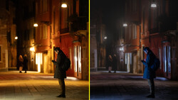
4. Using the Wrong White Balance and Never Fixing It
White balance is one of the most powerful creative tools in Lightroom, but it is also one of the most neglected. Many photographers leave their camera set to Auto White Balance, import the raw files, and never touch the Temperature and Tint sliders. Auto White Balance is often close, but "close" is not the same as correct, and the difference between a temperature that is 300 Kelvin too warm and one that is accurate can be the difference between skin that looks healthy and skin that looks jaundiced.
The simplest correction method is the White Balance Selector (the eyedropper tool). Click it, then click on something in your image that should be neutral gray: a concrete sidewalk, a white shirt in open shade, a gray card if you had one in the scene. Lightroom will recalculate the temperature and tint to make that reference point neutral, and the rest of the image will shift accordingly. This is not always perfect, because "correct" white balance and "pleasing" white balance are not always the same thing, but it gives you an accurate starting point from which to make creative adjustments.
The deeper mistake is not developing an eye for color casts in the first place. If you have been looking at your images with a slightly magenta or slightly green tint for months without noticing, your visual calibration is off, and it is affecting every image you produce. Spend some time studying the Tint slider specifically. Most people focus on Temperature (warm versus cool) and completely ignore Tint (green versus magenta), which is equally important and equally capable of ruining skin tones.
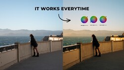
5. Over-Saturating Colors
The Saturation and Vibrance sliders occupy a dangerous position in the Basic panel: they are right there, easy to reach, and the immediate visual feedback is intoxicating. Push Saturation to +40 and suddenly your sunset looks like it was painted by a Renaissance master having a fever dream. The problem is that oversaturated images are one of the most reliable tells of amateur editing. Colors start to clip, meaning they hit the maximum value the color space can represent and lose all internal gradation. Skin tones turn orange. Greens become radioactive. Blues look synthetic.
Vibrance is the safer of the two sliders because it preferentially boosts muted tones while protecting already-saturated colors and skin tones. But even Vibrance can be overdone. A good rule of thumb is that if you can see the effect of the slider, you have probably gone too far. Saturation and Vibrance adjustments should feel invisible in the final image. The viewer should think the scene naturally looked that vivid, not that someone edited it. If you want to push specific colors further, use the HSL panel or the Color Mixer's targeted adjustment tool to boost only the hues that need it, leaving everything else alone.
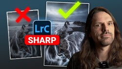
6. Sharpening Without Understanding What You Are Sharpening
Lightroom applies default sharpening to every raw file (Amount 40, Radius 1.0, Detail 25), and many photographers either never change these values or crank the Amount slider up without adjusting the supporting parameters. The result is either under-sharpened images or, more commonly, images with visible sharpening artifacts: crunchy edges, amplified noise, and halos around contrasty transitions.
Sharpening in Lightroom works by increasing contrast along edges. The Amount slider controls how much contrast is added. The Radius slider controls how wide the edge enhancement extends. The Detail slider controls how aggressively small textures are sharpened versus large edges. And the Masking slider, which is the one most people ignore, controls where sharpening is applied.
The Masking slider is the key to good sharpening. Hold Alt (Option on Mac) while dragging it, and Lightroom shows you a black-and-white preview. White areas receive sharpening; black areas do not. For a portrait, you want to push Masking high enough that smooth skin areas are black (no sharpening) while edges like eyes, hair, and clothing remain white (sharpened). For a landscape with fine detail everywhere, Masking stays low. Ignoring this slider means you are sharpening noise in the sky, grain in smooth water, and texture in skin that should be smooth.
7. Editing on an Uncalibrated Monitor
This is not strictly a Lightroom mistake, but it affects everything you do in Lightroom. If your monitor is not calibrated, you are editing blind. A screen that is too bright will lead you to produce images that are too dark when viewed on other devices or printed. A screen with a warm color cast will cause you to overcorrect toward cool tones. A screen with oversaturated colors will make you think your images look fine when they are actually flat and undersaturated.
Hardware calibration with a colorimeter (devices like the Calibrite ColorChecker Display or the Datacolor Spyder X) is the gold standard. These devices measure your screen's actual output and build a correction profile that your operating system applies automatically. The process takes about five minutes, costs between $100 and $200 for the device, and needs to be repeated roughly once a month as your monitor's characteristics drift over time.
If a hardware calibrator is not in your budget right now, at minimum turn down your screen brightness. Most laptop and desktop displays ship at brightness levels far above what is appropriate for photo editing. A target of around 120 candelas per square meter is standard for print work. Your screen almost certainly shipped at 250 or higher. Turning it down will not fix color accuracy, but it will prevent you from consistently producing images that are too dark.
8. Applying the Same Preset to Every Image and Walking Away
Presets are useful. They provide a starting point, establish a consistent look across a series, and save time on repetitive adjustments. The mistake is treating a preset as a finished edit. A preset is a set of fixed slider values applied to every image identically, and every image is different. The exposure is different, the white balance is different, the color palette is different, and the dynamic range is different. A preset that looks perfect on a golden-hour portrait will look terrible on a blue-hour cityscape, even if both were shot on the same camera with the same lens.
The correct workflow is to apply a preset as a starting point, then adjust every image individually. At minimum, you should be evaluating and correcting the exposure, white balance, highlight and shadow recovery, and any color shifts the preset introduces. This does not take long, maybe 30 seconds per image once you develop the habit, but it is the difference between a gallery that looks cohesive and one that looks lazy.
The same principle applies to Lightroom's "Auto" button in the Basic panel. Auto tone is a useful sanity check, but it frequently overexposes shadows, clips highlights, and pushes a color profile that may not match your intent. Use it as a reference, not a result.
9. Never Using Local Adjustments
If every edit you make in Lightroom happens in the Basic panel using global sliders, you are leaving the application's most powerful tools untouched. Lightroom's masking system (introduced as a major overhaul in late 2021 and continuously improved since) supports luminosity masks, color range masks, AI-powered subject and sky selection, radial and linear gradients, and brush-based selections, all of which can be combined using intersect and subtract operations to target extremely specific areas of an image.
The practical impact is enormous. Instead of trying to balance a bright sky and a dark foreground using the Highlights and Shadows sliders globally (which affects the entire image and often introduces a flat, HDR-like look), you can select the sky with a single click, darken it independently, and leave the foreground untouched. Instead of boosting Saturation globally to make a subject's red jacket pop, you can mask the jacket specifically and push only that color. Instead of applying negative Clarity globally to soften a portrait, you can mask the skin and leave the eyes and hair sharp.
If you are not using local adjustments, you are fighting the software instead of working with it. The AI-based Select Subject and Select Sky tools are remarkably accurate and take less than a second to generate. Start there, and expand into more complex masking as your confidence grows.
10. Exporting at the Wrong Settings
You can do everything else right and still produce images that look terrible if your export settings are wrong. This is where many photographers unknowingly destroy their own work. The most common errors are exporting at unnecessarily low resolution, applying too much or too little output sharpening, exporting in the wrong color space, and choosing JPEG quality settings that introduce visible compression artifacts.
For web use (social media, portfolio sites, blog posts), export as JPEG at a quality of 80 to 90, in the sRGB color space, resized to an appropriate pixel dimension for the platform. Exporting a 45-megapixel raw file at full resolution for Instagram is pointless and creates an enormous file that the platform will aggressively recompress. Resize to something between 2,000 and 2,400 pixels on the long edge for most social platforms.
For print, export at full resolution as a TIFF or maximum-quality JPEG in the Adobe RGB color space (or whatever color space your print lab specifies). Apply output sharpening matched to the print medium: "Matte" for fine art papers, "Glossy" for photo papers and metal prints. Skipping output sharpening for print is a common mistake that results in images that look slightly soft on paper even when they were perfectly sharp on screen.
For archiving, export as TIFF with no compression or as DNG. These formats preserve all your editing data and image quality without the generational losses that come from repeated JPEG saves. If you want to go deeper into building an efficient, repeatable Lightroom workflow from import through final export, Mastering Adobe Lightroom covers the entire process in detail, including catalog organization, batch editing, and output strategies for both print and web delivery.
Your editing is only as good as your final output. Invest five minutes in setting up proper export presets for each of your common use cases, and you will never accidentally send a client an sRGB file when they needed Adobe RGB, or upload a 60 MB JPEG to a website that only needs a 500 KB one.


Join the Fstoppers community for free
-
Post comments and join in the discussions
-
Browse the site ad-free
-
Share your work and get featured in the community
-
Compete in the photo contests for fun and prizes
2 Comments
Most greatest information ever read. Printed and is on a door that opens on my desk doors!!
All had even more info than I even have found or experimented with.
Just to add, All should know that what is seen on the camera LCD/EVF is a Jpeg image and is affected by settings just for the cameras Jpeg settings. 1. Yes most all just leave WB in Auto but to add there are camera Profiles you can preselect before the capture - in the main section at the right upper are 4 boxes where Lrc has all the profiles for your camera (that you may not even known about) and if not set before a capture you can select the list and as you pull the pointer across each you will see the changes each have, a good way to find the right one for your genre - when doing astro milky way say on a beach or desert Portrait gives the sand a nice tan color.
The subject of the color picker again when doing MW's if you pick the galactic center (a bright white) you will get that baby blue sky or even the white of a night surf. Also some info here on Fstoppers say to move the picker around till you have an 30 selection in all three colors, what ever you may like even!
Lens corrections - back in 2015 and I got the hot new Rokinon 14mm f/2.8 unchipped but had a very bad horizon mustache on the left side no one until Lrc a year later finally had the correction for this unchipped lens but if your lens is unchipped Lrc has a long list of lens makers and their lenses you can select from, just more info.
For the Tone Curve I still after years can not make the right pulls on the curve so at the top there is the white block with a curve in it select it and you get sliders to use, like the shadows part the shadows in the foreground can be brightened or reduced also the highlights and whites do some more to the whites lowering brightness and glow in night lights exp white LED lights at night have a blue shade in the light cast on the ground and other places carful adjustment can rid or say you are doing a sunset/rise with a marina of boats in the foreground the boats will have a blue tint due to being on the side you are on or shadow side and help making white.
Monitor calibration even today a monitor for photographers yes you need to have right brightness. i have one and it has a puck and if you touch brightness will change, messes every thing up so a redo and the Datacolor does a fast calibration every month. Also for us who are color perfect there is the datacolor spyder cube raw calibration tool - It is a better than a grey card in a couple of ways one where the little silver ball on top helps with exposure but a little hole on the bottom that gets the blacks just right but you have a white side and grey side to color pick off. you just do a pre capture with it do your adjustments with and link your capture with it. I used at the Grand Canyon even at sunrise for the camera just gets all the shadows as blue shades like the old film photos used in post cards on sale, ugly.
Everything was covered very well and a must read most often just to know.
About some AWB camera settings, just in my case for me when I bought the A7RV in the AWB setting you have norm, yellow and white, the white is great for snow and the different shades of the greys like a dirty bear in snow but for me I do Sunsets with a marina in the foregrounds with the white boats staying white not a blue tint or white birds to be white not a blue tint. just info you may have that on your camera.
Just have fun out there or inside playing with an editor takes more of your time than the capture of that moment in a second of time!
Top Five in order of importance:
7
7
7
7
Everything else...