If you've not used Adjustment Brushes with Range Masks to make subtle changes to colors in Lightroom, you're missing out. This is how I used both tools to finish my edit of this rock climbing photograph.
The first part of this article explained how I chose a preset and then used Adjustment Brushes to brighten the climber and bring out the orange hues within the rock. (If you're interested in how I shot this photograph, click here.) The job is far from finished; here's how I completed the edit, with some split tones and gradient filter thrown in along the way. This is where we'd reached:
The Water Was Blue, So Why Isn't It Blue?
The Verzasca Valley is famed for the color of its river. Unfortunately, any camera would struggle to pick up these gorgeous aqua hues on such a gray day, but it’s an element that I wanted to bring through. I also knew that a blue/green tint to the water would balance nicely with the orange of the rock.
The Color/HSL panel is no use here. I could pick out the color that’s present in the water, but those sliders would impact the entire image, doing weird things to the mountain in the background. Having played, I found that the effect was also quite limited on the water itself.
Instead, I went back to painting with color (click here to see how I painted the rock orange). I picked a strong blue and went a bit crazy. I was careful not to overlap onto any rocks, using the Erase tool for any places that looked sloppy. I left the saturation much higher compared to my orange painting, as even if I’d turned it down, the blue would still be coming through in the white parts of the water, making it look unnatural. Instead, I had a different technique in mind: Range Mask.
Making the Most of the Range Mask
At the bottom of the Adjustment Brush panel is the option to add a Range Mask. This allows you to target a specific color or luminance (i.e. brightness) with your brush. I chose luminance and dragged the slider on the right across to the left so that the brush only affected a range of shadows, effectively removing the blue from the water’s foam. I had not really tried this technique before, but I was pleasantly surprised by the result. I refined it by erasing any areas that still looked odd and painting in more using a brush with a much lower flow where I thought it needed a touch extra.
The “Show Luminance Mask” option comes in handy here if you need to check your work. Basically, it presents you with a masked version of your adjustment brush (i.e., it shows your brushwork in red) but with a grayscale version of the image so that you can see where the changes are kicking in.
Tidying Away the Distractions
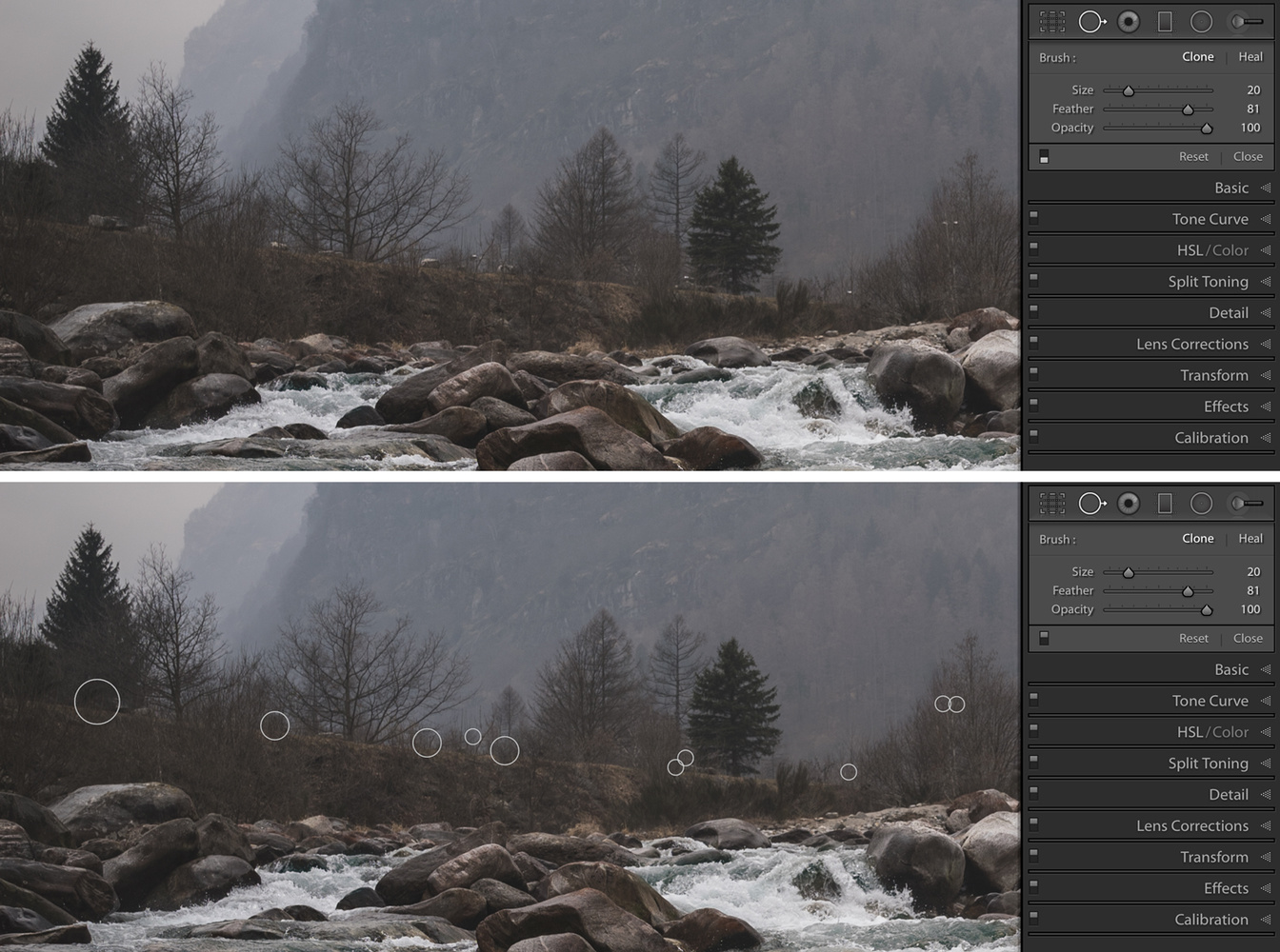
I decided to tidy up the banks of the river using the Clone tool. The tiny, idyllic village of Brione is hidden behind the trees on the left, and the tops of a few street lights were distracting. I also cloned out a few boulders that risked pulling the eye, as they were leaping out at me.
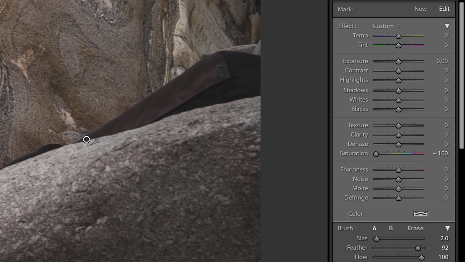
A few other small jobs: the bright red crash pad underneath the climber, Zofia Reych, was annoying me. On the day, I shot a load of plates without the crash pad to give me the option of removing it completely. I had a quick play, but eventually decided to leave it in the shot for a few reasons. Firstly, Zofia didn’t want to misrepresent what she was doing: pretending to climb without a mat would have felt odd to her, even if it was my decision. Secondly, with the red of the pad desaturated, it was barely visible.
This was a simple task: new Adjustment Brush, turn the Saturation to -100, start painting. I could afford to be fairly clumsy with my brushing here, but if you’re ever struggling to get this spot on, remember that you can use a Range Mask to target the color that you’re trying to kill.
For some reason, I never feel like Lightroom can completely desaturate something. Fortunately, in this instance, it wasn’t a problem to have a very faint hint of the red left in the mat.
Balancing the Brightness
As mentioned in the first article, I often work in circles, starting on one part of the image, then moving onto another before returning to an area that I thought I'd already finished editing. Sometimes, it's not clear what needs to be done until you've spent some time staring, and it's not unusual for work on one part of an image to make you aware of what needs doing elsewhere.
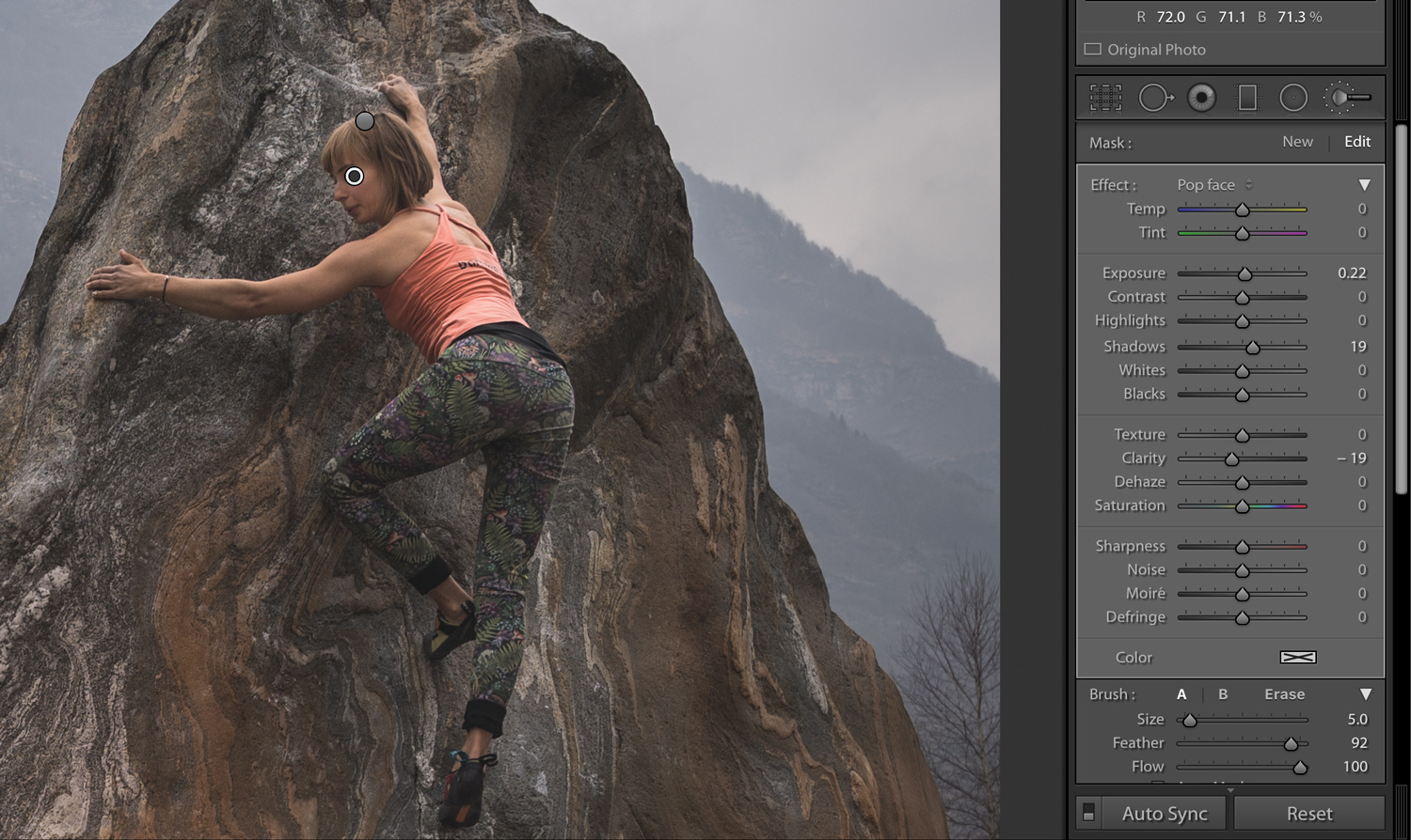
Returning to Zofia, her face felt a little dark. Another Adjustment Brush fixed this. I have a brush entitled “Pop face” saved — it lifts exposure and shadows a touch but also drops the Clarity (-19) to soften the details in case they are unflattering.
Another brush lifted some of the tiny shadows in Zofia’s face (Shadows +19, Clarity -19) that were a result of her clenching her jaw as she focused on not falling off the rock. I doubt anyone but me would have noticed this, but it made me feel happier. Editing skin is a process that's often much better suited to Photoshop, but in this image, the face is so small and the change so subtle that it didn't need to be too refined.

This brings up an area where Lightroom annoys me: there’s no easy way to toggle a specific adjustment on and off. You can toggle all of the adjustments, but there are many occasions where I want to see the effects of one particular brush. The workaround is to delete an adjustment brush entirely and then Command/Control+Z to undo the deletion. It’s not ideal.
The Crop
Along with my addiction to vignettes is a complete inability to hold a camera straight. I rotated the image slightly (press R to bring up the crop/rotate tool), and knowing that Zofia would need this predominantly for social media, I opted for a 4x5 crop. I like both options for different reasons: I think I prefer the 3x2 ratio for the landscape, but Zofia is smaller in the frame and I fear she gets a bit lost. Let me know what you think.
Lifting the Leggings
Speaking of getting lost: those leggings. They look great in the flesh, but the complex pattern is not ideal for photographs, especially against the complex texture of the rock. One option would be to simply lift the exposure and shadows, but a better option is to create contrast through color (as discussed in this article).
There’s already a lot of green and teal in the design, so I decided to accentuate this, again by painting in some color using an Adjustment Brush.
I went strong and then dialed it back using the same technique as before: a Range Mask based on Luminance that targeted the darker tones. I also played with a few other adjustment settings and settled with lifting the Shadows to +40. Trying to get the balance right — separating the legs from the rock to make the athlete’s form clearer but without making it distracting — can be quite tricky, and I’m still not sure if it needs changing. Often, I need to spend some time away from the image and come back to it later on before I can get it right.
This is where I wish Lightroom had greater layers functionality. With Capture One Pro's layers, every means of editing is at your disposal, including tone curves and HSL sliders. By contrast, in Lightroom, Adjustment Brushes can only call on 16 sliders (why is there no Vibrance slider?), the color thing described above (what is that called?!), and the Range Masks. It feels slightly limited by comparison.
Making a Moodier Sky
The sky was feeling disappointing compared to what I felt on the day, so I dragged a Gradient Filter down from the top and dialed down the Exposure (-0.55) and Highlights (-42). I wanted an even spread across the clouds, but without reducing the exposure on the rock and Zofia. I had a few options here: I could drag the filter into place (press M, start dragging), click on “Brush,” choose “Erase,” and then start painting out all of the areas that I didn’t want affected. Instead, I decided to use another Range Mask and restrict the graduated filter to highlights. It probably wasn't entirely necessary in this instance, but it's a good habit to get into.
Final Tweaks
Zofia now felt too colorful, so I decided to knock the saturation back slightly (I would have chosen the Vibrancy slider, but it doesn’t exist!). This is another area where Lightroom is a bit fiddly: trying to find the right Adjustment Brush from a stack of existing Adjustment Brushes is annoying. With Capture One, it’s possible to label layers and stay organized; by contrast, with Lightroom, you just have to click on each pin one by one and stare at the adjustments and/or mask (toggle the mask by pressing “O”) until you remember what each one does. If you’ve made a lot of small changes to, say, a model’s face, this can get very complicated very quickly.
Finding the pin that lifted exposure and shadows from quite early on in my editing (see part one), I added to it by dropping the Saturation to -7. The left-hand edge of her leggings looked dark, so I made a new brush and lifted the Exposure by +0.25.
The final touch was a split tone. I’d left the color temperature of the entire image as it was shot, not wanting to make it colder for fear of killing the orange tones in the rock. As a result, the coldness of the day wasn’t coming through, so I added a hint of blue to the shadows, complemented by a tiny touch of orange in the highlights.
Is It Finished?
Good question. I might come back to it and make further changes. Every time I return to the photo after a break and look at the clouds, I tweak them slightly darker and then change my mind again. Very often, I find that my initial attempt at an edit is too heavy, so I might come back in a few weeks and tone it down somewhat. I'm also now leaning towards the 3x2 crop. Suggestions welcome!
Let me know what you would do differently or if you have any questions by leaving a comment below.


It feels like, every day a new article on this photo is released. :D
Ha! I'm done now, don't worry. It's been epic.
Not this blasted shot again. It's like Groundhog Day.
Thank you for making an actual written tutorial and not another damn video.
I really like this, I think it looks great. I'd love to see a bit more color in the water personally but I still think is a really nice photo.
Very useful, how to bookmark this?
Use bookmarks!
Take a piece of paper, write the URL on it and cut it to a bookmark of your liking.