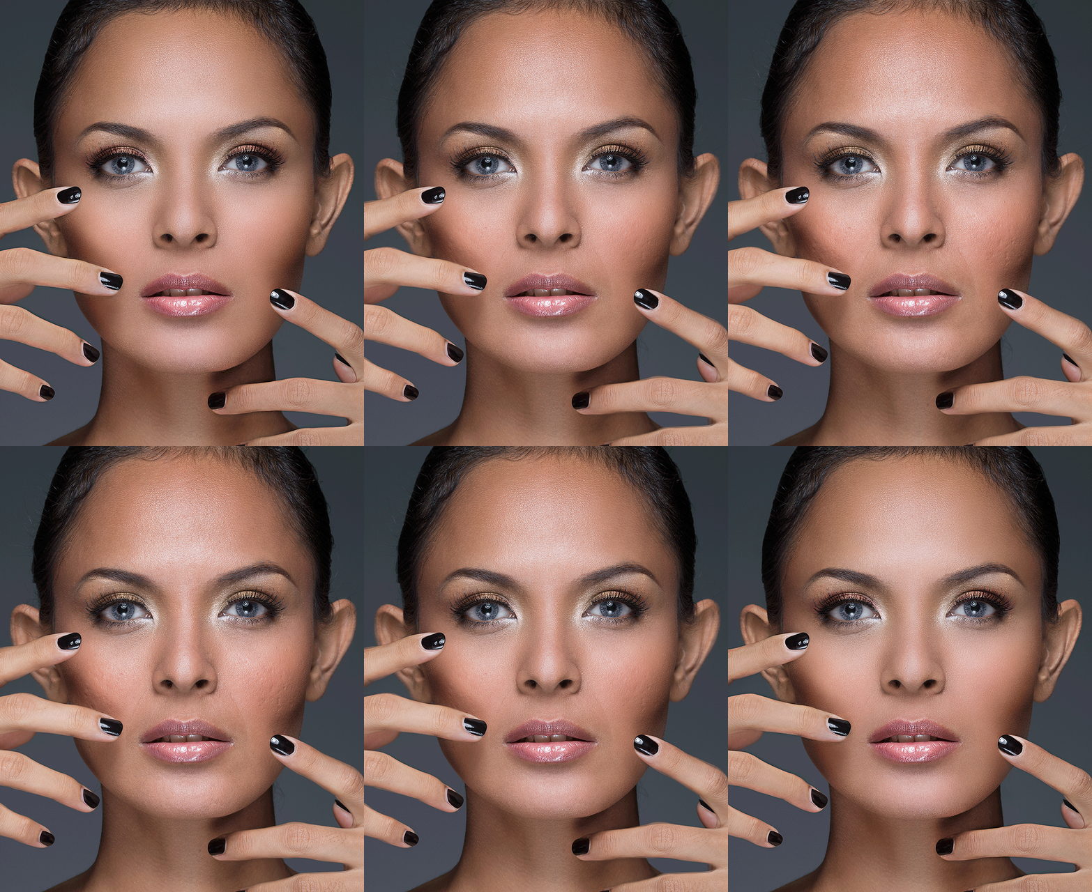
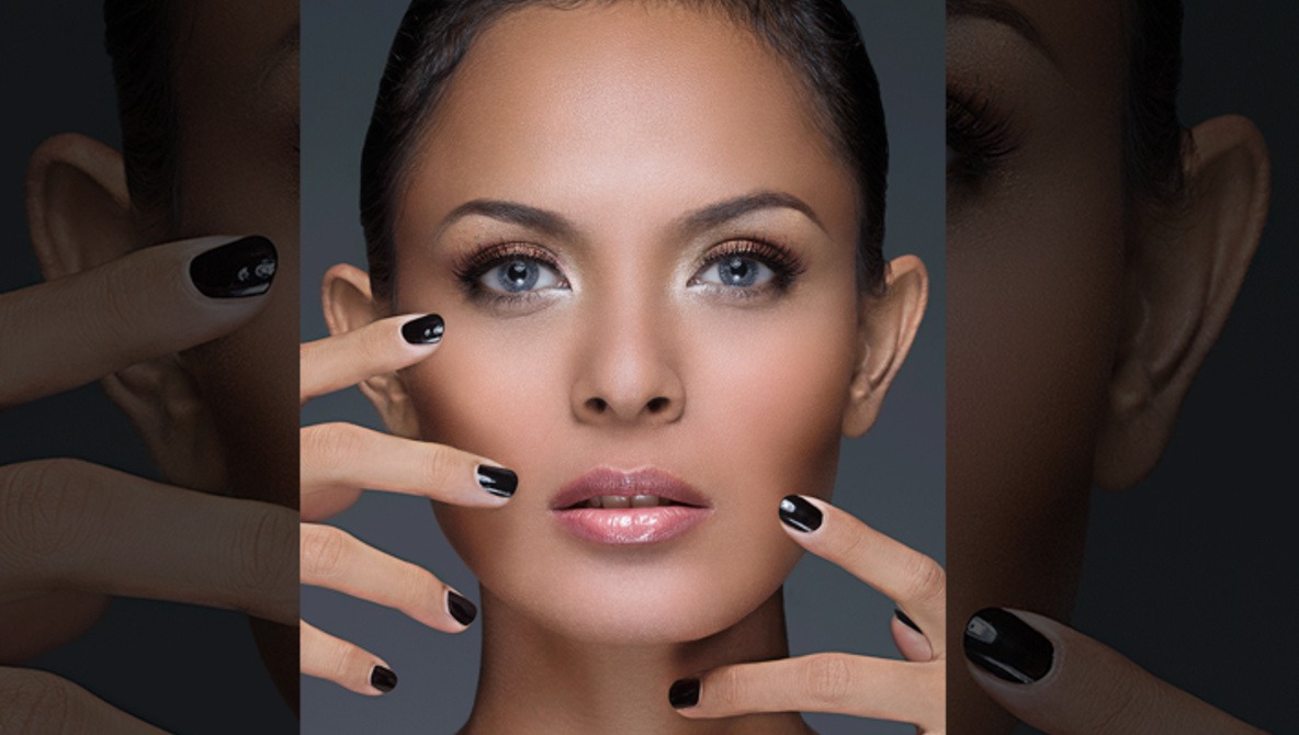
Photoshelter is hosting a webinar featuring retoucher Kristina Sherk this week, and to advertise the webinar they posted an animated gif showing before and after Sherk got her hands on the image. I was shocked, as Sherk not only easily erased 10 years off the model, but even more amazingly did it without making it look fake.

Unfortunately, the webinar closed because it filled, but Photoshelter will be posting a recording of that webinar on their blog later in the week. Amazing right?
UPDATE: It has come to Fstoppers's attention that in our original article showing the outstanding retouching work of Kristina Sherk and her upcoming webinar, we neglected to put the image (and the retouching applied to it) in the proper context. Having only what was written on the PhotoShelter Blog, we lacked the back story that properly contextualizes this image. In an effort to quickly publicize the webinar being hosted by PhotoShelter and SharkPixel.com, we failed to check into the full story behind the retouching. Thus, giving our readers a fragmented frame in which to view Kristina's work through.
Sherk’s original purpose behind retouching this image was strictly for educational purposes and is to be included in her upcoming instructional retouching DVD. Her intent with the image was to show the possibilities of post production, but with the stipulation that though it can be done, retouchers should take the skills learned in creating such a piece and utilize those skills in the degree they see fit for their client's needs.
[Via Photoshelter]


Too much for me
Dmitry Krasitsky's portfolio: http://www.pbase.com/photodrug/portraiture
To above
His work is amazingly well done. Skin looks natural and not like an android. Thanks for linking it. *bookmarking*
Nice stuff, Dmitry!
"without making it look fake" that's very relative. If you say it would fit perfectly on our magazines standards, I'd agree with you. But personally, I'd go on a different direction, specially on the fingers. But amazing job, for sure.
holy crap...shrunk her ears too.
Typical beauty/makeup work though...all the better to get girls to buy the makeup :-)
Fingers don't look great so I wouldn't use images w/ her hands in them...
Thanks for the tip! My work is always in a state of change and I welcome all types of critique! I'll keep that in mind when I re-edit this piece!
How did you do the ears??
not an amazing retouch at all.. photo is incomplete... not at its full potential...
I'd darken the fingers a bit since they are slightly brighter than the face in the original state and draws some of the attention away from her face, but I wouldn't get rid of the highlight that gives the fingers their depth like what seems like it has been done in the after state.
Truly amazing. An Artist of the 21st century!
It's plastic what's wrong with you people? Toy barbie look more human then this. I would like to view a professional retouch tutorial not this crap
what are you? Twelve?
Hi Gabriel, Thanks for your comments. While I can't speak for FStoppers, I can speak for my business, and I'd love to hear any critiques or comments you may have on how I can improve my craft. Please feel free to email me via the comments page on my website. Best, Kristina Sherk (retoucher).
Krista, respect for the guts to put your work up for criticism out here. Above is my first reaction to the title of the post and your before/after images. The internet lets me be blunt. Here is my view on this: an image starts in camera. If you shoot beauty, close-up, portraiture your lighting should be adequate to the face your capturing. For women with less then perfect skin softer light is your friend. 95% of us humans have less then perfect skin. But the before picture seems to specular and contrasty when it comes to lighting and I bet this is not a raw image or the sharpening in the camera that captured it should be turned way down. From the start you are setup to a tough job. Women spend lots of money to have baby like smooth skin and here we are on the internet praising sandpaper skin. Really? The trick is to soften the skin while preserving texture. I know what an oxymoron I just said. Imperfections make retouching even less noticeable to our human eye. Selectively you should leave some imperfections. Photoshop it's an art by itself. Looking at your portfolio I see nice images way better then this. Show your best work, always!!!!!! This should be put in the how not to Photoshop an image section. Look just at the forehead or just at the chin: sandpaper. From far away it looks OK, but on my 27 inch iMac it looks like plastic. Your model is gorgeous ! If you've used Portraiture or other method tone it down, way down. It's true that I've seen advertisements in Vogue with Photoshop just like above but that is one page bought by the people who advertise in the magazine and just can't afford a better retoucher . I'm mean to you again but frank. Photoshop it's not only smooth skin, your colors are all over the place too in this image. So, I don't want to be a bully but really fstoppers "mind blowing"? I apologize to you for the harsh words. I had a Kelby Training subscription, Lynda and I watch creative live whenever I can. One thing is sure : every image has it's challenges and what works here it doesn''t work there. The more time I spend at it the better I get that's why i said I would love to see other tutorials. Here is a photographer who's work I admire, with skin technique similar to yours but done better , in my opinion. You are not far Kristina but not quite here yet. Keep up the good work: http://www.floriansommet.de/image/a1/2053/
The internet doesn't let you be blunt, but being a kind of a jerk does! Florian's work is beautiful, but are you sure he actually does his own retouching? Does he have tutorials out there?
this kind of retouch is terrible this is no acceptable I would be fired for this
I love that all of sudden all you guys become America's next best retoucher.
that's my favorite part too. Everyone'san expert.
You do not have to be "America's next best retoucher" to look at a photo of someone and feel or think that the skin looks unnatural.
not fake?
shows you have lost your sense for reality....
not nice, too plastic
mind-blowing? it's terrible...
Hi Marian, Thanks for sharing. I'm always looking to improve my skill and I'm also open to suggestions and improvements. It helps me become better at my craft. Please feel free to send any critiques or comments to me via email. Best, Kristina Sherk (retoucher)
Hello Kristina. I'm not gonna tell you if this is good or bad, but since you asked for suggestions: For instances, the ears and hands look different than the face. The ears should be a bit more red and darker I think. The fingers lost volume and glow, thus looking old and dry. Take care of the fingernails (both the highlights and the skin around them), and balance out the tone and brightness on the tip of the fingers, they look too white. On the face, don't clean it too much or it will look fake. You altered the face by changing the shadows and highlights, it wasn't a lot, but it was enough to give you a really different result. These elements are what give you sense of shape and depth and you need to be really careful when doing this, constantly looking at the before and after so you don't change people's expressions too much. The skin looks good, but it's just too much. Just tone it down a bit, recover some of what's behind at about 50% and i'd say it'd look good! :)
Classy! :)
Much respect for keeping your cool here. That takes a lot of integrity. Your skill is clearly doing great, and if this is what the client wanted, then you hit it out of the park. PERSONALLY, I like a little bit of chaos in my work and I think the one thing on the face that makes the piece look off is the area between the nose and the mouth. The uniformity of the skin tone and topography kind of kill the shape of the cheek and it makes the mouth look like it's just floating on a flat surface.
Thanks for sharing!
Interesting. Compare the two:
From Marian: https://plus.google.com/photos/110999958633357563669/albums/profile/5833...
to above from Kristina
What baffled me most was the question of how can a woman with such a bad skin become a pro model ? Let's pretend the makup artist did an awesome job her skin still is ugly.
Other than that, this is what we get served 10 times a day in ads, commercials and billboards. Don't know what is so great about.
Have you seen the state of pro model skin? Its far from perfect.
Kristina has done an ok job at it, I personally think she has gone a little too far and although kept skin texture the uniformity of it can make it look too fake.
Its usually the bits around the mouth that look most fake to me but in all honesty this is better than a lot of the campaigns out there.
oh great.. yet ANOTHER skin retouching tutorial.
how many do the world need? there are thousands already....
Yes, but this isn't a tutorial. And most tutorials out there boil down to "Gaussian blur" with, in my opinion, horrible results. I'd love to find what I consider a really good skin retouching tutorial out there, but haven't.
I always wonder when it comes to focusing to retouching to this extent is it still photography? Or is post production an art in itself?
Ashley,
I definitely believe retouching is an art. And I think you've touched on a very interesting point! Thanks for sharing!
Someone, please make another BTS video, cuz this site is stretching to fill with content.
http://www.ian.ca/#a=0&at=0&mi=2&pt=1&pi=10000&s=0&a...
His work
Where's yours?
I like your stuff, Ian!
I agree with most people here about the fingers and the fake look the image has, but I can appreciate the amount of work put in and yeah it is an improvement, but still a little heavy for me.
Is this supposed to look real? If so, a complete botch. Is it supposed to look like some kind of "perfect future human android prototype"? Then it looks good. It all depends on the purpose/intent of the work.
His work: http://www.tobiassolem.se/portfolio/dayshoots-dead-things/
Vs
Above
Yes, I never intend to make skin seem artificial.
haha youre cracking me up Jose
Nice work, Tobias!
Sorry, but way too over processed for my taste.
http://www.picsbyandy.com/Portraits
His work
Yep, his models look like real people!
Stop. Please stop. It's 2013, and this is a step in the exact wrong direction.
His portfolio vs above work:
http://jeremysale.com/
Dude, that's actually pretty good.