
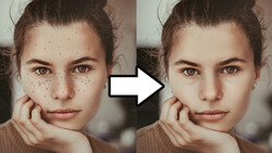
In dealing with bigger paid jobs lately, I've had to find ways to refine my retouching workflow. I used to do most of my skin cleaning by dodging and burning problem areas. It then had to be color-corrected of course. Negative dodge and burn gives you excellent results when mastered, but it eats up a lot of time. For some clients or projects, justifying 1-3 hours of postproduction per image is simply not possible. Being confronted more and more with this real-world issue, I have taken the time to look into my workflow and see how I could spend less time in front of my computer. Here are some of the things I have changed as well as a few tips I could give anyone facing similar issues.
Raw Development and Export
When teaching retouching, I always stress on the importance of a great raw development. If your raw file is crap, your final image will be no different. A great image starts with excellent photography and raw processing. Take the time to process your raw file correctly and make sure you do not end up with clipped or oversaturated areas. When retouching for a commercial client I also never do any color toning at the time of the raw development. I do not want to take the chance of my customer changing his mind and me being stuck with a color grading that does not match the new client's ideas. Color processing always comes last, and so does sharpening.
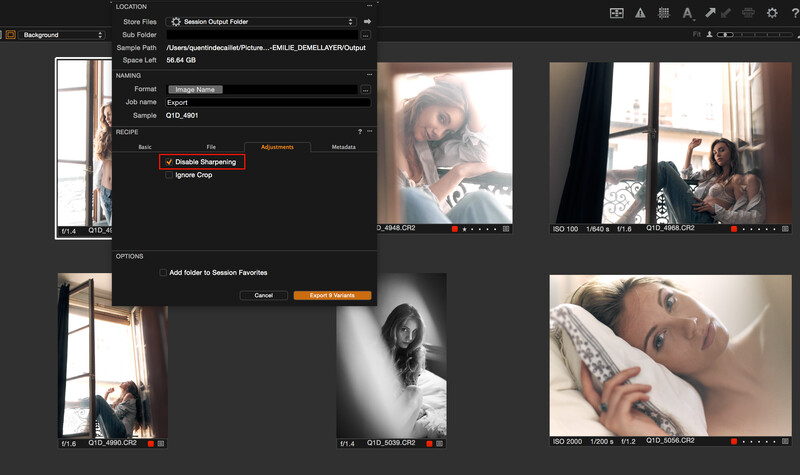
Speaking of sharpening, when exporting my raw files for retouching, I always disable it. Sharpening accentuates every single detail of an image, including stray hair strands, spots, and other skin issues. If you wish to spend more time retouching, go ahead a crank up the sharpening slider in Capture One or Lightroom.
For the same reason, leaving the clarity slider at 0 is a good idea. Do not even think of pulling it under its neutral position to soften the skin and save time in Photoshop. Going down this road you will only end up with a very soft and cheap looking image.
Another thing I do when exporting is thinking of the final use of my images. Not every client will need the large color palette of a 16-bit file. For many uses, a simple 8-bit file will be good enough. If I can get away with an 8-bit TIFF, I will not hesitate twice and export it in 8 bit. This will save space on my hard drive and be quicker to load and display in Photoshop. The smaller the file, the better for my workflow when time is an issue.
Try to do as much as you can in your raw processing software. It is one of the reasons why I use Capture One. Having the ability to correct skin tones and make them uniform before getting in Photoshop is such a time saver. It is also not rare for me to develop a single raw file multiple times and stack the development in Photoshop to get similar results for other tones than just the skin's. But this will be for a next article as it is not always a timesaver.
Don't Start with Frequency Separation
Many photographers have begun to go way overboard with frequency separation. It leads to very weird looking skin texture and tonal transition. Starting to retouch an image with this technique is bad practice. It has its place in a retoucher's workflow, but it should not be the go-to tool for anything and everything. Other tools such as the healing brush and clone stamp tool can get great results, spending as little time or even less than with split frequency.
Frequency separation has a tendency to make people go over what should be done for a natural result. Using Photoshop's tools helps avoiding this problem. For me, frequency separation comes after a basic cleaning using a combination of the healing brush and the clone stamp tool, and having dodged and burned the problem areas. I would use split frequency only if those two techniques were not enough. But I will come back to the different uses I make of the frequency separation in a future article.
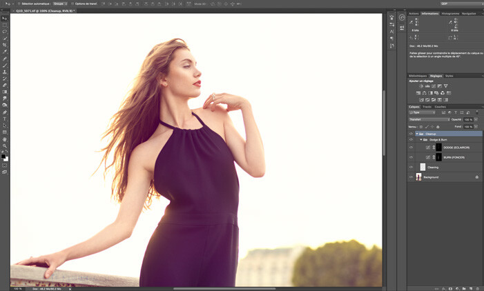
Dodging and Burning Zoomed at 100%
I already talked about it in a previous article. Zooming in at more than 100 percent for dodging and burning is very often a loss of time. To speed up your workflow, you should rather do most of your editing at 100 percent and then zoom in if some areas requires it. To zoom in at 100 percent in Photoshop, simply press Cmd+1 or Ctrl+1. The goal here is to even out the tones to make problems disappear while keeping as much details and texture as possible.
Dodging and burning requires a lot of patience to clean a picture entirely. If you need to keep your retouching under a certain amount of time, try not to work zoomed in at 400 percent, and you'll see a significant improvement in terms of how long you are in front of your screen. Also, keep in mind that it is rather unlikely that anyone will look at your images pixel by pixel. Not everyone is a pixel peeper, so no reason to retouch pixel by pixel.
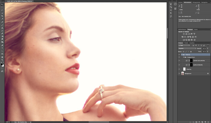
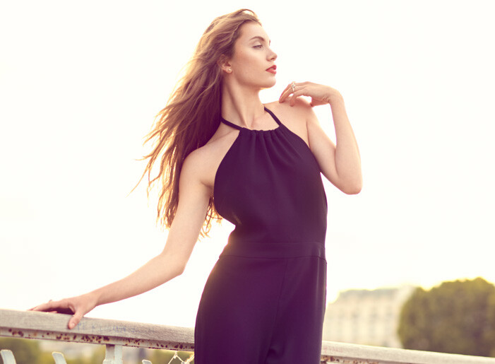
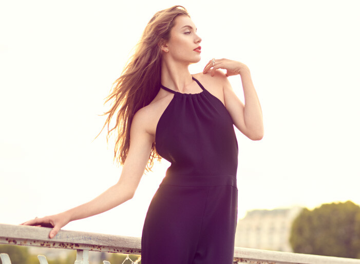
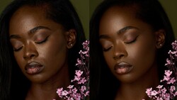
As you can see, both views could get the job done. However, when zoomed in tighter we can see some areas could have used more work. Knowing these pictures would not see any other media other than social networks and some small-sized prints, there was no reason to bother editing zoomed in at 400 percent; 100 percent did the job just fine for the desired result.
Don't Obsess over Dodging and Burning, Even Out Tones with Split Frequency
When you are pretty happy with your dodging and burning, then comes the place for frequency separation. In my previous aforementioned article, I spoke about the radius for this technique. Now, for evening out tones, I do not follow the same advice regarding my radius choice. I rather keep it between 2.0 and 4.0. My goal being to get most of the texture out of the lower frequency but keep as much color details in it. It will allow me to work on tonal transition — or micro transition as some may call it — very quickly and effectively.
Once my frequency separation is created, I will then create a layer in-between the high and low frequencies. Using a soft brush with an opacity of 100 percent and very low flow (1–5 percent), I then gently paint the colors where I need to even out the transitions. Do not forget to resample the color very often to keep the colors as natural as possible. Sampling is key here.
Painting here should be used in a way very similar as what is done when dodging and burning for cleaning up an image. For example, if there is a light spot that needs to be corrected, sample a color next to it that is darker and paint very gently on it until it disappears. By working this way, you should get superb results and spend much less time than by using the local dodge and burn technique alone. It might not be as clean and precise, but it does the job quicker and for most clients it will be more than enough. Again, only a few clients are pixel peepers that will look with a magnifying glass at your work. Combining local dodge and burn with frequency separation for correcting transitions is very powerful. If you get a hang of it, you might have a hard time to come back to negative dodge and burn alone. You are warned.
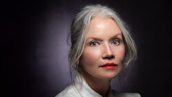
The difference here is very minimal. It is especially noticeable on the right hand. I could have used a dodge and burn layer to do the job, but this probably would have translated into some color shifting. With frequency separation, I evened out skin tones very easily with minimal texture loss and not much visible color shift.
Keep Your Retouching Layers
For the very same reason as why I do not do any color grading when processing my raw files, I will never flatten a PSD/TIFF before it has been approved and printed by the client. If my customer comes back to me asking for a small change, I want to be able to open up my file and go back into my layers to make the correction very quickly. I do not wish to edit my file all over again! PSD or TIFF files with layers takes up quite some space, sure, but in my opinion (and experience) it is well worth it to keep them for a couple of weeks or months. External hard drives and cloud space do not cost much anymore, so creating a backup of the files should not be an issue anymore.
Use Actions and Scripts
Seeing how many people that do not take advantage of the power of scripts and actions always fascinates me. Both tools are probably two things I could not live without. I have developed my very own actions and scripts for color grading or for keeping a very similar look and workflow on my commercial jobs. I also use the Retouching Academy panel religiously every day. It helps me concentrate on the problems existing in my picture and not on the settings of the techniques that have to be used to correct them. Having to go into Photoshop's menu to use Apply Image when creating a frequency separation is just a loss of time. I'd rather use these precious seconds for retouching my images.
Once your workflow is in place, look into creating your own actions or even scripts. This will help you stay consistent and avoid having multiple pictures retouched in very different manners for a single job.
Amongst these six tips, the one that has helped save time the most is probably using frequency separation for evening out skin tones. I rarely used it this way until recently, and for large commercial jobs it saved me more than once. Those that edit pictures for fashion blogs or corporate gigs will probably be more than happy to give this a try.
The other thing I noticed more lately is that we, as photographers and retouchers, tend to look for absolute perfection while our clients do not. Do not get me wrong, I am not telling you to edit your pictures in Paint, I am just saying that rather than edit pixel by pixel, we should rather focus editing our images accordingly to its final usage. If your client requires images for social networks, there is no need to obsess over some very fine details as these will not be seen. Same goes with large billboards. I have heard photographers say that a picture for such a large format should be retouched more than large wall prints. In some instances, it might correct, but this is only a minority of times. Who will ever watch a billboard from up close? This is why the "working zoomed in at 100 percent" works just fine with most retouching jobs.
Do you use any specific techniques for retouching as quick as possible? Would you like me to create specific articles that go further into details on some of these techniques? Do you retouch personal and commercial work in a different way?
Join the Fstoppers community for free
-
Post comments and join in the discussions
-
Browse the site ad-free
-
Share your work and get featured in the community
-
Compete in the photo contests for fun and prizes
9 Comments
Another great article Quentin, but even if you explain things the best and simplest way you can, I would like to see how you actually apply these techniques in a video, do you think you'll have enough time and will to make some someday? thx and keep doing these very useful articles!
Videos will start coming out in a few weeks. However, they'll be in French first on my Youtube channel and then eventually some time in the future in English to complement my articles here on FStoppers.
Great, im actually a frenchy! I just spotted your Youtube channel, merci beaucoup Quentin!
Just a newbie question. I've seen a lot of those comparison sliders and have been wondering how it's done.
It's done using HTML, JS and/or CSS3. Nothing related directly to post-production or photography ;)
I smile, because I have the same problems, and I did almost the same things to speed up my workflow. :-) But I always do DB later, than FS, I will try to do the opposite next time! I have a suggestion for you! To even out skin tones, instead of the Brush tool, try to use the Clone Stamp tool with a soft brush, 10%+10% (or 100%- 01-02%...) Opacity. On a blank layer between the split layers, set it for the Low layer with Current&Below. quick and perfect for tones. Use it like a Dodge&Burn method, and sample lighter or darker areas for the purpose. The great thing, that it will not lose saturation, and will clone colors also! Maybe you've already known it, maybe not. :-)
I do use it from time to time. I also use the mixer brush which works quite well for most situations.
Great article Quentin! I appreciate your attitude in these articles. Professional, high standard, yet realistic. Thumbs up!
Nice article.