You can get a striking, modern poster look in Photoshop without fancy plug-ins, but only if you stop guessing and start building the effect in a logical order. The video focuses on a specific recipe: a clean silhouette, controlled motion blur, and color that behaves like light instead of paint.
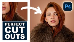
Coming to you from Aaron Nace with Phlearn, this methodical video starts with a reference image and a blunt question: what are the actual ingredients that make the look work. Nace breaks it down into three parts you can recreate on almost any file: a subject separated from the background, a background built from simple tonal structure, and color applied in a way that respects those tones. The first move is compositional, not “effects.” He widens the crop to a horizontal frame so the background has room to breathe. Then he isolates the subject fast using Photoshop’s Select Subject, drops that cutout onto a new layer, and fills it with black so the shape reads clearly even before any color shows up.
Next, the video builds the background in black and white on purpose, and this is where a lot of people usually go wrong. Instead of picking pretty colors first, Nace lays in a basic radial gradient underneath the subject, using a simple black-to-white structure to set where the brightest and darkest areas will live. That decision controls everything that happens later. After that, he adds motion to the subject with Path Blur in the Blur Gallery, but he keeps it adjustable by converting the layer to a Smart Object first. He also calls out one toggle that completely changes the feel: centered blur versus one-direction blur, which is the difference between muddy and intentional.
Once the tones and motion are set, Nace switches the whole image from “grayscale structure” to “color logic” with a Gradient Map adjustment. The key idea is that the gradient map assigns colors to brightness ranges, so the brightest areas get one end of the gradient and the darkest areas get the other. He shows how reversing the gradient instantly flips the mood, which makes it easy to test options quickly. Then he demonstrates why this approach stays flexible: move the underlying black-to-white gradient and the colors shift in a controlled way, like relighting a set instead of repainting a wall. He also tweaks gradient points and adds darker anchors to keep the subject bold, but he doesn’t lock you into a single “correct” palette.
The part worth watching closely is how the pieces interact when you start nudging them. Small moves to the radial gradient can change the color flow more than any brushwork would, and the blur can be re-aimed after the fact without rebuilding the layer stack. Nace also treats the reference as a guide, not a template, which keeps you from copying and instead pushes you to spot relationships: where the darkest tones sit, where the brightest tones land, and how color transitions follow those values. Check out the video above for the full rundown from Nace.
Join the Fstoppers community for free
-
Post comments and join in the discussions
-
Browse the site ad-free
-
Share your work and get featured in the community
-
Compete in the photo contests for fun and prizes
No comments yet