



How to Use the Background Remover Tool in Photoshop
One of the things Photoshop sells itself on is automated tools, the tools where it uses AI or an algorithm to do the work for you.
Mario Olvera is a photographer, digital artist, and friend from Mexico. He creates surreal conceptual composite images and commercial works.
One thing to remember when creating composites is that a couple of extra little details can make a huge difference.
Ever find yourself needing the inspiration to create an image, but you just can muster up any from anywhere?
If you are like me and you are at the beginning of your transition from stills to video then you will also like me, be eating up as much free education on YouTube as possible.
When creating composites using various images from multiple photos, each part has its unique color balance. This is where most beginners tend to fail when creating a composite.
At the beginning of the year, I worked on a client job for York Fashion week with local agency NIMA and videographer Beetroot Box. The brief was to create a teaser campaign for the upcoming event.
Being a freelance photographer and digital artist, I have resigned myself to the fact that I will not always be able to use my own photography in the images I create for clients.
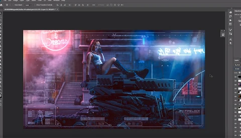
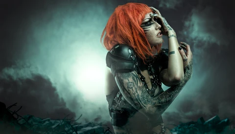
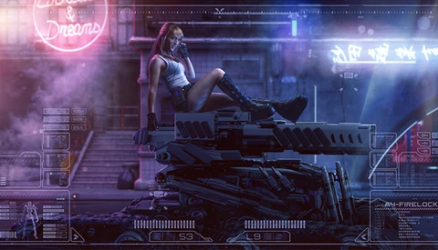
Cyberpunk is very "in" at the moment. With the impending release of the video game and the rise of Synthwave music, a lot of cyberpunk art is being created.
One of the most asked subjects people contact me about is how I color my images. Everyone expects a simple answer that solves everything, but unfortunately, it does not work like that.
If you have worked in this industry for at least a couple of years you will have more than likely come across a whole plethora of interesting and curious characters whilst on shoots or at networking events.
Richard Terborg is a conceptual fashion, portrait and fine-art photographer from Holland. Known for his bold and crazy colors, Richard is just as bold and crazy in real life. In a fun way, not a ruin your life way.
Sometimes it is good to step away from commercial work for a little while and practice styles or techniques you would not normally use or would like to get better at.
I am lucky enough to have hosted or been a part of workshops around the world. One thing I teach in my workshops is that photographers should not look at other photography to be inspired.
Dodge and burn are one of my favorite go-to techniques. It can be used in so many different ways by using numerous techniques.
Colin Anderson is a composite photographer from Australia whose work is super stylistic and conceptual. He has worked with many large companies including Adobe, the Discovery Channel, and IBM.
Nemanja Sekulic has amassed a huge following on YouTube with his fantastic photo-manipulations and tutorials.
In this YouTube video, Brendan Van Son discusses with us the feelings and thoughts of what happens when you are working on assignment and your photos suck.
Creating fantasy composites is always fun: you get to invent your very own worlds and characters. Technically, in a composite sense, you can also get away with more unrealistic elements.
In this short video, videographer Max Yuryev puts the Sony a6400 and the Fuji X-T30 to the test to compare and see which one has the best colors straight out of the box.
We are now four parts into the art of composite series, and this week we touch upon style and influence.
So let me start with a bold statement. Adrian Sommeling is probably the most famous composite artist in the world.
Humans are the greatest adaption machines in the world. We are, by nature, made to adapt.
Anya Anti is an internationally published photo artist from the Ukraine who now lives in the Big Apple. If you have never seen her work, you are missing out on a whole series of quirky, interesting, and fantastical images that stir up emotion and imagination.
For some people, photography is more than just work. They put their blood, sweat, and tears into passion projects for which they get no payment.
Welcome back to The Art of Composite Photography. In the previous parts, we have covered pre-visualization, planning, and unbreakable rules.
Everyone in the industry must know who Pratik Naik is by now. And if you don't, then you should. In ten years Pratik has become one of the most famous retouchers on the planet.
What's up? Glad you could make it for part 2 of my Art of Composite Photography series.
Over the past 7 years since I first bought my camera, I have been lucky enough to meet a fair amount of the people that I looked up to in the industry. Some of them I have become very good friends with.
Do you have an image that is more popular with people than any of your others? One that stands out head and shoulders above all your work?
I always say, once you have the core foundations of Photoshop down you are pretty much set. There are plenty of neat tricks to learn, but most of the time the tricks are one-offs.
If you have dipped your feet into the movie poster or book cover industry, like me, you will know that one of the most underrated aspects of the poster and the cover industry is typography. The typography you use can make or break an image. Most digital artists, think of it as an afterthought but I guarantee you it is one of the most vital pieces of the puzzle to publisher or distributor.
As you can probably tell by my work I am a huge fan of composite photography. I chose the path of the composite warrior for a couple of reasons in the beginning.
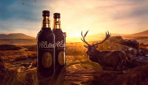
In this composite walkthrough, I take you through the various processes it took to create this advertising image. Throughout the video, you will hear my thoughts and why I decided on certain aspects.
Last October, I finally made the jump from part-time freelance into the world of being a full-time creative. It has been a rollercoaster ride of epic proportions, but here are the things I have learned so far.