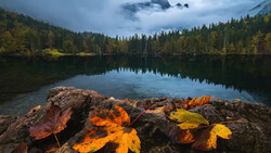
Autumn color looks rich in person and often collapses on screen. Precision editing brings back depth, shape, and believable color that survives the jump from trail to monitor.
Coming to you from Mickey Pullen with Eastern Shore Photo Instruction, this practical video starts with a disciplined base edit before any fancy work. Pullen switches the color profile to Adobe Landscape to add contrast and richer tones, checks clipping with the J key, and nudges highlights and shadows so sky and water sit inside a safe range. Lens corrections remove vignetting and a quick transform straightens the frame, while a simple crop trims a distracting rock and shifts your eye along the tree line. Building this clean foundation matters because later masks behave predictably when the file is balanced, especially with bright clouds above and dense foliage below. You get a file that accepts local edits without banding or surprise color shifts.
The sky gets two separate treatments. Pullen makes a sky mask and a clouds mask, then intersects the cloud selection with a color range so adjustments touch only the whites and not the blue around them. A small pull to highlights and a bit of clarity shape thin, high clouds without crunching edges. This split approach keeps texture in the sky while preventing that chalky look that happens when one global slider tries to fix everything at once. You keep control over subtle luminosity steps that guide the viewer from sky to treetops.
Color work is where the method flexes. Pullen builds three targeted masks for yellows, oranges, and reds. With each mask, point color samples the hue and pushes saturation and luminance high on purpose, then an intersected brush at roughly half flow paints color back into only the leaves that need it. You get painterly control without wrecking bark, rocks, or reflections. The Amount slider on each mask acts like a master dial when you want to pull intensity a notch without repainting. This pattern repeats across the canopy so yellows glow in sun patches, oranges warm midground leaves, and reds tuck into clusters near the waterline. It avoids the heavy hand that broad HSL moves have on mixed foliage.
Light shaping follows. A light Dodge brush lifts gloom in shaded branches, along water edges, and on small coves. A Burn brush reins in bright distractions that steal attention from the center of the frame. To strengthen reflections, clarity comes up while highlights come down so the mirror gets snap without a glare spike. Then a clever move many skip: with a small brush and the Shift key, Pullen paints straight up trunks to add a subtle ribbon of light that reads as depth. Vegetation gets a touch of negative clarity to ease crunchy edges, and a large radial vignette nudges attention inward while a small spotlight radial raises shadows where the eye should land. These are small, layered moves that read as natural rather than special effects.
Calibration is the last pass. Pullen swings the Red, Green, and Blue primaries to find a sweet spot that gently enriches foliage relationships while calming blues in sky and water. It is a global nudge that often solves that feeling of almost-right color without touching individual channels again. You leave with believable vibrance and intact tonality. Check out the video above for the full rundown from Pullen.


Join the Fstoppers community for free
-
Post comments and join in the discussions
-
Browse the site ad-free
-
Share your work and get featured in the community
-
Compete in the photo contests for fun and prizes
No comments yet