Details:
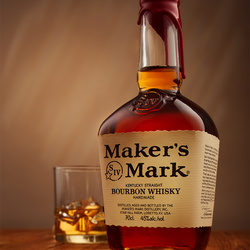
-background is lit by a flash head with a grid, cto gel and tracing paper over+ another flash with a optical spot with a gobo
-Left and right - 60x90 cm softboxes difussed through 1 sq meter panels
-Optical spot on the label
-Gold reflectors cards behind the bottle and glass
In Lists


Very nice
Thank you
Great image Sebastian,
love shots like this,
they look so simple, but people just dont realise the amount of hard work that goes into a shot like this.
Almost perfect. Love the lighting. The uniqueness of the bottle is wonderful. I see possibly a reflector card peeking out at the bottom left of the glass, but if I wasn't looking for something I would never have seen it. Excellent work.
Thanks. I chose the bottle for it's shape and for the matte textured label. I'll try to fix that card
Can you clarify for me the "optical spot" you used for the label? I'm not familiar with the term, and I'd love to know how you accomplished it. Is that a form of snoot?
Yes it is a snoot basically, except it has a lens inside that allows focus adjustment for the spot and use of gobos to create different effects (shape of a window for ex.). The model I used is elinchrom minispot lite
Ah! Very cool! Thank you for the info-
Nice Shot
For me the wooden table leading you into the shot works great and the low camera angle, takes it from an excellent shot to world class IMHO. Very well thought and executed shot
Thank you for the kind words!
this well shot
very nice! i wonder about the lens and the aperture...
thank you! I used a 45mm Tilt/Shift Canon lens at about f5.6
Bourbon of the God's that is. Great shot!
Very nice lighting, well done! Just a tiny point: The reflections on the bottle's neck could look better if they were golden, too. And the glas is filled, while the bottle is still closed. But I know that a Maker's Mark bottle isn't too pretty once it is opened. ;-)
Well executed. The wooden surface adds warmth and I really like the background lighting.
Great image Sebastian. I know how hard it is to pull off bottle shots and yours is very well done. Nice to see a label that all text is clear and pronounced as well. Keep them coming!
Agree with Lee - great shot, and to the uninitiated, people glancing through their magazine have no idea of the time spent crafting such shots.
Love it!