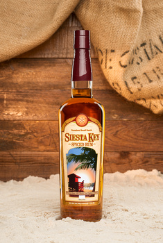
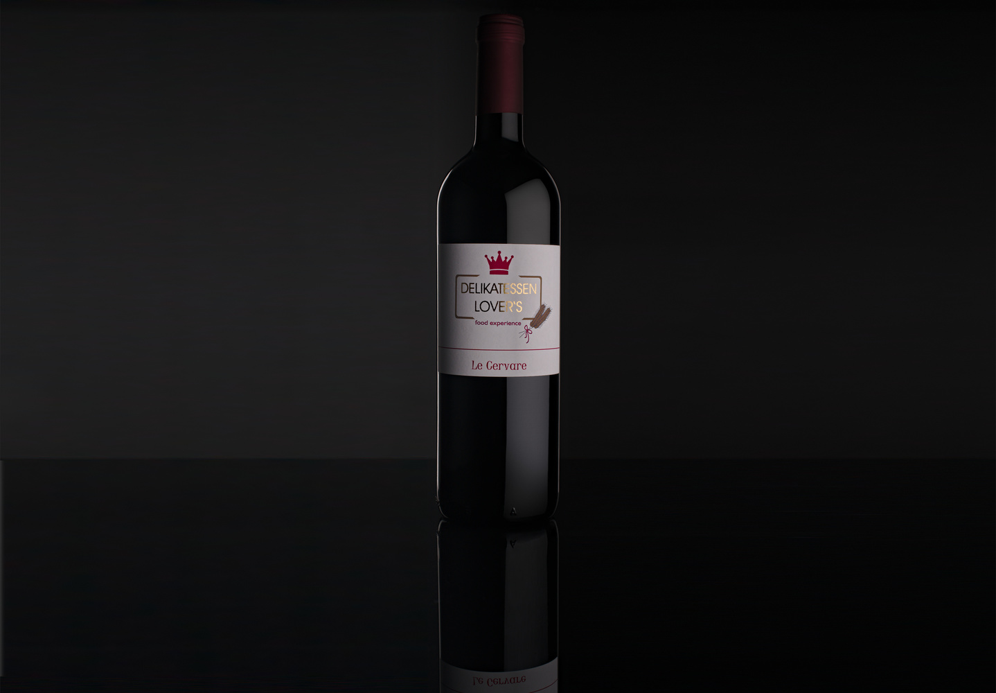
A lot of good stuff going on here, but the highlight on the label coming from the right side is bumming me out. Perhaps if the gold letters themselves were illuminated the other way? We read left to right, so should usually go that way. Otherwise the eye gets pulled to the end of the words, then they have to back track. Beyond that, the edge lights being different is a bit distracting as well. Super subtle changes and this would be a pretty solid image IMO.
Forgot to write a paragraph about the styling for this photo. The black background that almost blend into the bottle should give a relaxing and intimate feel. The golden highlights on the label should make it perceive the product as premium high quality.


3 Comments
A lot of good stuff going on here, but the highlight on the label coming from the right side is bumming me out. Perhaps if the gold letters themselves were illuminated the other way? We read left to right, so should usually go that way. Otherwise the eye gets pulled to the end of the words, then they have to back track. Beyond that, the edge lights being different is a bit distracting as well. Super subtle changes and this would be a pretty solid image IMO.
thanks. i agree
Forgot to write a paragraph about the styling for this photo. The black background that almost blend into the bottle should give a relaxing and intimate feel. The golden highlights on the label should make it perceive the product as premium high quality.