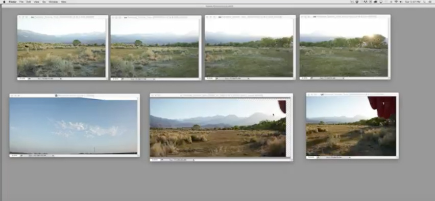
Erik Almas, one of the best commercial composite photographers, has recently teamed up with the team at PRO EDU to create a fully comprehensive tutorial on his complete shooting and retouching process. In this video Almas takes us through an hour-long tutorial, retouching and completing the backplate for one of his tutorial images. I'm always impressed when photographers and retouchers, especially those at the top of our industry, open the doors and reveal their entire process and Almas has done no less here.
In this comprehensive retouching tutorial, Almas takes seven images from a recent shoot and seamlessly stitches them together. Attention to detail and doing things the right way, which so often happens to be the long way, is a common thread with those who are the best at their crafts. Almas' choice to stitch manually using his own techniques are a testament of someone taking the slow road in order to achieve the top results.

A backplate is the staging ground for any good composite. Stitching together several images as well as toning and refining that staging ground is paramount to to completing a high-end composite. After completing the initial stitch, Almas also shows his methods for adding contrast and for removing distracting elements.
What I found particularly impressive was his ability to match contrast and color from between images and then mask those elements in without any trace that they weren't really there. By using fundamental techniques that include adjusting contrast with curves and adjusting color using curves, Almas is able to create seamless image blends.


Great tutorial with really valuable info. I could not watch all of it though. The constant tapping on the trackpad was just to annoying.
Question: Should the clouds that were dropped in have a bit more color and shadows due to the position of the sun?
This was a great tutorial. The "Show-n-Tell" theme for the monthly meeting of the local camera club was "Panoramas". I initially was going to leave it to those that use Photoshop. But then, I found Corel PaintShop Pro can create panoramas; so I thought "What the heck?"
I pulled out my Canon Lens Work book and found the horizontal angle of view for the FD 28mm f2.8 was 65°. I wanted overlap, so, to make it simpler, I chose to shift my tripod 45° for each shot. To me, it made sense that the camera should be set fully manual: shutter speed, aperture, and ISO (I was shooting film, so that was set). I metered for the darkest exposure and that was fixed for the three fames.
I was at two different spots on the lake, one was a quiet cove with a boat launch; the other was over by the dam which can be windy and dynamic with the waves.
I used Corel's instructions for creating a panorama: https://www.youtube.com/watch?v=EWhuHmUIOu0
Changing the opacity of the frame being dropped helped to line up the images.
With this photo, the seams appear seamless. It even has a sun flare from the sunrise.
https://www.flickr.com/photos/ralphhightower/8436105383/in/album-7215763...
This photo was "so-so". The waves, the clouds, I could not make the frames appear invisible.
https://www.flickr.com/photos/ralphhightower/8436106459/in/album-7215763...